This is a not-so-deep dive into what went into relaunching this site.
Despite being well over 4,000 words long, it’s not a comprehensive how-to, but a broad collection of pointers with some notes along the way. It turned out a lot longer than I expected, but it should serve as a good clearinghouse for how I built this site, should anyone ever be curious enough to ask.
I could have probably written several articles instead of one, but where’s the fun in that? This isn’t going to be just a web development blog, after all. I’ve got more fun things I want to move on to.
Anyway, let’s dive in!
Static site generator
What’s a static site without a static site generator?
Jekyll is the 800-pound gorilla when it comes to static site generators, but diversity is thriving in this ecosystem. I’ve used a few static site generators over the years, but most static-generated sites I’ve built have been with Jekyll. Since I’m a big fan of Gulp, I’m already investing myself in a Node.js-based dev environment, so this time around I wanted to go all-in with Node tools.
StaticGen is a great resource for comparing static site generators. I evaluated a few, starting with a few in the React and Vue world, including Gatsby, Gridsome, and VuePress, but they were all really a bit much. Hexo was also very interesting, but the community seems very heavily skewed toward China, and, which leads to a lot of the discussion of it being in Chinese. That doesn’t make it a bad project, it just makes it hard to dive into quickly. I may come back to it someday for future projects.
In the end, I went with Eleventy. It’s the most Jekyll-like of all the Javascipt-based generators, and it’s very flexible when it comes to templating languages. It uses Nunjucks by default, which I’m somewhat partial to.
It’s easiest to get started with Eleventy if you use a boilerplate. I forked Eleventy Netlify Boilerplate, added some basic Gulp tasks, and made Supertrain Conductor, but there are many good ones out there.
Static site generator resources
- Eleventy - Node.js-based static site generator
- Netlify JAMstack templates - Try out JAMstack site generators on Netlify with just a few clicks
- Supertrain Conductor - Eleventy Netlify Boilerplate with Gulp added
- StaticGen - Compare static site generators
- Gulp - Node-based task runner. It’s really helpful for Sass compilation and SVG sprite generation.
- Nunjucks - Powerful templating language
CMS and writing
I had chosen Eleventy, and I was intent on launching this site serverlessly, so there was really only one option: Netlify CMS. The real magic of Netlify CMS is that it runs completely in the browser!
I looked at several other options but nothing matched its simplicity. Hell, I couldn’t even figure out how to log into the admin for the Ghost-based tools, and it was never clear how that would work on Netlify anyway. Do I run it locally and then git push it? I really don’t know.
That’s not to say that Netlify CMS is perfect. Oh boy does it have issues. But I can mostly deal with them. The biggest problem I see is its own popularity. A lot of people seem to be very excited about it, but the pace of development is glacial. My impression is that the team is mostly Netlify employees who work on it as time allows. And there’s not much time allowed. There are open issues from years ago that are all planned for development, but nothing ever seems to really happen with them. There’s even a beautiful redesign that seems to have completely stalled. It’s absolutely abysmal on a phone as well, making writing on-the-go much trickier. A responsive design is also planned, but I’m not holding my breath.
Fortunately, none of that matters too much, because Netlify CMS does exactly what I need. My actual biggest day-to-day gripe is that the included WYSIWYG/Markdown editor, based on Slate.js, doesn’t support smart quotes. There is a plugin that does auto-replacement, but the demo itself doesn’t work, so I haven’t bothered trying to implement the plugin.
I’m too much of a grammar perfectionist to use straight quotes in my writing, so I’ve been doing most of my writing in Typora, a desktop Markdown editor. I just paste my text into the Netlify WYSIWYG editor when I’m done. Typora even supports YAML frontmatter, so I can create and edit any posts I create in it. Frankly I prefer writing in a dedicated editor, but it’s a pain that I have to.
The Netlify CMS WYSIWYG editor is easy to extend, however. I created two plugins to embed YouTube and Vimeo players, just like how inline images are embedded. These embed a pattern into your editor, which renders in the preview as the real thing, or even a static preview image, if you prefer. If you use Eleventy like I do, you’ll need to accommodate the pattern as a shortcode, which is also straightforward enough.
CMS and writing resources
- Netlify CMS - Browser-based CMS for static site generators
- Netlify CMS custom widgets - Extend Netlify CMS
- YouTube embed for Netlify CMS/Eleventy - Add YouTube videos to Netlify CMS WYSIWYG editor
- Vimeo embed for Netlify CMS/Eleventy - Add Vimeo videos to Netlify CMS WYSIWYG editor
- Eleventy Shortcodes - Extend template language with reusable content
- Slate.js - React-based framework for building rich text editors
- Slate auto-replace plugin - Doesn’t work as far as I can tell 🤷♂️
Hosting
I want to host my website with a minimum of eels. The previous iteration was just a few simple pages sitting on an Amazon S3 bucket. It cost me 50¢ a month to host. Six bucks a year isn’t going to break the bank, but seeing that 50¢ charge in my bank statement every month was kind of infuriating. I am also cheap, so if I could do this for nothing, that’s really what I prefer to do.
I had a few demands:
- Free hosting
- Free, private repository
- The site has to live at my domain
Until recently, it was either difficult or impossible to achieve this.
- I could host a free repository on BitBucket, but I the site would live at something.bitbucket.io
- I could host a free site on GitHub, but the source would be public.
- I could have done this with BitBucket and Netlify, but I wanted to keep all my stuff in one place on GitHub.
GitHub only supports Jekyll or completely static HTML, and I wasn’t interested in building a single-page Javascript application as my personal site. It’s possible I could have strung something together with CircleCI, but that’s getting pretty complicated, and I don’t want to deal with technical eels anymore than I want to deal with monetary ones.
Netlify has been offering free hosting for several years, but earlier this year something great happened: GitHub started offering free, unlimited private repositories. You lose a few features if you go private, but it’s nothing I care about for my personal site. An additional nice benefit to hosting on Netlify is that they handle HTTP/2, form processing, and SSL setup — all for free.
Hosting resources
- Roderick on the Line Ep. 134: “A Minimum of Eels” - Not really eels, but remora
- Netlify - Free hosting for personal sites
- GitHub: Unlimited free private repos - Also free
- HTTPS on Netlify - Again, free
- Netlify forms - This too is free
Media
One of my favorite features of Netlify is that they handle image resizing and optimization. By enabling Git Large File Storage, you can shrink the size of your repository and reap the performance benefits Netlify’s image transformation service. This feature lets you resize any image just by adding a query parameter to the URL, making it extremely simple to set up srcset and sizes attributes for templated images, such as in my photo gallery. It will work anywhere you call an image, just add a parameter like ?nf_resize=fit&w=300&h=300, and it’ll resize it for you. It even provides a parameter, nf_resize=smartcrop, that will use smartcrop.js to automatically crop images. It borders on magic.
Even though Git LFS moves your images out of your repository, you still get them when you clone your repository locally. The setup requires careful configuration, but ultimately not terrible. You’ll need to apply the same local configuration if anyone else shares access to the same repository. The biggest drawback is that GitHub Desktop chokes whenever it’s trying to upload or download an LFS-hosted image, so you’ll need to stick to the command line.
Thanks to Netlify’s media features, I can avoid adding image resizing and cropping to my build process, which really simplifies things on my end and frees up space that hundreds of generated thumbnails and responsive versions of images would eat up.
I haven’t needed to set them up yet, but Netlify CMS also has support for Uploadcare and Cloudinary.
Media resources
- Netlify Image Transformation
- Netlify Large Media
- Netlify image resizing demo - Test out how simple it is to resize images
CSS and markup
OK, now we’re into the fun stuff. This site’s design is fairly vanilla, but I’ve got lots of good tricks just below the surface.
Grid
I went heavy with the CSS grid layout. It’s been two years since Grid appeared went prime time, and it’s definitely ready for use. For what it’s worth, Firefox currently has the best grid inspector, which, unlike Chrome, will show the names for named lines. One bit of best practice that I’m not currently doing is using @supports to detect CSS Grid support and provide a fallback layout. Since my site is very low-traffic and since my layout gracefully degrades very well, it’s just not a priority. Remember to ask yourself: “do websites need to be experienced exactly the same in every browser?”
- Breaking out with CSS Grid Layout - Technique in use on my individual post pages… like the one you’re reading right now!
- A Complete Guide to Grid - Just an excellent overview of CSS Grid
- A simple visual cheatsheet for CSS Grid Layout - A great quick reference to CSS Grid
Flexbox
CSS Grid isn’t a replacement for Flexbox. As long as we need to align things in one dimension, Flexbox will usually be the best choice. I’m using it in the top navigation.
- A Complete Guide to Flexbox - If you can wear out a web page by loading it too many times, I might have done that to this one.
Dark mode and CSS variables
“Your scientists were so preoccupied with whether or not they could, they didn’t stop to think if they should.” — Ian Malcolm
I did this because I could.
Do people today expect a web site to turn dark because they’re using a dark appearance on their computer? No.
Do people like having their retinas scorched by bright white backgrounds while they’re reading in the dark? Also no.
Nobody expects this, and you have to be using either Safari Technology Preview or Firefox Developer Edition today to even see it, but I suspect this will be considered an essential accessibility accommodation in a few years. In the meantime, there’s really no downside to it.
If you do something like this, don’t just invert the colors — a few fine adjustments will go a long way.
Variables were one of the huge wins when Sass first arrived. They allowed us to finally stop repeating ourselves, and to easily make changes without having to sift through mountains of CSS. CSS variables take this to the next level because, unlike Sass variables, which compile to values throughout your CSS, you can actually change the value of CSS variables in the browser. I’m using them for the basics like color and spacing, but they really help with toggling to dark mode. Rather than dropping media queries all over my styles, I can do it in just one place.
Check out this simplified example:
:root {
  --text: #010203;
  --background: #fff;

  @media screen and (prefers-color-scheme: dark) {
     --text: ##fff;
     --background: #101112;
  }
}
Apply the variables to your text and backgrounds, and just like that, you’ve got dark mode! Variables were also very helpful with keeping margins and padding consistent at different breakpoints.
I occasionally post code snippets (like right in this post), and Prism is the gold standard for making code look good on the web. This also takes advantage of dark mode. I can @import the entire Prism dark styles inside of a media query and easily enable dark colors for syntax highlighting:
@import 'prism';

@media screen and (prefers-color-scheme: dark) {
  @import 'prism-okaida';
}- Dark Modes with CSS
- The Dark (Mode) Web Rises
- What is the difference between CSS variables and preprocessor variables?
- Prism - Syntax highlighting
Fluid typography
Rather than have to think about font sizes and media queries, a relatively simple bit of CSS calc math lets my font sizes scale based on viewport sizes. If you use a technique like this, it’s important to consider the size of your text column at different sizes, rather than focusing just on the viewport.
The general rule of thumb is to keep a line of text to 45 to 75 characters. On the web, you can usually stretch this up to 85, and I’ve found a balance that stays safely inside of this range. This is a nice, easy to implement feature that goes a long way toward improving readability.
- Fluid Typography - Sass mixin
- Size Matters: Balancing Line Length And Font Size In Responsive Web Design
Other CSS stuff
One last neat technique I’m using is object-fit and object-position, along with CSS Grid to make a square grid in my gallery and on my homepage. It’s really easy to do. Click over to CodePen and resize it to see how images span rows at different breakpoints.
While this is a really useful technique, I might actually switch to using Netlify’s image cropping to give me square images. The feature’s results are very good, while “cropping” in bulk, in the browser, using CSS object-fit is a very blunt instrument
Performance
This site is fast. Like, very fast. I’m actually very proud of it. I launched with 100 in all categories on Chrome’s Lighthouse audits.
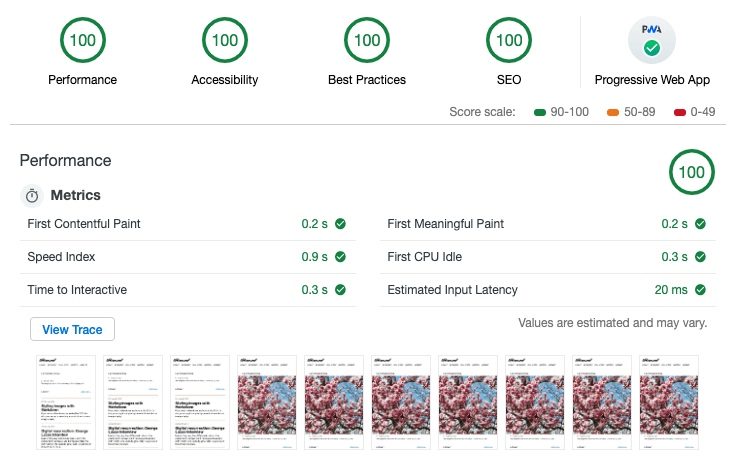
Not bad, right? You can have this too. It wouldn’t hurt to start with my boilerplate, Supertrain Conductor, but the real key is the fact that Netlify has really tuned their infrastructure, including using HTTP/2, to make things fast. Still, I’m using a few techniques to make things even faster.
Responsive images
I’m using srcset and sizes. If your images fill the width of the viewport, like I’m doing with hero images, you can leave off the sizes attribute. There’s a bit of magic and luck involved when it comes to selecting the correct image sizes. Since you’re probably using min-width media queries, you almost certainly want to load an image that’s actually slightly larger than what you need. Each browser handles this slightly differently, and a few extra kilobytes won’t make or break you. Trust me on this: Learn to let go of getting this exactly right and you’ll be happier.
I’m not using the picture element anywhere, but using Netlify’s smart cropping might be a good use case for art-directed images.
ServiceWorker
I’m not doing a whole lot with ServiceWorker at the moment, but it’s in place and functional. It’s shockingly simple to cache your site for offline access, but I just decided that, well, I didn’t want to. All of my styles are inlined for performance, so there’s not a lot to fetch ahead of time, and I don’t want to cache the pages that see a lot of updates, and there’s no point to caching the pages nobody ever goes to. It was a nice thing to implement, but a simple personal site isn’t really the primary use case for this technology.
SVG sprites
I don’t have many SVG images on this site, but the few that I do have will be repeated again and again. Case in point: My notes listing, which includes a few SVG icons. Using a sprite sheet will shave some significant weight off this page in time.
I’m using Font Awesome icons, Gulp SVG Sprite, and a Nunjucks shortcode in Eleventy to pull the whole thing together. Here’s my shortcode:
eleventyConfig.addNunjucksShortcode("icon", (iconName, useInline) => {
  const spriteUrl = '/_includes/assets/svg/icons/icons.sprite.svg'
  const iconId = `#icon-${iconName}`
  const href = useInline ? iconId : spriteUrl + iconId

  return `<svg class="icon icon--${iconName}" role="img" aria-hidden="true" width="24" height="24">
  <use xmlns:xlink="http://www.w3.org/1999/xlink" xlink:href="${href}"></use>
  </svg>`
});
Font loading
I use several Google Fonts on this site. They generally load really well, but if we can make them load a little faster, why not? This little inline script helps do just that. Just drop it in and don’t ask too many questions.
- Lighthouse Audits
- Lozad - Lazy loading using Intersection Observer
- Lozad.js: Performant Lazy Loading of Images
- Responsive Images: If you’re just changing resolutions, use srcset
- Responsive images for busy people: srcset and sizes
- Making a Simple Site Work Offline with ServiceWorker
- Gulp SVG Sprite
- Make your Google Fonts render faster
Syndication
We’re in the endgame now, so let’s just hand Thanos the Time Stone and get this over with.
Feeds
Of course I’ve got an RSS feed, but I’ve also got a JSON feed! Nobody wants to work with XML anymore. JSON is actually fun to work with, and it’s much easier than RSS and XML. There’s no out-of-the-box solution for JSON Feed with Eleventy, but it’s not much effort to take the Eleventy RSS plugin and add a JSON feed template. I put a version of my JSON feed template in a Gist. It also uses a custom collection, sorted by date, which is also included in the Gist.
- JSON feed
- eleventy-plugin-rss - A pack of Eleventy plugins for generating an RSS feed using the Nunjucks templating engine.
Webmention
When I decided to bring this site back from the dead, I knew I didn’t want to deal with comments. If I were to implement traditional comments on a static site, it might mean using something like Facebook or Disqus, both of which load your site up with gross trackers. That was a complete nonstarter for me. Then Colin pulled me into the world of Indieweb.
In the Indieweb world, webmentions fill the role of comments. Webmention is an open standard, currently in W3C recommendation status. It’s kind of like pings from the olden days, but better.
There’s a bit of magic involved, but for the most part it just works (somehow). Webmention.io walks you through the setup and handles most of the magical aspects. If you’re using a traditional CMS, like WordPress, that takes care of the rest. If you’re going the static route like I am, there’s still some work involved. Max Böck has written an excellent article on setting up web mentions on a static site. A smart person would also grab a copy of Max’s excellent Eleventy Webmentions starter template. Be prepared to dig in a bit to get things functioning.
You can take the conversation to the next level by pulling in mentions from Twitter using Bridgy. Again, there’s magic involved. It’s almost weird how it just works. I’m still working out a few kinks in my implementation, but you can see one of my notes that’s chock full of webmentions.
Webmention.rocks is a great resource that lets you test your implementation. It’s incredibly useful if you’ve got a brand-new site and nobody has linked to you yet (sad face).
- Bridgy - Pulls comments, likes, and reshares on social networks back to your web site.
- eleventy-webmentions - Get webmentions working out of the box with Eleventy
- Static Indieweb pt2: Using Webmentions
In #indieweb parlance, cross-posting to Twitter or other services is known as POSSE, or “Publish (on your) Own Site, Syndicate Elsewhere.” That’s a mouthful, so let’s just stick with POSSE. Or better yet, if you’re discussing this with non-Indieweb nerds, just call it “automatically tweeting your stuff when you publish.”
Things get even hairier here, but luckily it’s not that bad if you’ve got the right starting point. Once again, Max Böck comes to our rescue with a great article on exactly the topic we’re dealing with. Long story short: We’re dealing with Lambda functions on Netlify. Max again provides code to help us get up and running.
- POSSE Publish (on your) Own Site, Syndicate Elsewhere
- Static Indieweb pt1: Syndicating Content
- Netlify Functions Playground - Try out a few simple Lambda functions
- Deploy succeeded - Post-deploy Lambda function to syndicate static content to Twitter
In conclusion…
A lot goes into making a “simple” static site these days. Nobody needs everything that I’m doing. If you just want to start publishing on an independent, static web site, you can get away with something much, much simpler. Hell, Netlify supports literally dragging and dropping your site to publish it.
If you want the benefits of static publishing, and you want your content in nice, clean, flat markdown, and you want hot new layout tools, and you want to participate in the broader independent web, it’s going to take some elbow grease. Start small and work your way up. I’ve been doing this for over 20 years, and I learned a lot of new stuff while building this. There are a lot of helpful people willing to lend a hand, including me. Feel free to drop me a line to let me know what you think, and don’t be afraid to ask questions.