I don’t intend for this blog to be a whiny journal of thoughts or cat pictures — that’s what Twitter is for. Maybe I’ll write about web development or post the occasional CSS demo or how-to guide too.
At any rate, blogs are made to be abandoned, so I need to set the bar low right now.
It’s good to be back.
]]>The WordPress post_class()
function normally spits out a bunch of semi-useful classes by default, but unless you want to have to use classes like .post-734
in your stylesheet, sometimes you need to go a step further.
Over at Digging into WordPress, Chris Coyier has an easy tip on how to add custom classes to post_class()
.
As it turns out, it’s trivial to add a custom class to a post. Here’s all you have to do:
<?php post_class('classname'); ?>
That’s pretty self explanatory, but you’ve still got to hard-code that class into your template. What if you want to change it on a per-post basis? Well that’s easy: Just use a custom field. Here’s how:
Create your custom field. Let’s use “custom_class” as our name and “fancy” as the value.
Set the value of the custom field as a variable inside your loop.
<?php if (have_posts()) : ?>
<?php while (have_posts()) : the_post(); ?>
<?php $custom_classes = get_post_meta($post->ID, 'custom_class', false); ?>
Now, let’s use that variable in post_class(), instead of the hard-coded value we saw earlier:
<article <?php post_class($custom_classes) ?> id="post-<?php the_ID(); ?>">
That’s it. You can use the same custom field multiple times in a single post. The false you see above means it will return an array of values, so if you’ve got ten “custom_class” custom field values, you’ll get all ten as custom fields in that post.
This simple technique is already in use on this site, and it will allow me to eliminate a plugin on this year’s redesign of The Yule Blog.
I’ve created a gist on GitHub, so go fork it or comment there, if that’s your thing.
]]>The CSS here is not terribly complicated, but there’s a few things to take note of. Most of what makes this “fancy” is in the CSS3 transitions and animations, but even these new methods depend on good old CSS positioning. To get started, the elements you see here, the article and form, are inside of a container div with position: relative; set on it. This doesn’t do much except to make it available to be positioned, or to have other positioned elements work with it. Notice that most of the styles applied to the article are just for show.
The article
is also using position: relative;
. The form
, however, is using position: absolute;
, which takes it out of the normal flow of the document. This allows us to use z-index
to put it behind the relatively positioned article.
The animation is triggered when the “add” or “cancel” links are clicked. When they’re clicked, jQuery adds or removes a class that has a CSS animation attached to it. It’s all pretty simple but it ties together to make a nice effect.
Keep in mind that in a real-world situation, you would use Modernizr to detect css animation support, and you would also probably use more specific selectors. It’s also probably not the kind of thing you’d want to do on mobile devices, either, but that’s what media queries are for.
Go ahead and screw around with it on CodePen or fork it on GitHub.
This was originally posted at jsFiddle, but I ported it over to CodePen to simplify things. This worked fine in 2011, but I made a few updates to reflect improvements in CSS since then.
]]>First, let me say I realize that in 2011 we’re supposed to be detecting features, not browsers. Feature detection is superior to browser detection, since it lets us actually accommodate antiquated browsers. Plus, with Modernizr, it’s easier than browser detection ever was anyway.
Nine times out of 10, you can create an experience that will gracefully degrade by taking advantage of Modernizr. Occasionally, however, it adds a lot more time to a project.
Recently I had to re-code a site to 2011 standards while keeping the same design. When it was all said and done, just about everything worked fine in IE 6. There wasn’t much to change in the navigation, however. The nav had previously relied on an IE DHTML behavior to make the :hover
pseudo-class work on elements other than links, which was the kind of thing we wanted to avoid this time around. Sure, we probably could have made it work with jQuery, but that would have defeated the purpose of modernizing the code and slimming down the page weight. The pure CSS approach already worked fine for 98 percent of the site’s visitors.
The decision to drop IE 6 support had been made even before I started this project, but I didn’t want to leave that two percent hanging without some kind of warning when everything but the nav was just fine. So we decided to add a message for IE 6 users.
There is no shortage of easy to implement IE 6 warnings on the web, but they all seem like overkill. Plus, if you’re using HTML5 Boilerplate, you’re already detecting IE 6 using a foolproof method.
HTML5 Boilerplate uses IE Conditional Comments, which are nothing new really, but H5BP packages a few in a very useful format. Take a look:
<!--[if lt IE 7]> <html class="no-js ie6 oldie" lang="en"> <![endif]-->
<!--[if IE 7]> <html class="no-js ie7 oldie" lang="en"> <![endif]-->
<!--[if IE 8]> <html class="no-js ie8 oldie" lang="en"> <![endif]-->
<!--[if gt IE 8]><!--> <html class="no-js" lang="en"> <!--<![endif]-->
This adds a different class to the html tag for several version of Internet Explorer. We can use jQuery to take advantage of these classes without bothering other browsers.
First, let’s create the message text. There’s a number of ways you could do this, but we’re going to put a block of HTML in another file and then load that file using jQuery.
Put this in a file and name it alert.txt:
<h1>Whoa there!</h1>
<p>That’s a pretty old browser you got there. You’ll have a better experience here if you upgrade to something from the past decade. I recommend <a href="http://google.com/chrome" title="Chrome">Chrome</a> or <a href="http://firefox.com" title="Firefox">Firefox</a>.</p>
Now, here’s the jQuery you’ll need to get it into your page. You could shorten this a little bit, but I want to make it as clear as possible.
$('document').ready(function(){
// Grab the message from the text file
var ie6message = 'alert.txt';
// Create a div to hold the alert
var alertdiv = $('<div id="alert">');
// Load the message into the div
alertdiv.load(ie6message);
// Insert the message into the page. Notice the .ie6 class, which only appears when using IE 6.
$('.ie6 body').prepend(alertdiv);
});
And here’s all the HTML you’ll need to get started:
<!doctype html>
<!--\\\[if lt IE 7]> <html class="no-js ie6 oldie" lang="en"> <!\\\[endif]-->
<!--\\\[if IE 7]> <html class="no-js ie7 oldie" lang="en"> <!\\\[endif]-->
<!--\\\[if IE 8]> <html class="no-js ie8 oldie" lang="en"> <!\\\[endif]-->
<!--\\\[if gt IE 8]><!--> <html class="no-js" lang="en"> <!--<!\\\[endif]-->
<head>
</head>
<body>
<script src="https://ajax.googleapis.com/ajax/libs/jquery/1.6.2/jquery.min.js"></script>
<script src="script.js"></script>
</body>
</html>
Personally I can’t stand tutorials and drop-ins that try to design your site for you, so I’m not going to tell you how to style this. Just drop some styles in your stylesheet and you’re all set. Also, it’s probably not a good idea to be quite so preachy or condescending as this message. Change it to suit your visitors and the voice of your site.
Here’s a demo page that will let you see it in all browsers. Want to tell me why this is awesome/terrible? Tell me on Twitter or comment at GitHub.
]]>Nesting selectors is great and all, but over the last few years, a new shortcoming in CSS has popped up. Namely, keeping up with vendor prefixes. Most of the cool CSS3 features would be inaccessible to designers if we avoided vendor prefixes, and so, we do use them. We use lots of them. Browser support for new features is evolving rapidly, and it’s hard to keep up. Sass can help.
I’ve already discovered a few basic tricks that can help you get up and running with Sass very quickly.
You’ve got Sass installed, right? It spits out neatly formatted CSS. But you don’t want neatly formatted CSS. You want to compress the hell out of it and get that page to load .001 seconds faster. They tell you how to do this in the Sass documentation, but they do it in the most roundabout way possible. Here’s all there is to it.
sass --watch --style compressed style.scss:style.css
That was easy.
Nested selectors rule, but they just scratch the surface. To wrangle those vendor prefixes, you need mixins.
Here’s your first mixin:
@mixin box-shadow ($box-shadow) {
-webkit-box-shadow: $box-shadow;
-moz-box-shadow: $box-shadow;
-ms-box-shadow: $box-shadow;
-o-box-shadow: $box-shadow;
box-shadow: $box-shadow;
}
To use it, just call up the mixin with the @include
statement and give it some standard values for that property.
div {
@include box-shadow(1px 1px 5px #000);
}
This is what you’ll get after Sass detects the change:
div {
-webkit-box-shadow: 1px 1px 5px #000;
-moz-box-shadow: 1px 1px 5px #000;
-ms-box-shadow: 1px 1px 5px #000;
-o-box-shadow: 1px 1px 5px #000;
box-shadow: 1px 1px 5px #000;
}
Simple, right? Just substitute virtually any other vendor-prefixed CSS3 properties that share the same syntax and this technique will work just fine.
So where won’t it work? Gradients. Ugh, I know, right? Safari 5.1, which only came out with the release of Lion, is the first version to bring its gradient syntax into sync with the W3C proposal and every other browser vendor’s current implementation.
Off the top of my head, it seems safe to say that older versions of Chrome probably won’t support it, but Chrome updates automatically, so it’s much less of a concern. Keep an eye on your visitor logs for Safari 534.50 or later and sooner or later it’ll be safe to drop the older Webkit gradient syntax.
You might be thinking this might also not work with Firefox’s stupid border-radius syntax. Well, stop. Use the border-radius shorthand instead. Unfortunately, older versions of Safari won’t recognize the shorthand, but remember, we’re talking about rounded corners here, which degrade incredibly gracefully. You don’t care if old versions of Internet Explorer get rounded corners, do you? Occasionally you have to leave Safari behind too. Just use the shorthand and move on.
Back to this mixin technique. It works fine when you have one value, but what if you want to specify more than one box-shadow? There’s two ways to handle that, and for my money, one is better than the other.
Here’s the less good way:
@mixin box-shadow ($box-shadow-1, $box-shadow-2) {
-webkit-box-shadow: $box-shadow-1, $box-shadow-2;
-moz-box-shadow: $box-shadow-1, $box-shadow-2;
-ms-box-shadow: $box-shadow-1, $box-shadow-2;
-o-box-shadow: $box-shadow-1, $box-shadow-2;
box-shadow: $box-shadow-1, $box-shadow-2;}
Separate the two shadow values with a comma, just like you’d do with normally.
div {
@include box-shadow(1px 1px 5px #000, 1px 1px 1px #000);
}
Here’s the way I prefer to handle this: Just keep the original mixin you set up earlier. Then, set up a variable that contains both box shadows:
$realistic-drop: 1px 1px 5px #000, 1px 1px 1px #000;
Just call it like this:
div {
@include box-shadow($realistic-drop);
}
You can make the variable as complicated as you want. Add 100 drop shadows and you still just need to call one variable.
Have I mentioned that I love Modernizr? Only constantly. But where do you stick all those Modernizr classes in your stylesheet? Should you use them inline or make a separate section of your stylesheet and keep them all together? With Sass, there’s a good case to be made for keeping them together because Sass’s nested selector syntax will help you keep track of those Modernizr selectors.
Here’s an example:
.no-rgba {
div {
background: #fff;
}
p {
color: #333;
}
}
This becomes:
.no-rgba div {
background: #fff;
}
.no-rgba p {
color: #333;
}
Depending on how much you take advantage of Modernizr, this can come in really handy. RGBA is pretty basic, but once you start getting into things like 3D transforms, where you probably have to rewrite large parts of your layout to gracefully degrade, you’ll be glad you’ve got Sass to help keep your selectors in check.
This isn’t supposed to be the definitive guide to Sass. It’s really just a few things to help you build up speed a little faster. If you’re looking to take it to the next level, check out the Compass Framework or Bourbon.
As usual, there’s a Gist on GitHub. Hit me on Twitter or comment at GitHub if you want to shower me with praise or anything else.
]]>Most people have no idea what a bookmarklet is. The mere idea of editing a bookmark’s address doesn’t even seem to register with them. Me, I’m not like most people. You should be more like me. Here’s how.
Create a new bookmark. It doesn’t matter what site you’re on. Do it here for all I care.
Save that bookmark to your Bookmarks Toolbar.
Edit the bookmark. You’ll want to change both the name and the address. Here’s the code you’ll need:
javascript:(function() {str=location.hostname; down='http://downforeveryoneorjustme.com/'; location.href=(down + str);})()
Make it look like the picture:
There’s no step three.
Whenever a site seems unreachable, just click the item in your Bookmarks Toolbar and you’ll be whisked away to Down for Everyone or Just Me.
Have fun.
This can be a little tricky, because not all browsers will read the `location.hostname` in the address bar if the site is failing to load.
]]>I know what you’re thinking … “great, yet another grid system.”
Yeah, well you’re probably right. Here’s the thing: I don’t think there’s any one perfect CSS grid system, so it’s important to choose the one that works best for your project. There are many out there that I like, particularly the 1140px CSS Grid System.
The problem with this and most other grid systems is that it’s hard to get less semantic than classnames like “onecol”, “twocol”, “threecol”, etc. Enter Sass.
Sass makes it easy to avoid the ugly classnames usually associated with CSS grid systems. With Sass’s powerful variables and mixins, we can get the goodness of the grid without without all the mess.
This project arose from a need I had while redesigning The Yule Blog. I used the 2011 edition of that site as a learning experience to teach myself more about Sass. While the site was always responsive, my approach needed some work, especially considering that there were 25 or so feature articles, each with a customized layout.
To prepare for the 2011 edition of The Yule Blog, I need to do some housekeeping. This grid system is already helping me to update the numerous templates and future-proof them by using semantic classes instead of classes tied to a grid system.
It’s easy to use. I want something powerful but not confusing. I don’t want to have to think about it too much when I actually use it. It requires Sass 3.2, so that it can take advantage of the new mixin features.
Keep in mind that your class names will vary because you will create them using @include in the Sass. These examples use nonsemantic class names.
<div class="container">
<div class="row">
<div class="col-4">
<p>Column 1</p>
</div>
<div class="col-8 last">
<p>Column 2</p>
</div>
</div>
</div>
You can offset columns to the right. Look at examples.html to see this in action.
<div class="container">
<div class="row">
<div class="col-4 push-4">
<p>Column 1</p>
</div>
<div class="col-4 last">
<p>Column 2</p>
</div>
</div>
</div>
This example uses includes the container, row, column and push mixins…
.mcs {
@include container;
.mcs-content {
@include row;
article {
@include column(4);
@include push(4);
}
}
}
Markup for this example…
<div class="mcs">
<div class="mcs-content">
<article>
</article>
</div>
</div>
Include breakpoint mixins to add a responsive element as the page width shrinks. This example uses the same markup as above.
.mcs {
@include container;
.mcs-content {
@include row;
article {
@include column(4);
@include push(4);
@include breakpoint(desktop-small) {
@include column(6);
@include push(3);
}
@include breakpoint(phone-landscape) {
@include column(6);
@include push(3);
}
@include breakpoint(phone-portrait) {
@include column(8);
@include push(2);
}
}
}
}
This grid is based in large part on the original 1140px CSS Grid System by Andy Taylor. I’ve extended a series of mixins created by Ryan Schmukler and added push classes by Liam Cooke. I hope that my work can tie all these great things together.
Please feel free to fork the project on GitHub and submit a pull request with any improvements. There’s definitely still work to be done.
]]>I want to be able to have linked headings look just like normal headings, without inheriting the color for standard links. For example, for standard links, I’ll include this:
a {
@include links;
}
Since I don’t want my headings to stand out as links, I’ll do this for them:
h1 a {
@include links($link: #222, $visited: #222);
}
To break this down a bit further, I define some variables for the project. Then, I create the mixin, which can take optional arguments for the various link state colors, and a transition. If I don’t define a value when I include the mixin, it will just inherit the defaults that I set in the variables. If I do, it will override.
// These are global colors
$lcolor: #7ab4e5;
$vcolor: #7ab4e5;
$hcolor: #e62c25;
$acolor: lighten($hcolor, 10%);
$fcolor: $hcolor;
$link-transition: .15s color ease-in-out
// Mixin will let you override globals... or not, depending on what you pass to it.
@mixin links(
$link:"",
$visited:"",
$hover:"",
$active:"",
$focus:"",
$transition:""
) {
&:link {
@if $link != "" { color: #{$link}; }
@else { color: $lcolor; }
}
&:visited {
@if $visited != "" { color: #{$visited}; }
@else { color: $vcolor; }
}
&:hover {
@if $hover != "" { color: #{$hover}; }
@else { color: $hcolor; }
}
&:active {
@if $active != "" { color: #{$active}; }
@else { color: #e62c25; }
}
&:focus {
@if $focus != "" { color: #{$focus}; }
@else { color: $fcolor; }
}
@if $transition != "" { @include transition(#{$transition}); }
@else { @include transition($link-transition); }
}
I use Bourbon to power the transition mixin, but I think Compass‘s mixin will work just as well.
]]>If I want to reuse it, I’ll have to make some adjustments to it — namely I’ll have to define different colors. That’s obviously not ideal for a mixin library, where you need to be all things to all people, but it makes perfect sense here. Not all mixins need to be reused outside of your project.
This includes a reference to a transition mixin, but that’s only handling vendor prefixes. You can define your transition properties manually if you don’t use a mixin to help with prefixes.
@mixin links(
$link: '#7ab4e5',
$visited: '#7ab4e5',
$hover: '#e62c25',
$active: 'lighten($hover, 10%)',
$focus: $hover,
$transition: '.15s color ease-in-out'
) {
&:link { color: $link; }
&:visited { color: $visited; }
&:hover { color: $hover; }
&:active { color: $active; }
&:focus { color: $focus; }
@include transition($transition);
}
Usage — all arguments are optional:
a {
@include links(red, blue, green, yellow, purple, 1s all linear);
}
]]>I know everybody and his brother has already done something like this, but I just wanted to try it for fun since it’s not a super practical thing.
]]>I’m not sure what’s up, but something weird is going on with CodePen’s iframe. The animation isn’t working right. It works fine locally and over at CodePen. Oh well.
]]>It started out as a Twitter account to post interesting facts about Christmas, and snowballed (ugh, puns) into this. I missed writing, but since writing consistently is hard, we decided that if we could focus on one subject and limit ourselves to just part of the year, we could end up with a better result. I also wanted something that I could use as an outlet to try out new CSS techniques, since I often get distracted coming when trying to come up with demos without any context. So far, It’s been a great success.
We recently launched this year’s edition. Following in last year’s tradition, it features a new design. It’s a little less ambitious than in the past, but the idea this time around is to iterate on it next year, rather than scrapping the whole thing.
Due to some unforeseen circumstances, we’re probably going to keep the content a little lighter this year, but there will still be a lot of cool stuff. Check it out and let me know what you think!
]]>One of these days I might get around to making some fancier options for it, but this gets the job done for now.
You can fork it on GitHub or see it in action on CodePen. Enjoy!
]]>This is the latest iteration of my website, which went online July 27, 2002. It was previously built with WordPress. Before that, it was on MovableType and TypePad. Now it’s built with a Stupid Static Site Generator that I made.
It’s nice to see you.
]]>Literally every one of your users.
Users don’t care about Javascript libraries. They don’t care about an unparalleled developer experience. They don’t care about your business objectives, KPIs, or technical architecture.
Users care about getting their shit done.
Do more of what users want from you. Make these things easy for them to do. You might just have to talk to them. Yeah, that’s a lot of work, but it’s important to know you’re building the right thing before you can build things right. The tools and technology you choose are important, but secondary.
I realize these aren’t terribly deep or original thoughts, but this is what I find myself thinking about more and more lately.
]]>I started this site on July 31, 2002 — three days before I graduated from college. For the record, I beat Daring Fireball by two whole weeks (quality wise, let’s say I’m a close second).
I had been making web sites for myself and others for six years before I started this site. Up until then, I bounced around between GeoCities and university hosting before ever establishing a true outpost of my own. In those early days, site was intended to be a journal of my post-college experience, a true weblog.
Now, 17 years later (it’s up to 21* now), I’d say I did what I set out to do. The earliest entries really do tell a story of setting out in the real world, and the highs and lows along the road from useless college student, to semi-productive member of society. I put about three good years in before I wandered off to work on other personal projects, but my early output was fairly prolific, and written mostly very late at night.
A lot of those early entires come off like I’m desperately complaining to the void, but the reality was marginally less pathetic.
“Never read the comments” has become a mantra in the era of Facebook Boomers gleefully sharing Nazi memes, but in the days before true social media, comments were the best thing we had. It was normal for tight-knit collections of AIM buddies, forum posters, blogroll pals, and IRC freaks to regularly go out of their way to check in on their friends’ blogs, and this site was no exception. Dig in on the Wayback Machine and see for yourself.
As part of an ongoing reorganization of my digital life, I’ve decided to scour saved files, old SQL dumps, and the Internet Archive and reassemble the entire Illtron portfolio in one place. I’m not sure if I’ve managed to save everything, but it’s damn close.
I’m not old enough to be an internet pioneer, but I do remember those early days, and they were good. Social media eventually appeared, and it was fun for a while, but it became an attractive nuisance.
The people I like on Twitter all seem to have disappeared, replaced with political shouting. Now, don’t get me wrong — I actually like that stuff, but it’s not a platform for sharing. For normal people — those without tens of thousands of followers — it’s purely a consumption platform, a fine place to follow along if you can keep the Nazis and bots out of your replies.
Facebook is, well, Facebook. It’s a shoddy website completely populated by sociopath Baby Boomers, which is only only a slight exaggeration. Most of the people I care to keep up with aren’t there either anymore, and the ones who are still there don’t share interesting stuff there these days. For the most part, Facebook has become a weird self-contained ecosystem, where people share pablum from other Facebook pages, with pages ripping off content from other pages, each time making it worse in some unique way. Also, I’m pretty sure I’ve never even used the word “pablum” before, but it works, so I’m going with it.
None of this is to say that social media is evil, or can’t be great for some things. At its best, it can be a lot of fun. What I’m getting at is that it’s not a platform for original thoughts, or even small, fun things, for normal humans. And that’s what this site started out as. Granted, a lot of what I wrote back then was pretty shitty, but it was a platform, and people did occasionally read it.
That’s where I’m coming from this time. I want my platform back. I don’t want algorithms or the cacophony to drown it out. If nobody’s going to see what I write, it’s going to be on my terms.
* Yes, I made a thing that keeps this updated live.
]]>The video started making the rounds, but it really blew up after the AV Club picked it up. It racked up about 700,000 views on YouTube before it got taken down. Even though it felt like fair use, I decided not to file a counter claim.
It still survives on YouTube in the form of a few really shitty rips, where of course, somebody had to add watermarks and stretch it out to 16:9. It must sound ironic that I’m complaining about somebody ripping off a video that I cobbled together from copyrighted material, but at least I put some effort into it.
Well, I uploaded it to Vimeo too, and it’s still there. Enjoy…
]]>I think it’s safe to say I was the first to stake a claim on this nom de internet. The name I’ve travelled under online for the longest time is freshyill, which itself has a silly, but straightforward origin story: I needed an AIM screen name.
I was on ICQ a lot longer than I was on AIM. It was actually something like a year and a half, but it felt like a long time. ICQ was nice because it didn’t bother with names. You got a nice, sterile, number, and everyone was happy. The uh oh aside, ICQ seemed like the better choice of instant messaging services in the mid–late ’90s. AOL was the kiddie internet, and AIM was an extension of that, so I was resistant to the idea of signing up. Consequently, I held out a lot longer than I probably should have.
By 1998, it was clear that ICQ just wasn’t catching on in my circles. AOL bought the developer of ICQ, so it started to seem like I’d be getting on AIM sooner or later, whether I wanted to or not. By that time, however, every normal name I would ever choose was already taken. Complicating this was the fact that AIM screen names were limited to just 10 characters in 1998.
I flat-out refused to just add a number onto some version of my name like a normal person, so I had to get creative. I was listening to a lot of Beastie Boys at the time, and well… “freshyill.” It’s still my go-to whenever I need a username today.
Illtron wasn’t much better. In the summer of 2001, for some reason I wanted another screen name (it seems like everybody had at least two). I was listening to Deltron 3030 basically on repeat at the time, and well, “freshyill + Deltron 3030 = Illtron 3030.”
A quick aside from the Illtron.net internal style guide: “Illtron” is capitalized, “freshyill” is lowercase.
Back to the entry at hand…
I don’t quite know why I went with Illtron over freshyill when I registered the domain for this site. In my headcanon, which is also true canon, freshyill is personal, but Illtron is somehow bigger, more all-encompassing. That makes a lot of sense historically, because I periodically hosted blogs for at least four or five other people on the domain back when it was on Movable Type.
On to the point of all this: In time between when the original site petered out, and now, a lot of usurpers have appeared on the scene. Who are they and why do they suck? Well…
Of course, some of what you’ll find out there actually is me.
It’s somewhat surprising that of all the people who have picked up the name, nobody has actually done much with it. It’s a bunch of random accounts, clearly belonging to different people, on different services. Most are just a name with virtually no public content associated with it.
I don’t have a deep thought that this is all leading up to, just the observation that it’s like these people also needed a name, and came up with something semi-random, exactly like I did.
]]>Yesterday I mentioned that I’m working on an a reorganization of my digital life. Since none of what I’ve produced over the years takes up any physical space, it’s not quite a full-blown Marie Kondo exercise, but the process shares similarities. A lot of it involves dumping things into a series of piles, sorting through it to understand what I’ve got, actually looking at it, and then organizing it in a pleasing way. Sounds simple, right?
Organizing a bag full of old clothes is easy: The properties that determine the value of an old sweater are obvious: Does this fit? Do I still like the style? Is it damaged? Has anthropogenic climate changed obviated the need for it? Once you’ve answered the questions you have, you can thank your sweater, and make the call: Do you keep it or toss it?
Sorting digital objects is a little more complicated. Being unable to physically examine and spatially arrange objects adds a lot of time to the process. I recently sorted about 30,000 photos. You can ask yourself some similar questions that you might ask about a sweater, but they only go so far. Is it blurry? Can I tell what’s going on here? It may be blurry, but if it’s the best photo you have of a dead relative or pet, and unlike sweaters, there will never be another one like it, you might be willing to put up with a lack of focus.
Likewise, if you throw everything in a pile, you lose contextual information that you may never get back. If “Untitled-1.psd” ends up in a digital pile, you may never really be able to understand why it was important in the first place. Maybe that’s enough to determine that it just doesn’t spark joy. On the other hand, it may be a vital clue that helps you piece together the design of a long-dead GeoCities site that the Wayback Machine never picked up and you would love to see again. A sweater is usually just a sweater, but in this business, a file is rarely just a file.
Most of the time, there’s just no way to know unless you dig in — and sometimes you just don’t even have the tools to get started. I’ve got a lot of files that are a mystery. Sometimes it just means tracking down a copy of the right software, but sometimes it takes much more — especially if you’re an old school Mac user who refused to use file extensions in the ’90s on moral grounds. But research and elbow grease pay off, and believe it or not, you can open a ClarisWorks document in 2019.
This isn’t really the start of a how-to guide. It’s more of a how-did. In the coming weeks and months, I plan to begin a series about what I’m doing to get this stuff under control. Some of it is already done, and some of it is still on my to-do list. Some of it involves digital archaeology, and some of it is just wrapping my head around the tools available today.
Re-launching my own website is one of the starting points, because it gives me the platform to document the process, and forces some self-imposed accountability on me. I’ll probably share some tips, but results are what I’m mostly after.
Just like Marie Kondo teaches that you should fold and store your clothing in a way that allows you to both see and access everything easily, I plan to start making more old sites visible by putting them online, instead of just filing them away in folders on a drive.
I spent over a month reading, converting, cleaning up, and posting over 400 entries from my original blog. They were spread across old files, SQL dumps, TypePad exports, and even the Wayback Machine. The work was boring and hard, but ultimately very satisfying. The end result sparks joy, so I’m going to keep doing it.
]]>As new media formats appear, so must we develop the tools and methods to archive and store them. The oldest books are mostly gone, but we eventually figured it out. The same goes for newspapers: Virtually everything the New York Times ever published is available online. Early television was recorded on kinescope, which was never meant as a storage format, and most were lost or destroyed after they served their purpose of rebroadcasting across time zones. For the most part, however, we figure these things out and eventually it’s not a problem anymore.
Much of the early World Wide Web is lost. If the creator didn’t archive it, and the Wayback Machine didn’t catch it, it’s probably gone. Well, I’ve got one of those things to share.
In early 1999, the world was trembling with excitement for The Phantom Menace, the first Star Wars movie in 16 years. There was no such thing as ordering movie tickets online yet, so so we actually camped out in front of the movie theater, a week before the release. I wasn’t alone out there on Lackawanna Ave. in Scranton — I’m pretty sure it was the first time I met Colin Devroe. It’s hard to overstate what an event this movie was.
A few months ago, as I was first getting the digital decluttering bug, I came across a video file on an old hard drive. I actually had to download a codec to get it to play, but eventually it did open. What I found was a 60 Minutes interview of George Lucas by Leslie Stahl. The picture is minuscule, and the quality is basically as bad as you’d expect from internet video in 1999, but this broadcast was a big event at the time. So big that I downloaded it the day after it aired. It probably took a long time.
After looking around, I found that this video apparently isn’t available online anywhere else. This is it. CBS still has a page about the interview, but the video itself is long gone from their servers. Sadly, the article is filled with broken links to what looks like what would have been a really nice story package about the movie at the time.
The Phantom Menace may not have lived up to the hype, but it’s also hard to overstate exactly how huge the hype was. The hype itself was undeniably great. Please enjoy this little resurrected bit of the the hype:
There are a lot of good Markdown guides out there, but they’re basically all how-to guides that just tell you what HTML your Markdown will produce, and don’t get into presentation of that HTML — nor should they. A frequent question I see is people asking how they can add classes to their images so they can style them. Unfortunately, that’s generally not possible. Some Markdown parsers might hack in support for something like this, but it’s far from common, and relying on one weird parser’s behavior kills the portability of the content.
The solution is actually surprisingly clean and simple: Hash symbols and CSS.
You can add any hash symbol you want to the end of the image URL, which provides a clean hook for CSS styling using an attribute selector. The possibilities are nearly infinite. Start with a few images, and include a hash symbol followed by anything:
![Block image](https://picsum.photos/id/1020/600/300#block)
![Avatar](https://picsum.photos/id/219/300/300#avatar)
![Align right](https://picsum.photos/id/564/500/300#right)
Next, sprinkle in some CSS. the img[src$="#something"]
attribute selector targets src
attributes that end with your hash.
img[src$="#block"] {
display: block;
margin: 0 auto;
}
img[src$="#avatar"] {
display: block;
margin: 0 auto;
border-radius: 50%;
max-width: 50%;
}
img[src$="#right"] {
float: right;
margin-left: 1em;
margin-bottom: 1em;
}
Now you’ve got styled images!
The only real caveat is that you have to control the CSS on the site for this to do any good. If you can’t control the styles for the site where you’re writing, there may still be a simple solution: It’s also perfectly valid to add a style block to your Markdown.
<style>
/* You know what a style block looks like.
Just drop your fancy image styles here and put this right in your Markdown, champ! */
</style>
Sometimes the output will be restricted or sanitized, which might remove style blocks, so your mileage may vary. Adding a style block may also come in handy if you need to add presentational styles to accommodate a single piece of content, and you would prefer to not make more styles available globally.
There is a gotcha, however: Images are always placed inside of paragraphs by Markdown. It’s generally not a big deal, but it limits some styling possibilities.
See how the code blocks on this page pop out wider than the main text column? Those are all immediate children of an element with display: grid applied, and styled to align to a different CSS grid column. The images aren’t immediate children of the grid; the paragraphs are. We can’t do that to images inside of paragraphs, at least until CSS subgrid ships, and even then the targeting might be tricky.
Don’t let anybody tell you that using attribute selectors for styling is bad practice. It’s a useful part of the spec, and this approach is simple with no technical overhead. It beats the hell out of hacking class attributes into Markdown-generated HTML or manipulating the markup with Javascript.
]]>Despite being well over 4,000 words long, it’s not a comprehensive how-to, but a broad collection of pointers with some notes along the way. It turned out a lot longer than I expected, but it should serve as a good clearinghouse for how I built this site, should anyone ever be curious enough to ask.
I could have probably written several articles instead of one, but where’s the fun in that? This isn’t going to be just a web development blog, after all. I’ve got more fun things I want to move on to.
Anyway, let’s dive in!
What’s a static site without a static site generator?
Jekyll is the 800-pound gorilla when it comes to static site generators, but diversity is thriving in this ecosystem. I’ve used a few static site generators over the years, but most static-generated sites I’ve built have been with Jekyll. Since I’m a big fan of Gulp, I’m already investing myself in a Node.js-based dev environment, so this time around I wanted to go all-in with Node tools.
StaticGen is a great resource for comparing static site generators. I evaluated a few, starting with a few in the React and Vue world, including Gatsby, Gridsome, and VuePress, but they were all really a bit much. Hexo was also very interesting, but the community seems very heavily skewed toward China, and, which leads to a lot of the discussion of it being in Chinese. That doesn’t make it a bad project, it just makes it hard to dive into quickly. I may come back to it someday for future projects.
In the end, I went with Eleventy. It’s the most Jekyll-like of all the Javascipt-based generators, and it’s very flexible when it comes to templating languages. It uses Nunjucks by default, which I’m somewhat partial to.
It’s easiest to get started with Eleventy if you use a boilerplate. I forked Eleventy Netlify Boilerplate, added some basic Gulp tasks, and made Supertrain Conductor, but there are many good ones out there.
I had chosen Eleventy, and I was intent on launching this site serverlessly, so there was really only one option: Netlify CMS. The real magic of Netlify CMS is that it runs completely in the browser!
I looked at several other options but nothing matched its simplicity. Hell, I couldn’t even figure out how to log into the admin for the Ghost-based tools, and it was never clear how that would work on Netlify anyway. Do I run it locally and then git push
it? I really don’t know.
That’s not to say that Netlify CMS is perfect. Oh boy does it have issues. But I can mostly deal with them. The biggest problem I see is its own popularity. A lot of people seem to be very excited about it, but the pace of development is glacial. My impression is that the team is mostly Netlify employees who work on it as time allows. And there’s not much time allowed. There are open issues from years ago that are all planned for development, but nothing ever seems to really happen with them. There’s even a beautiful redesign that seems to have completely stalled. It’s absolutely abysmal on a phone as well, making writing on-the-go much trickier. A responsive design is also planned, but I’m not holding my breath.
Fortunately, none of that matters too much, because Netlify CMS does exactly what I need. My actual biggest day-to-day gripe is that the included WYSIWYG/Markdown editor, based on Slate.js, doesn’t support smart quotes. There is a plugin that does auto-replacement, but the demo itself doesn’t work, so I haven’t bothered trying to implement the plugin.
I’m too much of a grammar perfectionist to use straight quotes in my writing, so I’ve been doing most of my writing in Typora, a desktop Markdown editor. I just paste my text into the Netlify WYSIWYG editor when I’m done. Typora even supports YAML frontmatter, so I can create and edit any posts I create in it. Frankly I prefer writing in a dedicated editor, but it’s a pain that I have to.
The Netlify CMS WYSIWYG editor is easy to extend, however. I created two plugins to embed YouTube and Vimeo players, just like how inline images are embedded. These embed a pattern into your editor, which renders in the preview as the real thing, or even a static preview image, if you prefer. If you use Eleventy like I do, you’ll need to accommodate the pattern as a shortcode, which is also straightforward enough.
I want to host my website with a minimum of eels. The previous iteration was just a few simple pages sitting on an Amazon S3 bucket. It cost me 50¢ a month to host. Six bucks a year isn’t going to break the bank, but seeing that 50¢ charge in my bank statement every month was kind of infuriating. I am also cheap, so if I could do this for nothing, that’s really what I prefer to do.
I had a few demands:
Until recently, it was either difficult or impossible to achieve this.
GitHub only supports Jekyll or completely static HTML, and I wasn’t interested in building a single-page Javascript application as my personal site. It’s possible I could have strung something together with CircleCI, but that’s getting pretty complicated, and I don’t want to deal with technical eels anymore than I want to deal with monetary ones.
Netlify has been offering free hosting for several years, but earlier this year something great happened: GitHub started offering free, unlimited private repositories. You lose a few features if you go private, but it’s nothing I care about for my personal site. An additional nice benefit to hosting on Netlify is that they handle HTTP/2, form processing, and SSL setup — all for free.
One of my favorite features of Netlify is that they handle image resizing and optimization. By enabling Git Large File Storage, you can shrink the size of your repository and reap the performance benefits Netlify’s image transformation service. This feature lets you resize any image just by adding a query parameter to the URL, making it extremely simple to set up srcset
and sizes
attributes for templated images, such as in my photo gallery. It will work anywhere you call an image, just add a parameter like ?nf_resize=fit&w=300&h=300
, and it’ll resize it for you. It even provides a parameter, nf_resize=smartcrop
, that will use smartcrop.js to automatically crop images. It borders on magic.
Even though Git LFS moves your images out of your repository, you still get them when you clone your repository locally. The setup requires careful configuration, but ultimately not terrible. You’ll need to apply the same local configuration if anyone else shares access to the same repository. The biggest drawback is that GitHub Desktop chokes whenever it’s trying to upload or download an LFS-hosted image, so you’ll need to stick to the command line.
Thanks to Netlify’s media features, I can avoid adding image resizing and cropping to my build process, which really simplifies things on my end and frees up space that hundreds of generated thumbnails and responsive versions of images would eat up.
I haven’t needed to set them up yet, but Netlify CMS also has support for Uploadcare and Cloudinary.
OK, now we’re into the fun stuff. This site’s design is fairly vanilla, but I’ve got lots of good tricks just below the surface.
I went heavy with the CSS grid layout. It’s been two years since Grid appeared went prime time, and it’s definitely ready for use. For what it’s worth, Firefox currently has the best grid inspector, which, unlike Chrome, will show the names for named lines. One bit of best practice that I’m not currently doing is using @supports
to detect CSS Grid support and provide a fallback layout. Since my site is very low-traffic and since my layout gracefully degrades very well, it’s just not a priority. Remember to ask yourself: “do websites need to be experienced exactly the same in every browser?”
CSS Grid isn’t a replacement for Flexbox. As long as we need to align things in one dimension, Flexbox will usually be the best choice. I’m using it in the top navigation.
“Your scientists were so preoccupied with whether or not they could, they didn’t stop to think if they should.” — Ian Malcolm
I did this because I could.
Do people today expect a web site to turn dark because they’re using a dark appearance on their computer? No.
Do people like having their retinas scorched by bright white backgrounds while they’re reading in the dark? Also no.
Nobody expects this, and you have to be using either Safari Technology Preview or Firefox Developer Edition today to even see it, but I suspect this will be considered an essential accessibility accommodation in a few years. In the meantime, there’s really no downside to it.
If you do something like this, don’t just invert the colors — a few fine adjustments will go a long way.
Variables were one of the huge wins when Sass first arrived. They allowed us to finally stop repeating ourselves, and to easily make changes without having to sift through mountains of CSS. CSS variables take this to the next level because, unlike Sass variables, which compile to values throughout your CSS, you can actually change the value of CSS variables in the browser. I’m using them for the basics like color and spacing, but they really help with toggling to dark mode. Rather than dropping media queries all over my styles, I can do it in just one place.
Check out this simplified example:
:root {
--text: #010203;
--background: #fff;
@media screen and (prefers-color-scheme: dark) {
--text: ##fff;
--background: #101112;
}
}
Apply the variables to your text and backgrounds, and just like that, you’ve got dark mode! Variables were also very helpful with keeping margins and padding consistent at different breakpoints.
I occasionally post code snippets (like right in this post), and Prism is the gold standard for making code look good on the web. This also takes advantage of dark mode. I can @import
the entire Prism dark styles inside of a media query and easily enable dark colors for syntax highlighting:
@import 'prism';
@media screen and (prefers-color-scheme: dark) {
@import 'prism-okaida';
}
Rather than have to think about font sizes and media queries, a relatively simple bit of CSS calc
math lets my font sizes scale based on viewport sizes. If you use a technique like this, it’s important to consider the size of your text column at different sizes, rather than focusing just on the viewport.
The general rule of thumb is to keep a line of text to 45 to 75 characters. On the web, you can usually stretch this up to 85, and I’ve found a balance that stays safely inside of this range. This is a nice, easy to implement feature that goes a long way toward improving readability.
One last neat technique I’m using is object-fit
and object-position
, along with CSS Grid to make a square grid in my gallery and on my homepage. It’s really easy to do. Click over to CodePen and resize it to see how images span rows at different breakpoints.
While this is a really useful technique, I might actually switch to using Netlify’s image cropping to give me square images. The feature’s results are very good, while “cropping” in bulk, in the browser, using CSS object-fit
is a very blunt instrument
This site is fast. Like, very fast. I’m actually very proud of it. I launched with 100 in all categories on Chrome’s Lighthouse audits.
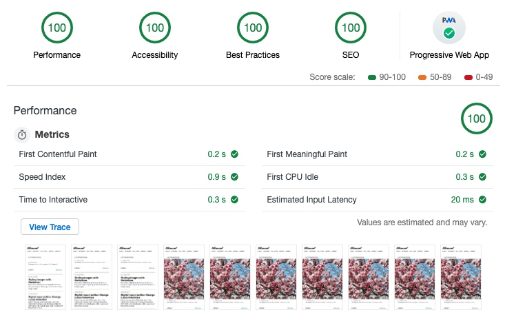
Not bad, right? You can have this too. It wouldn’t hurt to start with my boilerplate, Supertrain Conductor, but the real key is the fact that Netlify has really tuned their infrastructure, including using HTTP/2, to make things fast. Still, I’m using a few techniques to make things even faster.
I’m using srcset
and sizes
. If your images fill the width of the viewport, like I’m doing with hero images, you can leave off the sizes
attribute. There’s a bit of magic and luck involved when it comes to selecting the correct image sizes. Since you’re probably using min-width
media queries, you almost certainly want to load an image that’s actually slightly larger than what you need. Each browser handles this slightly differently, and a few extra kilobytes won’t make or break you. Trust me on this: Learn to let go of getting this exactly right and you’ll be happier.
I’m not using the picture
element anywhere, but using Netlify’s smart cropping might be a good use case for art-directed images.
I’m not doing a whole lot with ServiceWorker at the moment, but it’s in place and functional. It’s shockingly simple to cache your site for offline access, but I just decided that, well, I didn’t want to. All of my styles are inlined for performance, so there’s not a lot to fetch ahead of time, and I don’t want to cache the pages that see a lot of updates, and there’s no point to caching the pages nobody ever goes to. It was a nice thing to implement, but a simple personal site isn’t really the primary use case for this technology.
I don’t have many SVG images on this site, but the few that I do have will be repeated again and again. Case in point: My notes listing, which includes a few SVG icons. Using a sprite sheet will shave some significant weight off this page in time.
I’m using Font Awesome icons, Gulp SVG Sprite, and a Nunjucks shortcode in Eleventy to pull the whole thing together. Here’s my shortcode:
eleventyConfig.addNunjucksShortcode("icon", (iconName, useInline) => {
const spriteUrl = '/_includes/assets/svg/icons/icons.sprite.svg'
const iconId = `#icon-${iconName}`
const href = useInline ? iconId : spriteUrl + iconId
return `<svg class="icon icon--${iconName}" role="img" aria-hidden="true" width="24" height="24">
<use xmlns:xlink="http://www.w3.org/1999/xlink" xlink:href="${href}"></use>
</svg>`
});
I use several Google Fonts on this site. They generally load really well, but if we can make them load a little faster, why not? This little inline script helps do just that. Just drop it in and don’t ask too many questions.
We’re in the endgame now, so let’s just hand Thanos the Time Stone and get this over with.
Of course I’ve got an RSS feed, but I’ve also got a JSON feed! Nobody wants to work with XML anymore. JSON is actually fun to work with, and it’s much easier than RSS and XML. There’s no out-of-the-box solution for JSON Feed with Eleventy, but it’s not much effort to take the Eleventy RSS plugin and add a JSON feed template. I put a version of my JSON feed template in a Gist. It also uses a custom collection, sorted by date, which is also included in the Gist.
When I decided to bring this site back from the dead, I knew I didn’t want to deal with comments. If I were to implement traditional comments on a static site, it might mean using something like Facebook or Disqus, both of which load your site up with gross trackers. That was a complete nonstarter for me. Then Colin pulled me into the world of Indieweb.
In the Indieweb world, webmentions fill the role of comments. Webmention is an open standard, currently in W3C recommendation status. It’s kind of like pings from the olden days, but better.
There’s a bit of magic involved, but for the most part it just works (somehow). Webmention.io walks you through the setup and handles most of the magical aspects. If you’re using a traditional CMS, like WordPress, that takes care of the rest. If you’re going the static route like I am, there’s still some work involved. Max Böck has written an excellent article on setting up web mentions on a static site. A smart person would also grab a copy of Max’s excellent Eleventy Webmentions starter template. Be prepared to dig in a bit to get things functioning.
You can take the conversation to the next level by pulling in mentions from Twitter using Bridgy. Again, there’s magic involved. It’s almost weird how it just works. I’m still working out a few kinks in my implementation, but you can see one of my notes that’s chock full of webmentions.
Webmention.rocks is a great resource that lets you test your implementation. It’s incredibly useful if you’ve got a brand-new site and nobody has linked to you yet (sad face).
In #indieweb parlance, cross-posting to Twitter or other services is known as POSSE, or “Publish (on your) Own Site, Syndicate Elsewhere.” That’s a mouthful, so let’s just stick with POSSE. Or better yet, if you’re discussing this with non-Indieweb nerds, just call it “automatically tweeting your stuff when you publish.”
Things get even hairier here, but luckily it’s not that bad if you’ve got the right starting point. Once again, Max Böck comes to our rescue with a great article on exactly the topic we’re dealing with. Long story short: We’re dealing with Lambda functions on Netlify. Max again provides code to help us get up and running.
A lot goes into making a “simple” static site these days. Nobody needs everything that I’m doing. If you just want to start publishing on an independent, static web site, you can get away with something much, much simpler. Hell, Netlify supports literally dragging and dropping your site to publish it.
If you want the benefits of static publishing, and you want your content in nice, clean, flat markdown, and you want hot new layout tools, and you want to participate in the broader independent web, it’s going to take some elbow grease. Start small and work your way up. I’ve been doing this for over 20 years, and I learned a lot of new stuff while building this. There are a lot of helpful people willing to lend a hand, including me. Feel free to drop me a line to let me know what you think, and don’t be afraid to ask questions.
]]>In the early days of the web, people just made web pages. There were no social networks, and the closest equivalents of the time — forums, chat rooms, IRC, etc. — weren’t really platforms for creative expression, but places for people to meet and connect.
If you wanted to express yourself, you had to build a personal site, and the giant in this space was GeoCities. There were others like Angelfire, FortuneCity, and Tripod, but GeoCities was by far the largest, at least in terms of mindshare. I don’t know what made GeoCities so much more popular than the others, but the fact that there were no obligations to post a link back to GeoCities was a selling point for me. The others always seemed like cheap knock-offs of the original, which put me even deeper into the GeoCities camp.
Personal sites being an expression of one’s interests, it was common to build a site around a particular topic, which GeoCities not-so-subtly pushed you toward. When signing up, you had to choose a neighborhood and address. When a neighborhood filled up, they added a sub-neighborhood. On February 15, 1997, I staked my claim at Area51/Vault/3227. I had decided the topic of my site long before I ever actually launched it: Boba Fett.
I don’t really remember what made Boba Fett so interesting that I’d want to make an entire web site about the character. It could have just been that I was enthralled with the very idea of putting something on the internet, There was also the fact that there was so little material dealing with him that it was actually possible to build a definitive resource. The Special Editions had just been released in theaters, and though much maligned today, they had successfully restored Star Wars’s place in the broader pop culture consciousness. I guess it seemed like a somewhat natural topic to build a site around at the time.
I scoured the internet for anything Boba Fett related — no easy task before Google — and collected everything I could. Video was mostly out of the question, but I did compile a good collection of text, audio, images, and photos. I even painstakingly retyped entire articles from Star Wars guide books, which first necessitated buying the books.
It wasn’t all just downloaded images and sound clips ripped from VHS tapes. In January, 1998, I visited Star Wars: The Magic of Myth at the The Smithsonian National Air and Space Museum. I had with me an early digital camera, and I managed to capture some surprisingly clear, though low-resolution photos of the exhibit. The Smithsonian’s original “virtual online exhibition” is still available on their website, and it is itself extremely GeoCities-esque. I’d say my photos are at least comparable to theirs.
In mid–late ’90s personal site terms, a few tens of thousands of hits added up to a fairly popular site. I eventually became a GeoCities community leader, which had minimal benefits and lots of extra work. The few extra megabytes of web space was both worth it and necessary to keep up with my growing collection. Eventually, as with most things, life got in the way and I moved on to other projects.
GeoCities is long gone, but much of what I posted there survives. I still have two more or less complete versions of the site, along with lots of spare parts from earlier iterations. Today I’m sharing the 1998 and 1999 designs of the site. The content isn’t significantly different between the two, but each one is a unique look into what I was doing with myself on the internet 20 years ago.
I have actually had some of this posted in the past, though it wasn’t linked to from anywhere. This time, things are a little different. I had wanted to post everything exactly as it appeared the days these versions of the site went up in 1998 and 1999, but it didn’t quite work out that way. My static site generator, despite being told to just move them to the build directory, decided to do some processing along the way. As a result, some of the late-’90s HTML was causing errors. I cleaned those up and took a few more steps, namely:
I swear I’m out of the Boba Fett fansite game, but I had to do just this final thing.
Boba Fett wears two insignia — one on his shoulder and another on his chest. I wanted to use the chest insignia in this post, but I couldn’t find a good quality version of it. Everything is either a poor quality bitmap, or a vector that doesn’t look even close to accurate. So I did what was necessary and made my own. It’s not perfect, but it got the job done for my purposes. If you think you can do better, well, have at it! I’m posting the source file to Sketch Cloud, and you can download an SVG or PNG from me. This design is based directly on the screen-accurate Return of the Jedi symbol from the costuming guide at the Boba Fett Fan Club. Check them out for all your current-day Boba Fett needs.
]]>First, it’s interesting that the teaser gives almost no indication of the plot. Anybody who’s breaking down this trailer and applying too much meaning to any of the very brief shots is filling in a lot of blanks with their own desires for what they want out of this movie. That’s why I’m being very clear that anything I try to read in to this trailer is completely insane speculation that I really don’t expect to be true.
J.J. Abrams played it pretty safe in The Force Awakens while Rian Johnson shook things up in The Last Jedi. From appearances, Abrams set up a lot of pins that Johnson didn’t just fail to knock down, but he decided to play a different game altogether. I think this film will tie these things together. In The Force Awakens, Rey thinks she’s somebody. In The Last Jedi, Kylo Ren tells her she’s not. Putting aside the fact that it seems pretty unlikely that he’d have any idea who her parents are, things in Star Wars have a way of being true, from a certain point of view. The point here is that while the directors and writers are given wide creative latitude, there is a plan. I expect to see some resolution on things that were set up in The Force Awakens, but I don’t expect them to happen in ways that just ignores major plot points from The Last Jedi. Keep reading and I’ll come back to this thought in a bit.
The first full minute of the trailer pretty easy to digest because literally only one thing happens. Rey is in the desert and Kylo Ren is trying to run her down with his TIE Silencer. Unorthodox move, but I can respect it. Thinking outside the box is how you move up the ranks when you’re on Team Dark Side. That, and killing your master, and he’s already checked that box…
It seems like Rey has clearly been expecting this moment. Based on the fact that this is in the very first trailer, I doubt this is anywhere near the climax of the film. It’s interesting that they’d be having a confrontation like this at any other time because the heroes usually don’t directly confront the big bad in a Star Wars movie before the third act. Want some wild speculation? Try this on: this is early in the film, and Kylo Ren is not the big bad… somebody else is.
I have to imagine Rey disables the TIE fighter with that lightsaber move, which would lead to a head-to-head fight. I have some questions: What planet is this? It could be one of the desert planets we’ve seen before: Tatooine, Jakku, or possibly Jedha. I’d say it’s pretty likely to just be someplace completely new. Most planets are lifeless deserts, after all.
If you’re keeping track, J.J. Abrams is now two-for-two of opening his Star Wars teaser trailers with a person breathing heavily in the desert.
Moving on…
A ship approaches a city nestled in a rocky, mountainous landscape at night. The ship looks like an A-wing to me, but the planet is more interesting. It would be extremely synergistic for this to be Batuu, home of Black Spire Outpost. Disney is putting big money into building the new Star Wars attractions, and it just makes sense that they’d want to tie the park setting to the movies. Also, it looks a lot like the concept art, so there’s that too. It may or may not be, but I wouldn’t confirm or disconfirm it based on the fact that it’s not an exact match. Remember, the wider landscape images of Batuu are all just concept art. Anybody who tells you it’s definitely not Batuu is filling in too many blanks. In all likelihood, it’s probably just another new planet.
Here’s Goth Vader himself, Kylo Ren! He seems to be taking the long way when it comes to chopping dudes in half with a lightsaber. I’ve seen people speculating that this is one of the Knights of Ren, and now he’s fighting them for some reason. First, no. Second, another creature who looks just like this one enters the frame at the end of the shot. My biggest question: What kind of weapon is this guy using? It looks like an adze, which, as weapons go, is pretty primitive. My crazy speculation: The Resistance is hiding on a not-so-advanced planet and the First Order has tracked them down. They are the native inhabitants. Yeah, that’s actually not so crazy.
Next up: Furry helmet repairman hands. Kylo Ren smashed his helmet after Supreme Leader Snoke berated him for being a second-rate Vader wannabe. It was pretty easy to smash, so I can’t imagine what kind of protection it might have provided, but it was a good look. I don’t want to overthink the furry hands, but they are worth pointing out. Then again, have we ever seen Kylo Ren gloveless?
We are now entering the danger zone. J.J. Abrams put Kylo Ren in a Vader-esque mask. Rian Johnson had him smash it. We were meant to think he angrily threw out his homage to Darth Vader, and he was intent on blazing his own trail through the Dark Side. But what if — and bear with me here — he was just… angry. Kylo Ren threw a few temper tantrums in The Force Awakens. This is what I’m talking about with Abrams not necessarily discarding Johnson’s decisions. Sometimes smashing a helmet is just smashing a helmet. It doesn’t have to be a metaphor, or an overt shot at another film’s creative choices.
Here we have a one-second shot of Poe and Finn hangin out on some rocks in the desert. Is it the same desert planet that Rey is on? Probably! Finn is holding Rey’s staff, which will never stop looking like a lightsaber to me. Personally, I really hope it never gets actual lightsabers attached to the ends of it. Lightsabers are cool. Other things with lightsabers attached to them are not. Finn has apparently found a quality barbershop, so we can tell that some time has passed since we last saw him.
Oh, you thought BB-8 was cute? Well, now cute little BB-8 has a sidekick, D-0. I assume D-0 will play some key part, but since he is literally just a wheel with an eye and two antennae, I’m having trouble imagining what what he can do, other than roll around and be cute.
You old scoundrel! Look who’s back in the pilot’s seat of the Millennium Falcon. It’s none other than the smoothest Sabacc player in the galaxy, Lando Calrissian. A close inspection reveals that’s not the exact same shirt Donald Glover wore in Solo, but it’s damn close. When a style works, it works. And 40 years really isn’t all that long a time in galactic terms anyway.
Here we have what looks like jetpack-wearing stormtroopers chasing a speeder across a desert landscape. It’s all pretty blurry, but look to the sides: I’d put Republic Credits on those being moisture vaporators. Maybe this is Tatooine after all. Then again, moisture farming is probably pretty common on desert planets.
In the next shot, we see that the speeder is being piloted by Poe and Finn, with C-3PO along for the ride. Stay safe, guys.
Now here’s an interesting shot. An A-Wing crashes as it passes… an Imperial-class Star Destroyer? Watch for the shield generators (you know, the ball things). It’s hard to capture in one frame, but you can’t miss it if you step through the video. Notice though, that the front of this capital ship has a reddish stripe, just like the Venator-class Star Destoyers of the Clone Wars era. My wild speculation: This is a surviving New Republic ship, possibly something captured from the Empire, and given a new paint job.
You may recognize this as the award given to anyone who can destroy a Death Star who is not a Wookiee. I’m guessing these non-furry hands belong to Leia and the award belonged to Han Solo. I’m also guessing that while the hands belong to Leia, they do not belong to the late Carrie Fisher. It’s anyone’s guess how much unused material was able to be salvaged, but I hope that most of her scenes do not consist entirely of faceless over-the-shoulder shots.
Well, I guess we do get to see her at least once. Let’s just be glad that we get at least a little bit of Carrie Fisher in this movie. This trilogy really belongs to the new generation, but Episode IX was supposed to be Leia’s time to shine.
Everybody seems a little bit taken aback by whatever is right in front of them. I wonder what it could …
… be. Oh. That’s a Death Star. That’s definitely a Death Star. But which Death Star? Let’s put aside the possibility that there were more than two. This planet must be Yavin 4, Endor, or some other planet in the Yavin or Endor systems. The second Death Star was much closer to Endor than the first one was to Yavin 4, making Endor a much likelier location for this shot. There’s long been a fan theory about the Endor Holocaust. Could it be real? This scene, in a grassy field near an ocean, doesn’t really look like a planet where all life was obliterated at some point in the last 30 years, but it’s not exactly teeming with Ewoks singing yub-nub, either. For what it’s worth, Ewoks are not extinct in the new canon, though that doesn’t mean their planet wasn’t rendered uninhabitable by the Rebel Alliance.
No need to speculate here, it’s been confirmed that that is Darth Sidious you heard. Ian McDiarmid came out on stage during the panel at the Star Wars Celebration. But I have questions — and more wild, but semi-informed, speculation.
The last we saw ol’ Sheev Palpatine, he was hurtling down a reactor core shaft, put there by the freshly-redeemed Anakin Skywalker. Then a big explosion happened, and energy blasted from the shaft. Then, the Death Star blew up. It was spectacular. At some point, we now know, it crashed into the planet. We didn’t see a body, but he was dead. Good and dead. So now what? Could he be a Force ghost? Recent Star Wars canon indicates that this is not possible. As a Sith, he was obsessed with the material, as well as everlasting life. This prevents him from becoming one with The Force, which is part of being able to manifest one’s self as a Force ghost.
That doesn’t mean that Dark Side users are completely out of luck. The Dark Side is a pathway to many abilities some consider to be unnatural. There are at least two recent examples where followers of the Dark Side were able to have some limited form of life after death. The first is Enchantress, a Force-sensitive woman strong in the Dark Side, whose spirit inhabited a Salacc-like creature. Her spirit was bound to this place and she could not leave.
The other example is Momin, a Sith Lord whose spirit inhabited his mask after he was killed. The mask was eventually taken by Darth Sidious from the Jedi temple after the fall of the Republic, and given to Darth Vader as a gift. Momin, through his mask, was able to possess various imperials and native Mustafarians, and helped Vader design and construct his fortress on Mustafar. Momin was eventually able to resurrect himself, using the fortress itself to channel the Dark Side and restore his body. Momin challenged Vader, but Vader being Vader, he crushed Momin with a rock, killing him.
So what’s that mean anyway? Well, it established a few ground rules for life-after-death among Dark Side users, as well as a path to resurrection. In Revenge of the Sith, Palpatine claimed that his master, Darth Plagueis the Wise, had discovered how to cheat death. Was he just manipulating Anakin with tempting lies, or did his master really discover this power? Did he uncover it himself sometime in the ensuing years of the Empire?
Palpatine is back, but we don’t know in what form. Star Wars canon has established that a Dark Side user can return from the dead, and that while Dark Side users can’t become one with the Force, their spirits can inhabit a place or an object. It’s possible that his spirit is inhabiting the wreckage of the Death Star, but he may also appear in the flesh. We just can’t know for sure, but we do have a few hints.
The Last Jedi was polarizing, to say the least. But I do think the vast majority of the negative reactions were calculated political statements by extremely online manbabies who were more upset with the idea of strong female protagonists than with any aspect of the actual filmmaking. That said, both the manbabies and the people who recognize the manbabies as basement-dwelling wannabe-fascist shitheads, will be looking for validation in the latest installment of the series. The manbabies want The Last Jedi to be an aberration. The anti-manbabies want a continuation of The Last Jedi’s shakeup.
If there’s a pattern here, it’s that there is no pattern. We have no idea what to expect. With the Sidious reveal, we were given one big spoiler in the trailer, and it’s one that I don’t think anybody was counting on. The sequel trilogy has kept us guessing, and it’s not about to let up now.
It’s going to be a long wait until December.
]]>The Star Wars Celebration is wrapping up in Chicago right now, and the big event today was the panel for The Mandalorian. They released a few photos, but they also screened a sizzle reel, a teaser trailer, and five minutes from an episode. Enjoy these links while you can. There are many uploads of these videos, but they’re already starting to get taken down.
Everything looks absolutely fantastic. I realize that everybody and their mother will be dissecting and describing this footage, but I just wanted to share one thing in particular:
This alone would be enough to sell me on this show.
]]>I begged to get that NES for Christmas in 1988, but I never really followed up by asking for a lot of games. The quality of half the games I did own is even pretty debatable. That’s not to say I didn’t play lots of others. Back in those days, video game rentals were a big deal, and a much more cost effective way to play a new game than shelling out $50 to buy it. Chances were pretty good that a new game would probably be frustrating and not very good anyway. Online gaming was decades away, so it’s not like you could play against your friends who owned the same game. That made it easy to just borrow games from your friends, and it’s how I played most of my favorite games. So I did get to play a lot of different games, even if I only owned a small handful.
Whenever I load up an older NES game in OpenEmu, especially one I’ve never played before, I usually play for a few minutes and then give up. It’s hard to even know what’s any good, and more often than not, I end up just replaying one of the games I’ve played dozens of times before. Part of it is just the overwhelming paradox of choice. There are hundreds of choices, and I remain convinced that most just weren’t very good. At the same time, I know there are amazing games worth playing. Rather than ask around or search for top ten lists, I’m just going to defer to Nintendo Power’s authority.
I’m kicking off a series where I play through the games featured on the covers of Nintendo Power in the late ’80s and early ’90s. Like many kids in those days, I first subscribed in late 1990 to get the free copy of Dragon Warrior. I seem to remember a lot of the issues that predate the giveaway, and I know for a fact that I had the very first issue, which my elementary school music teacher took away from me for reading it in class. That would have been published before I even owned a Nintendo, so I must have gotten my hands on those older issues at some point before I actually became a subscriber.
Despite being mostly a big Nintendo ad, Nintendo Power actually had some pretty good information. The maps were invaluable, but dig through some old issues and you’ll find some pretty unvarnished talk about straight-up bugs in games. A tip in the Classified Information column describes a bug in Zelda II: The Adventure of Link that is used today as an essential part of sub-one-hour speedruns. Even the Konami Code was mentioned in the very first issue.
This gets said a lot these days, but video games used to be hard. Like, really hard. Very few NES games had the ability to save your progress, which required a battery inside the game cartridge. It’s hard to imagine The Legend of Zelda without the ability to save progress, but there were plenty of games of this scale without a battery. When you ran out of lives, you started over, and you sure as hell couldn’t turn off the Nintendo if you were making good progress. You can argue that today’s games are too easy, but this technical limitation made games in those days even harder than they had any right to be. I had games like Blaster Master that I never bothered to beat until very recently. They were just too hard to be fun, especially for a kid.
But what if they actually are fun? Or, more precisely, what if I can make them fun? There are a lot of games that I wanted to play that I never got the chance to, and plenty that I’d like to revisit. I don’t have time these days to invest in getting really good at a 30-year-old game just to beat it, even for games I liked. Emulators solve this for me. Not only can I save and load right before a difficult part, I can actually rewind the action and replay the annoying parts until I get through it.
Purists will hate this, but I’ve got absolutely no problem using emulator features get through a game. If I’m not playing against anyone except myself and the game, who cares? Everybody knew these games were next to impossible back in the day, which is why millions of people can recite the Konami Code in their sleep, and the Game Genie was a smash hit. If that wasn’t enough proof, think about these numbers: Only around 50 NES games had save batteries, but over 150 SNES could save. Super Nintendo games also increasingly had built-in cheats and hidden developer menus that could unlock power-ups, all to make the games a little more playable. There’s nothing new about taking every opportunity to make games more fun and playable.
Part of my reason for restarting this site was to write about the old games I’ve been playing. I recently played through all of the NES Zelda and Mario games, as well as Link’s Awakening for the Game Boy. I’ve beaten them all before, but I also started playing a few games that I’d never beaten, and I wanted to write my thoughts on them.
I don’t know how far I’ll get through the list of Nintendo Power cover games, but I’m going to give it my best shot. Some of what I write may end up being fairly in-depth, while other games just don’t lend themselves to more than a few paragraphs. I’m not sure how much there is to say about Track & Field II, but I do want to find out. Likewise, you can’t beat Tetris or Dr. Mario, but I can probably find a few worthwhile things to say.
The emulator tools, including Game Genie codes, are going to be necessary if I want to avoid pulling all my hair out. There was a jump in Adventure Island that I couldn’t get past no matter how many times I tried until I put in a Game Genie code. Thankfully Adventure Island isn’t a cover game, because it’s incredibly repetitive and I have no desire to play it ever again. If you’re ever curious about what’s after the first few levels, don’t bother. It’s just more of the same.
First up is Super Mario Bros. 2, which just happens to be one of my favorite games of all time. It’s going be a long road to get to Felix the Cat, which was featured on the September, 1992 cover, but we’ll just have to see how it goes.
]]>I remember quite clearly that I owned a copy of the issue of Nintendo Power with it on the cover. That issue, with the cover featuring the unforgettable clay sculpture of Wart chasing Mario across Subcon, was dated July/August 1988, but I didn’t even get a Nintendo until Christmas of that year. SMB2 was released on October 9, 1988, which frankly, blows my mind because it had always seemed like it was a new release when I got it. I don’t know when or where I got that copy of Nintendo Power, but it definitely wasn’t when the magazine was new.
It turns out that I got this game about six months after it was released, which as things go, isn’t exactly old. Christmas 1988 is when most of my friends seemed to get an NES, and I may have been the first of my friends to get this game. The only time I remember playing it before I got it myself was at Children’s Palace on a PlayChoice-10. I remember being extremely hyped for this game, something I’m sure that copy of Nintendo Power played no small part in.
The PlayChoice-10 was like a gateway drug. It always had a few games that none of my friends had, and it looked better than any NES on a TV. All the games on it just seemed to jump right off the screen. The effect was so dramatic that for years, I thought I had been playing a different version of the game. It turns out the game was exactly the same, but the hardware had important differences.
The single most important difference between the PlayChoice-10 and a standard NES was the Picture Processing Unit, or PPU. The PPU in the PlayChoice-10 output an RGB signal directly to an RGB arcade monitor. At home on an NES, the best you could hope for was composite video, but you were much more likely to be playing through an RF switch. Every link in the chain between the motherboard and your eyes was optimized for the best possible quality. The difference can actually be pretty striking.
It’s probably not quite accurate to call the PlayChoice-10 a reference implementation for the NES, but it’s certainly the highest quality you could hope to see in those days. The Famicom color palette is a topic in itself, but the short version is that there is no canonical NES color palette. This might seem tangential to this game in particular, but it really set my expectations for what this game was going to be.
Right from the start, it’s pretty obvious that this game is a huge leap over Super Mario Bros. Games in those days were light on story. The first Super Mario Bros. doesn’t tell you anything in the game. If you wanted to know anything other than the characters names, such as what the objective of the game even was, you had to consult the manual. Without the manual, you were just a guy murdering turtles for some reason. The manual for Super Mario Bros. did a fair job of explaining the gameplay, the enemies, and the point of jumping on all those turtles, but it wasn’t much to look at.
Super Mario Bros. 2 improved on this approach and added some things that probably weren’t possible when SMB1 was released in 1985. The manual is a huge improvement — the enemies don’t look like they’re drawn on an Etch-a-Sketch — and the story is much more fleshed out. The text is also a much better translation from Japanese than SMB1. When you pop the game in, rather than starting on a silent title screen, you’re greeted with carnival music, and after a few seconds, a brief version of the story that was presented in the manual. It’s a much more polished presentation, making the entire experience feel about as immersive as a game possibly could in those days. Mario has been through many iterations, but the difference is nearly as striking as the transition from the 2D SNES to the 3D N64. This was the first time that the Mario of the game looked like the Mario featured in the manuals, arcade cabinets, and merchandise.
World 1-1 of Super Mario Bros. 2 stands as one of the greatest tutorial levels ever made. This level introduces nearly every mechanic the game has to offer. In the story told in the manual and on the title screen, The gameplay picks up exactly where the story from the manual and the title screen leave off — Mario climbs a stair and opens a door. On the other side of that door is… nothing!
The game introduces you to vertical scrolling before you even press a button during gameplay. This is followed by enemies that you can’t defeat by jumping on. You then learn that to get anything done in this world, you have to pick up and throw things. You get to see areas that wrap around when you walk off the edge, as well as a door to enter. All this is before you really even enter the level.
On the other side of that door are climbing vines, potions, coins, mushrooms, POW blocks, hearts, moving platforms, cherries, star power, 1-ups, turtle shells, bombs, and stop watches. This world even introduces basic strategy mechanics with the first branching path. If you take the back route to Birdo, you learn that your character can leave the top of the screen to go over obstacles.
Some of the things introduced in 1-1, like POW blocks, turtle shells, and 1-ups aren’t terribly common as the game progresses, but the very first level lets you know how they work. The game eventually introduces new challenges — whale spray that can lift you up but harm you if you’re not careful, slippery ice, and increasingly annoying enemies — but it builds up to these things. You get a little bit of all the important stuff right from the start.
Beyond the first world, the game keeps you on your toes. Each world feels unique — much more so than in Super Mario Bros. Other than the two underwater levels, the original SMB didn’t add many new things as you progressed. Don’t get me wrong, Super Mario Bros. is a classic that I love it every bit as much as SMB2, but it feels more like a race to the end than a place you can explore.
The things this game had, as well as the things it didn’t have, help to cement SMB2’s status as the odd one out in the series. The lack of a countdown timer gives you freedom to explore and try new things. If you didn’t hit the wall behind the waterfall with bombs, you could just exit through the door and keep trying.
The lack of a score is also no problem. Scores on platformers always seemed like a holdover from arcade games. In an arcade, where the idea is to get you to part with as many quarters as possible, the ability to enter your initials alongside your score was the closest thing to an accomplishment you could hope for. But when you’re playing a game on a home console, accomplishment is measured in real progress. Nobody cared that this game didn’t have a score or a countdown clock because there was a real chance that you could actually beat the game. It’s not like the NES saved your scores anyway.
There are other things missing from this game that players may have been expecting. While we did get mushrooms and stars, those were the only power-ups in the game. None of those things you could pull out of the ground granted Mario and his friends any special powers. Mario games didn’t go power-up crazy until Super Mario Bros. 3, so it wasn’t that weird at the time. The game also features a distinct lack of things to jump into and smash. The only bricks in the game are walls and floors in a few levels, and there’s not a question block to be found. There are coins, but they’re only found in subspace, and instead adding up to an extra life, they give you chances at the slot machine bonus game. The lack of an on-screen display means the only time you can see how many lives and coins you have is between levels or when you die.
With so many standard Mario things lacking, and plenty of un-Mario things included, it’s almost as if Super Mario Bros. 2 isn’t really a Mario game at all. Of course, if you’re reading this, there’s a pretty good chance you already know the story. It’s actually not a Mario game. SMB2 started out in Japan as Yume Kōjō: Doki Doki Panic.
The usual story is that the real SMB2, which we eventually got as The Lost Levels on Super Mario All-Stars, was deemed to be too difficult for American players. If you think for a moment about the average difficulty of a game on the NES, “too hard to release” seems like a pretty absurd excuse. The Lost Levels was difficult, but not that difficult compared to most NES games. The real excuse is much more boring: The game was just too similar to SMB1. The original Japanese SMB2 introduced a few new game mechanics, such as wind and Luigi’s jumping ability, but for the most part it was a continuation of SMB1. The graphical differences weren’t even improvements, they really were just slightly different. One small difference I do appreciate is that on some levels, it is finally possible to do what every kid had a friend who claimed they could do in SMB1: Jump over the flagpole at the end of the level. You might not be glad you did, however.
If you can locate a copy of Doki Doki Panic, it’s worth checking out to see the little differences. The characters and story are obviously different, but many of the changes are more subtle. The American game includes lots of small animations that the original lacks, which makes for a more polished feel overall. The characters can’t run, which makes choosing which one to use much more important. There are places that some characters just can’t get to in Doki Doki Panic.
In SMB2, you don’t have to switch characters if you don’t want to. To beat Doki Doki Panic, you effectively need to beat it four times — once with each character. The characters can’t tag in and out like in SMB2 — in Doki Doki Panic, you can only switch between worlds, and if you do, you start back at the beginning, or wherever you left off with that character. It’s a system that worked on the Famicom Disk System that just wasn’t feasible on the NES. The story of how Doki Doki Panic came to exist, and how it became SMB2 is a bigger story than I can cover today, but it’s a fascinating bit of video game history.
Even though the SMB2 we got is regarded as a classic game of its era, it soon became clear that Nintendo never intended it to be the direction forward for the franchise. Super Mario Bros. 3 immediately took us back to collecting coins, stomping on goombas, and chasing Bowser across the Mushroom Kingdom to rescue the princess. With the exception of ports of SMB2 to other Nintendo systems, and one weird add-on level for the Game Boy Advance version of SMB3, Mario never pulled another vegetable out of the ground. A few enemies such as Bob-omb and Shy Guys still make regular appearances in Mario games, but the main villain, Wart, has only had a role in one game since then, and is was under his Japanese name in a Zelda game.
SMB2 wasn’t a complete dead end, however. It was released when Nintendo was quickly saturating all media, including the TV airwaves. The Super Mario Bros. Super Show! came on the air in 1989, when SMB2 was the most current Mario release. King Koopa was the main antagonist, but the show was mostly based on elements directly from SMB2. Wart, however, was nowhere to be seen. Enemies from the original Super Mario Bros. appeared on the show, but nowhere near as frequently as enemies from SMB2, including bosses like Fryguy and Mouser. Mario, Luigi, Toad, and the Princess were were all featured characters in the animated segments, just like in the game.
Once SMB3 was released, however, The Adventures of Super Mario Bros. 3 began airing on Saturday mornings, and it featured mostly elements from the new game.
The fact that all four playable characters have different attributes makes the need for great controls necessary. Like most Mario games, it never feels cheap when you get hit by an enemy. Collision detection is another improvement over Doki Doki Panic. It can be frustrating trying to collect cherries in Doki Doki Panic because it seems like the character’s hitbox only covers the lower half of the sprite.
Super Mario Bros. 2 holds up visually as one of the best games on the NES, despite essentially being a 1987 game. I certainly think it looks better in many respects than SMB3, which often seems drab and washed out compared to this game. SMB3 also makes a lot of graphical tradeoffs in order to allow for some different capabilities. The character sprites and subtle animations in this game make it seem much less stiff than SMB3.
The shortness of this game is also hard to ignore. The original Super Mario Bros. has 32 levels, but SMB2 has only 20. The game packs a lot of variety into those 20 levels, which helps it avoid getting repetitive, despite a few bosses showing up more than once. Nintendo overcorrected here with SMB3, which, while containing lots of variety, still gets extremely repetitive by the end. Most people will use a few warp zones, but if you actually try to play through, it gets tedious after 90 levels.
I originally said I’d be playing the games featured on the old issues of Nintendo Power, so let’s do a quick dive into what was exciting in the world of Nintendo in the summer of 1988.
We’ve been over the game, but how did Nintendo Power cover it? The SMB2 feature is huge but it doesn’t cover that much of the game. It really tells you all about the mechanics and how to play, but the maps only go up to World 2-3. Remember, Nintendo was being extremely strategic with the release of this game. The nature of the coverage of the game indicates that they really wanted to really prepare players for something different.
I was struck by the appearance of the character illustrations in the feature. Nintendo tightly controls how its characters appear these days, but their appearance is all over the map in this spread. Some of the art style is extremely Japanese, while some is clearly more tailored for American audiences.
None of it appears to be created specifically for this issue. It’s completely inconsistent and fun in a way Nintendo would never allow today. I love the manga style of the drawings, and I wish they kept it. It probably wouldn’t have played well with the American audiences they were very delicately trying to please, but it’s fun to think about.
The feature on The Legend of Zelda’s second quest is pretty great. It covers the entire overworld and the first six labyrinths, and even tells you how to skip straight to the second quest. It covers a ton of material that you wouldn’t have been able to find elsewhere. If you manage to sit a kid down in front of any of these games, don’t try to make it seem like the lack of Google made these games impossible to figure out. It’s only fair to send them in equipped with guides like this.
It’s hard to believe there was actually three baseball games for the NES by this point in 1988. RBI Baseball had the endorsement of the Major League Baseball Players Association, so it used real player names, but the teams were referred to only by their cities. Major League Baseball was licensed by the league, so it could use team names, but not the players’ names. Bases Loaded didn’t have the endorsement of either, but it was the best looking of the three, and you could charge the mound if you were hit by a pitch. It even had voices, which was really ahead of its time.
If you’re into low-speed fights, the Double Dragon feature covers most of the game. It’s not exactly a game where you can get lost, but maps were always fun. It’s got some nice information on the gameplay, but this was a game where staying alive was the only strategy you needed.
The Now Playing feature covered all the new releases out now, or that will be out by the time the next issue comes out. This had to get unsustainable at some point.
These both covered upcoming releases. Some highlights: Rambo, Metal Gear, Bionic Commando, Golgo 13, Zelda II: The Adventure of Link, Blaster Master, Castlevania II: Simon’s Quest, Marble Madness, Life Force, California Games, and my favorite, the game that spawned a Simpsons gag, Lee Trevino’s Fighting Golf.
I think it’s pretty clear that Nintendo Power was absolutely jam-packed in those days. I’m leaving out more than I’m describing, but I have two completely random things that I want to mention.
Super Mario Bros. 2 is both a classic and an oddity. It is a dead end, and a defining moment in the series. It was the product of a time when the elements of a Mario game had yet to be firmly established. It’s fun to think about what might have been, had Nintendo gone further down this path.
Super Mario Bros. 2 is a pretty important game to me, so this post is more of a very special entry than I think most will end up being. Most of the Nintendo Power cover games aren’t important to me at all, which is why I invented an excuse to play them. I want to experience them, even if I don’t end up loving them.
Next in the series is a game I’ve got plenty of experience playing for 45 minutes and then giving up on: Castlevania II: Simon’s Quest!
]]>I have created a graphic illustrating the definitive order for watching the movies of the Marvel Cinematic Universe. I’ll spoil it for you: It’s the release order.
I came across a garbage image from a Facebook page. Rather than give shitty Facebook pages what they want, and “engage” on that terrible platform, I’m going to put my correct version here.
Here’s the terrible version:
There’s a lot wrong with this. It basically shows the chronological order of events… except that it’s completely wrong in some places. Ant-Man and the Wasp and Doctor Strange seem to be placed completely randomly. It’s such an obvious error that I think it was done intentionally in order to stir conversation on Facebook. At any rate, it’s just not possible to put these movies completely in chronological order, because some scenes in the movies happen after other movies entirely.
Here’s what I threw together:
The truth is that it’s not necessary to see every movie in a particular order in order to understand everything. There’s just some movies you need to see before others. You can probably also take or leave a lot of the post-credits scenes, which further frees you up to watch things in other orders.
My chart doesn’t show every credits scene, only the ones that link movies together when there’s nothing in the main action. I don’t think any of the stingers are absolutely necessary to understand any other movie, but they do help establish a viewing order if you’re a completionist.
Take Doctor Strange. You don’t need to see anything first to understand that movie. It’s almost completely free-standing, but it does have a post-credit scene featuring Thor. That scene, however, is in Thor: Ragnarok. You don’t need to see Doctor Strange to understand Ragnarok, but they are linked, however tenuously. It at least establishes that the main action of Doctor Strange happens first. The same goes for Ant-Man and Captain America: The Winter Solider.
In my graphic, which I’m willing to concede is probably not actually definitive, I just try to make the connections. If a post- or mid-credits stinger leads into the start of a series, that essentially means the thing with the stinger isn’t necessary to understanding the next movie. If you’ve seen none of these, you can actually start with Iron Man, Captain America: The First Avenger, Thor, Guardians of the Galaxy, Ant-Man, Doctor Strange, or Captain Marvel without feeling like you’ve missed anything.
The flip side here is that all of these eventually lead up to the convergance points: Avengers, Avengers: Age of Ultron, Captain America: Civil War, Avengers: Infinity War, and Avengers: Endgame. If you want to get the full experience, you’re going to have to watch everything that leads up to those movies.
Some movies are also more skippable than others. Iron Man 2 doesn’t do much to lead up to Avengers, but it does introduce Black Widow, and it puts James Rhodes in the War Machine armor for the first time. Iron Man 3 doesn’t really lead up to Age of Ultron, but it is a fun movie and it establishes Tony Stark’s PTSD after the events of Avengers, which is a very big part of his overall character arc.
Even Doctor Strange, which you should see simply because it’s a visually stunning film, doesn’t really lead into Infinity War. It introduces the Time Stone, Stephen Strange, Wong, and The Ancient One, but Infinity War gives a good enough explanation for the Time Stone, and none of the other characters know who these people are anyway. Endgame probably tells you enough about The Ancient One in her scenes that viewers could figure things out without having seen Doctor Strange.
There are a lot of different orders you can watch these movies in, but if you you want to see everything, the simplest thing to do is just watch them in the order they were released.
]]>Castlevania II: Simon’s Quest may be at the top of this list for me. Back when an NES was sitting under every television, it seemed like lots of people owned this game, but nobody seemed to really love it.
Castlevania was a name everybody knew, and as games of the era went, the original wasn’t all that frustrating. It was a game that got easier with practice, and while it had some peculiarities in the controls and hit detection, it didn’t feel unfair or “cheap” like so many others did. I played through it again before playing Simon’s Quest for this review. Other than stairs, and the fact that it always feels (and looks) like Simon is walking through molasses, the controls are pretty good. I think it holds up well for a game from 1986.
Simon’s Quest is more — let’s say — complicated. I would guess that I’ve given this game a go at least five times over the years, probably more. Despite repeated attempts, I’ve never before made it much more than an hour or so into the game. Anybody can get to the first castle, but that’s where things really begin to fall apart.
The game mechanics are mostly well-executed, but not perfect. The idea of finding Dracula’s body parts and other relics in order to make your way to Castlevania and destroy the vampire is really good. The non-linear gameplay encourages exploration, although the game’s complete lack of wayfinding adds unnecessary difficulty. Even something resembling the very basic map in The Legend of Zelda would have been a huge benefit to the player. So many places in the game are referred to by name, but there’s almost no way to know if you’re in these places or not. An NPC in town that says “Welcome to Jova” or something like that would have been a huge benefit.
The lack of wayfinding affordances is probably the biggest problem with the mechanics, but it’s far from the most unforgivable sin of this game.
Hidden items are also a source of frustration. There are clues placed completely randomly throughout the game. Playing Castlevania, it quickly becomes second nature to take a swing at random blocks and walls with your whip. After all, you never know where a pork chop might be hidden. In this game, there are no pork chops. The only way to refill your health meter is to visit a church or level up, which removes the primary motivation for hitting random blocks.
There’s two problems with how Simon’s Quest handles hidden items. First, you need to use the holy water to find things hidden in blocks, which means you need to have it equipped. It’s not an effective weapon, so it’s hardly a given that you would keep it equipped. Second, the chances of finding something useful are virtually zero. “Dracula’s nail may solve the evil mystery” is not a particularly useful piece of information.
The useless random information is just one aspect of a bigger problem. Even if everything was well written and perfectly formatted, the clues just don’t make sense. For some reason, the designers thought it would make sense to have people in the game lie to you. That might actually be fine if they gave you some indication that they’re lying, but even the true information doesn’t make sense. Playing this back in the day, I think people just didn’t pay any attention to what the NPCs said, because none of it was useful. Most reasonable people — the children likely to be playing it especially — would just assume that they didn’t understand.
For as delicately as companies were supposedly handling their reentry into the U.S. video game market after the 1983 crash, Konami seemed perfectly fine with dumping garbage on American players. There’s really no shortage of articles on the internet that take a well-deserved dump on this game. More knowledgeable people have written extensively on the issues with the translation from Japanese to English. One of the most infamous confusing lines in the game isn’t even poorly translated — it was confusingly written even in Japanese.
I think it’s fair to say that the problems with this game aren’t technical; they’re human. Everything wrong with this game was easily preventable. All those glaring problems aside, I do think there’s a lot to like about this game. The actual gameplay isn’t frustrating like many games of the era. The controls and hit detection aren’t bad. In fact, it seems like the hitbox on items is actually quite generous, allowing you to pick up hearts that look too high to jump to or are embedded in walls. Simon also feels slightly less glued to the ground than in Castlevania to me, so it does have some improvements over the original.
One easy to miss aspect of this game is the fact that it doesn’t really have traditional bosses. You get through the first few mansions without ever encountering a boss, until suddenly you meet Death in Brahm’s Mansion. But things are a little differently than normal bosses. They look and behave like bosses, but they respawn when you reenter their room like every other enemy in the game. The music doesn’t change when you encounter them, and they don’t even have life meters. You don’t have to defeat them to clear the mansion, but one drops an items that you need to enter Castlevania, and the other drops a weapon that makes Dracula much easier to kill. All of the bosses, including Dracula himself, are ludicrously easy to defeat, but in this game the focus is supposed to be on exploration, not cheap boss fights.
Being 9 or 10 years old and playing this game, the source of what made it so frustrating wasn’t obvious. It was just an annoying game that made no sense, but one that I really wanted to like. I don’t have a lot of patience for terrible translations of old games these days, but luckily there’s a solution.
When I wrote that I was going to be playing the Nintendo Power cover games, my friend Jim mentioned the Simon’s Redaction ROM hack. This hack was a lifesaver. I played through the game twice — once on the original, and once with Simon’s Redaction. I leaned pretty heavily on the Nintendo Power and a walkthrough in both cases, but less so the second time around. Simon’s Redaction makes a number of improvements to the source material, mainly by fixing the nonsense text, removing all of the lies that people tell you, and adding dialogue to help you figure out where you are.
If you’re looking for a more fully-featured improvement, the Castlevania II Retranslation adds much more, including that sorely missing map and the save feature from the Famicom Disk System version. It also keeps the lies, but at least they’re no longer inscrutable nonsense. The developer has an in-depth breakdown comparing the translations of the various versions, including his improved version based on the original Japanese. It’s actually pretty interesting stuff with commentary that helps explain the crazy translation.
At the time it was released, and even for many years afterwards, Simon’s Quest stuck out like a sore thumb among the three NES Castlevania games, and even the two Super Nintendo releases. In hindsight, it helped spawn an entire genre. Simon’s Quest, along with Metroid, is an early example of a “Metroidvania” game, a genre that wouldn’t even receive a name for another decade. Oddly enough, none of the other Castlevania games for the NES or even the Super NES really qualify for this genre. The term wouldn’t even be coined until after Super Metroid and Castlevania: Symphony of the Night were released.
Simon’s Quest may feel unique among early Castlevania titles, but it actually builds upon concepts Konami introduced in an earlier game that never saw a U.S. release. Vampire Killer looks and sounds nearly identical to the original Castlevania in many respects, but with vast differences in the play mechanics. In this game, released for the MSX2 computer just a month after Castlevania hit the Famicom Disk System, Simon Belmont wanders Castlevania in search of keys and treasures to help make his way to destroy Dracula.
That sounds pretty similar to Castlevania, but in practice it’s quite different. The levels require backtracking to find the keys before you can open the door to advance, and the levels don’t scroll — they’re divided up into individual screens. You can advance by going left or right, as well as up and down stairs between screens. Going left or right eventually wraps around, a necessity for accessing many areas and items. For my money, Vampire Killer feels a lot more like Pitfall than a Castlevania game. While it’s fun to see a very different vision for something so familiar, the game is next to impossible. It’s a worthwhile play for only the most hardcore Castlevania fans. It’s hard to know for sure if Vampire Killer was the true vision for Castlevania that could just never be realized on the NES hardware, but it certainly laid the groundwork for Simon’s Quest and later titles.
And now comes the part where I look at what else appeared in the September–October 1988 issue of Nintendo Power.
The feature covering this month’s cover game was pretty in-depth. For a game as inscrutable as this, they do a good job of introducing how things work and the mechanics of the game. The article isn’t quite like the wall-of-text video game walkthroughs that have dominated many game sites for the last 15 years or so. Nintendo seemed to want to make people think at least a little bit, which was good because the article only takes you about halfway through the game. Crucially, the issue provided a map, though it wasn’t terribly useful. The art accompanying the piece is hilarious and I love it. The cover of the game is also notable, because Nintendo apparently received complaints that Dracula’s severed head gave kids nightmares.
There were too many upcoming games to mention all of them, but delays for both Zelda II: The Adventure of Link and Teenage Mutant Ninja Turtles are mentioned. Some other highlights include Jackal (because everything from Konami was a big deal), 1943 (likewise for Capcom), Hudson’s Adventure Island, Paperboy, Friday the 13th, Wrestlemania, Skate or Die, California Games, and John Elway’s Quarterback.
The NES Journal covers the announcement of the Power Pad and Power Set, which to me always felt like something that came out later, but I’ve already established that I have a pretty spotty memory for these things. NES Journal also contains a profile of the founders of Rare, which would go on to be pretty significant for Nintendo.
The Fall Television Preview mentions the TV adaptation of Dirty Dancing, but I think the mention of the 1988 Writers Guild of America strike is much more interesting. I can’t help but wonder how much the lack of new television shows helped Nintendo at this time.
The Celebrity Profile in this issue covers NFL players Eric Dickerson, Ron Morris, and Sean Jones. Ron Morris retired in 1995 after a career-ending knee injury, Sean Jones won Super Bowl XXXI playing for the Packers, and Eric Dickerson still holds the record for rushing yards in a single NFL season. Not too shabby.
Playing all the way through Simon’s Quest for the first time, and understanding things better now, it actually feels like I’d pick this game up again sometime in the future. I’d mostly likely play through the Retranslation ROM hack to experience a version that is both more idealized and closer to the source material. I’m glad I was finally able to cross this game off my list.
Next in the series is Track & Field II, which I’m sure is a timeless classic.
]]>It’s just so weird that Gish and Siamese Dream, which both felt like coherent works, led up to this.
]]>Hexagons are a pain in the ass. Everything on the web is based around squares and rectangles. Things naturally want to align at the top and bottom, left and right. But not hexagons. They eschew your silly CSS grids.
The first hexagons I had to make were just part of an image. One of our marketing designers made a nice Illustrator file full of hexagons that looked great in print, but tiny alignment issues really stood out when I extracted out some resources and attempted to make it into an SVG. I reworked the whole thing, painstakingly, in Sketch, and even though I put it into production, I’m still not thrilled about how it turned out.
I recently had take the hexagons to a new level with a hexagon-based menu. I found several sites devoted to making CSS Hexagons, including an entire blog and a grid framework, but they didn’t do quite do what I needed, which was to easily arrange a known number of hexagons to match a design. This particular design calls for images inside each hexagon, no borders, and a gap between the shapes.
Achieving the hexagon shape itself is actually the easiest part: Just use a CSS clip-path
! I don’t know why everybody seems to go through so much trouble of using a bunch of extra divs or pseudo-elements when CSS provides a tool that was basically built for the job. It’s not right for every job, however. We’d be out of luck if we needed a border, for instance. But clip-path
works perfectly here.
After that, we’re on to arranging them. Placing one hexagon in relation to another requires knowing a bit of geometry. The ratio of the diameter of a regular hexagon to its longest vertex is 2/sqrt(3)
, or 1.155. The ratio of the sides to the height is sqrt(3)/2
, or about .866. Once you know these things, things start to get easier. In case it’s not obvious, I’m no mathematician, so cut me some slack if my geometry terms aren’t quite right here. I’m doing my best.
So knowing these values, and doing a little bit of math on them, we can create a mixin and use that to place the hexagons on a grid.
@mixin place($row, $col, $dir: 'ew') {
@if $dir == 'ns' {
top: calc(var(--hexwidth) * var(--hexside) * #{$row });
left: calc(50% + var(--hexwidth) * #{($col * .5) - .5});
}
@elseif $dir == 'ew' {
top: calc(var(--hexwidth) * #{$row * .5 } * var(--hexvertex));
left: calc(50% + var(--hexwidth) * #{($col * .75 ) - .5});
}
}
You can plug in coordinates with this mixin, and easily position things on a grid, with values like @include place(1,1)
. It optionally takes an argument for the direction, either ew
for east-west or ns
for north-south. Everything can be rearranged at different breakpoints, so you can stack things more vertically at mobile sizes, and even skip spaces in the grid. Click through to the pen on CodePen and resize it to see things rearrange. It’s fun to watch.
You can probably tell from the top
and left
values that this is all using absolute positioning. That means that this whole thing ends up outside the document flow, so we need to add some height back in. There’s a mixin for that too.
@mixin gridheight($num) {
height: calc(var(--hexwidth) * var(--hexvertex) * #{$num});
}
This mixin can take either a whole number or a number and a half, depending on how many rows you want in your grid, so you might end up with @include gridheight(3.5)
, or something like that.
The last thing to worry about is the starting position of this grid within its container. This is a little tricker to write a mixin for, since this is where things get a little more custom, depending on what design you want to match. For the east-west grid, if you have an odd number, set it to left: 50%
; If you have an even number and you want to center it, you’ll need to offset it by half the width of a hexagon, left: calc(50% - (var(--hexwidth) / 2));
. There are plenty more possibilities, and rather than try to figure them all out for use cases I don’t have, I’m leaving this one to be handled manually for now.
The whole thing is pretty easy to experiment with, and there are copious comments in the code that explain the variables, and how their values change at breakpoints. Anyway, enjoy.
]]>Well, as it turns out, exactly what I need already exists. Jozef Maxted has written about using Gridsome and Netlify CMS to make connections between collections, which results in an extremely powerful GraphQL API. The limitation here is that this API is for Gridsome’s use only — it doesn’t handle anything except the site I’m building. But that’s actually just what I need. I don’t need a public API for a small static site, but just having it enables some very powerful functionality.
]]>The last three and a half years have been, let’s say, eventful. And that’s led to a certain amount of stress for anybody who has even the slightest inkling of the world around them. I figured I could try to focus my attention elsewhere by writing more and playing more video games. It worked for a while, but at a certain point, I just don’t want to do anything.
I worked a lot starting last summer. Placing all my attention on work lets me feel like I’m being productive when really I’m just occupying my brain. In the absence of something to focus on, my brain would simply eat itself. The thing about working crazy hours is that there’s usually a way out of it. I’m in a position where I should have simply committed to less work. Some people might just have to push back. But once I was committed, I was committed.
It took months of nights and weekends, supported by a few great coworkers who do way more than I would ever actually expect of them, but I actually got through it. That’s not to say I survived, but that the work was actually completed. I got it done, and it felt good. And, it all wrapped up just days before the holidays.
I took a full two weeks off of work over the holidays and did everything I could to not think about work. It was pretty nice. During that whole time, I didn’t really do much of anything, which was kind of an achievement for me. Of course, I was putting off tons of responsibilities and projects around the house, but it was still a nice feeling.
Work became a little more manageable, with lots of interesting and fulfilling projects in the pipeline. I started slowly getting things done around the house too. I bought a NAS, and used it to replace an ancient, 13-year-old iMac that had been called into duty as a server. New year, new me. It was a nice feeling.
But then that thing happened. It started small, as a trickle of stories, and eventually got big, affecting literally all of us.
All that work I had been doing? It was a couple of web sites for conferences run by my work. The first of them was cancelled about 36 hours before it was supposed to start. The site did manage to serve almost its entire purpose, but it was still disappointing to see the event get cancelled. I had been planning to attend to start doing some important research that would have been a huge benefit for all those fun projects in the pipeline.
So here we are. It’s a new world, and we’re all just living in our houses in it. This will be week five. It honestly hasn’t been bad. I don’t have the slightest desire to kill anyone, and I’m like 75 percent sure the rest of my family feels the same way about me. Right from the start, I got big ideas. All that stuff I wanted to do last year — more writing and more video games — was at the top of my list.
It didn’t quite work out that way. I came up with tons of other things that were just more pressing. Frankly, they were things that would benefit the rest of the household in some way, which may be why they’re not in a hurry to kill me. But the feasible items on the big list are getting done, and it’s getting closer to the “watching the shows I want to binge” end of things. Somewhere on that list is still “write more and play more video games,” and I’m getting started on it now. Maybe.
]]>Overall, I grade the current global pandemic an F. It’s not good! That’s not to say that there aren’t silver linings. Like a lot of people, I’m getting things done. Here is a non-exhaustive list of the good, the bad, and the inane things I’ve stopped putting off, as well as the things I have yet to stop putting off:
I’ve done a lot so far, but there’s more to do.
I’ve got a lot of media to catch up on. I’ve got a pretty good list, and I bet there’s more than this that I want to watch.
There are still useful things to do.
When I had the idea to write this series, I knew it was only a matter of time until I started running into the clunkers. I was just expecting to get a little deeper than the third issue before I ran into a game that was literally painful to play. I’ll get into that in a minute.
Track & Field II is the cover game of the third issue of Nintendo Power, from November/December 1988. This is prime material for me because I clearly remember owning this issue. Somehow I owned all of these early issues, even though I didn’t get an NES until Christmas of 1988.
With that in mind, I obviously wouldn’t have been a Nintendo Power subscriber when this issue was current, and I’m not certain I even was until the Dragon Warrior giveaway, unless I got that as a subscription renewal. Yet somehow I remember owning these. A mystery for another day, I guess.
I never played this game when I was a kid, but it’s exactly the kind of game you’d see at other people’s houses when you were there, but they’d never play it either. You’d just play Contra or Mega Man. There’s probably a good reason for this.
I said this game was literally painful, and I meant it. The game is based on the 1988 Summer Olympics, and like competing in the Olympics, Track and Field II takes years of painful training to master. Most of the events are just pure mashing on the A button, interspersed with the need to occasionally hit the B button at precisely the right moment. Play most of these events long enough and it literally hurts.
So the game’s not great, but it does have some highlights. The game sprites are huge and it makes great use of the NES’s limited palette. The Olympic mode, which lets you choose from ten Cold War-era countries, and gives you an opening ceremony and named athletes, is a neat feature, but it has a downside — you have to play through the events of each day, meaning you have to actually get good enough to play through at least three events. If you get through an entire day’s events, the game will give you a password, allowing you to start at the beginning of the next day.
Day 1 of Olympic mode consists of fencing, freestyle swimming, and the triple jump. I have no idea what Day 2 consists of.
Like a lot of games of the 8-bit era, the game manual does a lot of the heavy lifting. Don’t expect anything to make any sense unless you read through the instructions. While the manual is written in clear English does an admirable job of explaining the controls for each event, don’t expect much help from Nintendo Power. It doesn’t do much beyond describe the events, although the canoeing map is useful.
I’m going to briefly go over each of the 12 main events, but skip the special events since I never actually got as far as playing any of them. I can’t imagine they made the best events nearly impossible to get to, although now that I think about it, that seems exactly like something Konami would do. Anyway, let the games begin.
Fencing is mashing A to attack, and occasionally holding B to defend. Sometimes I could win pretty easily, sometimes I couldn’t score a point to save my life. There’s no studying your opponent, waiting for a tell, or anything that seems like you might actually do in fencing (I have no clue, to be honest). If you’re not attacking or defending, your opponent is attacking. You’re always pushing at least one button. If the computer were holding a controller, it would be be doing the same. It’s not a fun event, but you can at least mash your way through it.
Score: 2/10
Here you’re not just mashing, but mashing as rapidly as humanly possible. You mash A to build up speed, and then — and here’s where it gets confusing — you tap B for a split second to jump. Exactly how much of a split second you hold on B for determines the angle of your jump. Going from button mashing, to quickly tapping while watching your power meter, the approaching jump line, and your jump angle is a lot to track mentally. I was able to complete a few jumps by using rapid fire on A, but there’s not really any trick beyond timing on the B button to getting good distance on your jump. It seems like you’re aiming for a 45° angle, but how long you need to hold on B for to get that, I have no idea.
Score: 1/10
Yet more mashing. Even with the instruction manual, I couldn’t quite figure this one out. Eventually I turned on rapid fire, held down both B and A, and just won the race. Maybe I just wasn’t mashing fast enough.
Score: 1/10
What is even happening with this one? You cycle through dive styles with A (why not left and right?) and then jump with B. Mash some buttons while you’re in the air and you’ll do different moves during your jump. No matter what, you end up in what looks like a terrible entry.
Score: 3/10
This is one of the few events that’s not just a pure mash-fest. Clay Pigeon shooting can just about qualify as being fun, with an appropriately NES-level of difficulty. There’s no button mashing at all, just pure reflexes. Of all the events in this game, this one might bear the closest resemblance to the sport it portrays. It plays like a more enjoyable version of the clay shooting mode in Duck Hunt. It works with the NES Zapper, in case you happen to have both one of those and a CRT lying around. The big sprites and parallax effect on this one are even nice looking.
Score: 8/10
Hammer Throw is unique in that it involves button mashing and D-pad mashing. Spin counter-clockwise around the D-pad and eventually hit a button. Spinning around the D-pad is so thoroughly unenjoyable that I didn’t really care to try to get this one right. This one is just terrible, and that’s all I feel like writing about it.
Score: 1/10
More button mashing. Imagine, if you will, Street Fighter II, but with no special moves, a life bar that makes no sense, and also your player (or your opponent) just seems to get randomly knocked down. This isn’t the worst event, but it is very confusing. The life bar works its way down to a knockout, but you apparently get knocked down before. At any rate, just press toward your opponent and kick and you can usually win pretty easily. It’s fine.
Score: 5/10
Pole Vaulting, like the Triple Jump, is another one that requires vigorous button mashing followed by a quickly timed split-second hold on the B button. I was able to get the hang of this one with the help of rapid fire, but I could never quite make it over the 6-meter bar. This event also has nice, big sprites and makes great use of the NES’s color palette. The way the screen pans past your runner, bringing the focus onto the tip of the pole is a nice design choice.
Score: 5/10
Canoeing is actually fairly challenging and fun. A certain amount of button mashing is present here, but in this event it makes some sense. The button taps represent strokes of the oars, not just building up power, as in other events. This is also the one event where Nintendo Power provides even a modicum of assistance, with the map being a handy guide to which type of gate is next, and which direction to paddle to get there. Like most events, this one only makes sense if you read the manual. The gates are labelled with symbols representing normal, reverse, and loop, although you’d never know that without help from the manual.
Score: 8/10
Archery is actually a pretty interesting event. It’s got the obligatory button mashing, but there’s actually some skill and strategy involved. You need to aim arrow along two axes while accounting for the wind. This event has a nice overhead view of how your arrow travels in addition to the side view for aiming. Using rapid fire on this one instead of mashing the A button actually makes this one fun, although I was never able to figure out how to land a 90-meter shot with a strong headwind.
Score: 8/10
This is the most painful event of all. It’s just pure button mashing with a little bit of timing. Unlike a lot of events, the controls on Hurdles are actually perfectly clear, making it one of the less frustrating events. The problem is that you need to mash A for the entire race. I’m convinced it’s just not possible if you hold your controller with a normal grip. If you place it on a table or hold it against your chest, you’ll have better luck. Rapid fire makes this one much easier, letting you focus on timing the hurdles, but it is possible to win against the computer if you’ve got the forearm and wrist strength.
Score: 2/10
The Horizontal Bar is very much along the same lines as the high dive, except instead of choosing a dive, the game randomly cycles through possible moves. Naturally, you’re mashing A the entire time, and when a move you like flashes on the screen, you tap B. Eventually FINISH flashes on the screen and you’re realize you’re one last button press away from ending the entire game.
Score: 1/10
Let’s break down everything else noteworthy from the November/December 1988 issue of Nintendo Power. Trust me, things can only get better.
A completely worthless spread for a cover game. The closest thing to strategy in this game is well-timed button mashing, so I’m not sure what a better feature on Track & Field II would even look like. The pages are heavy on illustrations because there’s really nothing to say. Most of the text is devoted to explaining what the buttons do, but it somehow manages to do a worse job of this than the game manual.
There another pretty useless feature on Mickey Mousecapade, which is a game that I remember existing, but unlike Track & Field II, it’s the kind of game that I don’t remember anyone owning.
This issue also covers Blaster Master, which should have been the cover game. The feature covers the first two levels, including detailed maps maps for the side-view and overhead parts. This game was absolutely sprawling for its day, and it’s one that I actually did own. I finally played through and beat it last year. I never realized quite how far I made it in the game, which I can probably credit to this issue.
In the late ’80s, Nintendo was desperate to introduce role-playing games to American audiences, even going so far as to publish and give away free copies of Dragon Warrior with Nintendo Power subscriptions. This issue contains a feature on Ultima and Legacy of the Wizard. The feature explains the ins and outs of RPGs, including character classes, items, and combat.
And also… I swear I’ve played Anticipaton, but looking at the six pages devoted to it, I don’t remember this game one bit. Four are devoted to Blades of Steel, which is possibly the definitive sports game of the NES era for me.
Counselor’s Corner had some questions on Metal Gear, Rambo, Double Dragon, and Gauntlet. I love seeing the classics like these show up in these columns. OK, so maybe Rambo wasn’t a classic, but a friend of mine owned it, and I used to love trying to play it. I never had any idea what I was doing, but I do remember getting killed by birds all the time.
There’s a great warp tip for Gradius in Classified Information. I can’t say for sure that I’ve ever even heard of Seicross, Zanac, or Deadly Tower, but they all get a tip.
The highlight of Classified Information is a tip for getting to the minus world in Super Mario Bros.. It’s not a particularly good tip, since it doesn’t describe the technique very well, but it’s still fun to see such a legend appear in print.
Video shorts has some more legends: Bubble Bobble, Paper Boy, and Tecmo Bowl are all featured. Less notable, but meaningful for me are Dr. Chaos, which I know nothing about, but I remember seeing in KB Toys at the mall all the time, and Milon’s Secret Castle, which the same friend who had Rambo owned. Every kid’s dream, the NES adaptation of Oliver Stone’s Platoon also makes an appearance.
Pak Watch shows off Wrestlemania, California Games, Skate or Die, Spy vs. Spy, and the Power Pad among others.
There are lots of ads for cool Nintendo merch and accessories. I might have had some of this stuff, or maybe I just dreamed about it enough that I think I did. This issue also features a three-page short story: The origin of Captain Nintendo, better known as Saturday morning’s Captain N: The Game Master.
The Player’s Forum has a profile of Tonight Show guest host, and Doritos pitchman Jay Leno. Perhaps you’ve heard of him? I do distincly remember this Doritos comemrcial. I find it incredibly relatable to know that Jay Leno used bring along his NES to play Zelda until all hours of the night when he was doing standup in small towns. I do exactly this with emulators on my computer and Raspberry Pi when I travel for work.
Track & Field II was just brutal, but I’m going to take it as evidence that can make it through any terrible NES game if I set the extra buttons on my controller to rewind and speed up emulation. Tedious button-mashing is tolerable if you can enable rapid fire, which is exactly what I imagine players who actually enjoyed this game did every time. It didn’t help matters much that, cover art aside, this wasn’t exactly a classic issue of Nintendo Power.
Next in the series is Zelda II: The Adventure of Link, a game near and dear to me. Unfortunately I just replayed it a year or so ago.
]]>A month and a half ago, I mentioned two things that I wanted to do with this site: Write about old video games and maybe switch to Forestry. Well, it took a while, but I did put together a tedious post about Track & Field II. It was more work than I care to admit, but I did it and I’m proud of it.
As for switching the CMS on this site to Forestry, well I did that too. I think I did, anyway. I mean, I‘m writing this on Forestry. But I can never just do a thing. I had to do tons of things.
This wasn’t just an arbitrary change. When I rebooted this site, I included Netlify CMS as a means up updating it. I love the idea of keeping all my text in nice, clean, version-controlled Markdown. Netlify CMS was a beautiful solution that helped me go completely static on this site, while keeping the machinery that runs it open-source.
Unfortunately, that’s where things start to fall apart. I love Netlify’s platform. I love it so much that I began using it at work to host sites for some major conferences that we run. As a platform for building and serving high-performing static sites, you can’t go wrong.
Over the last year, I worked with Netlify CMS a lot. Like, a lot. I built three sites with it for work, and I pushed it to its limit. What I learned is that while it works fine in a pinch for a technically savvy user like myself, it was a mistake to put it in front of anybody else. The little bugs are annoying (would you like to recover your nonexistent draft), but the UX is just too rough. It’s too much to bother getting into right now, and this isn’t about trashing the details of Netlify CMS itself.
Netlify CMS is a great tech demo, but it’s pretty much an abandoned product. It has 475 open issues on GitHub, and development moves at a snail’s pace. Users still love the idea of it — even going so far as to contribute designs to improve it.
Yes, there have been small, incremental improvements under the hood, but visually, just about nothing has changed in three years the community has been begging for better design and UX. And while the Netlify CMS team has started a UX improvement project, I just can’t wait it out any more. If I want to write more, I need a CMS that’s conducive to writing. Unfortunately, Netlify CMS isn’t it — at least not today.
I’ve spent the last two weeks working on major, under-the-hood changes to this site. It’s still powered by Eleventy, but with some big improvements. Eleventy added support for arbitrary data file formats a few versions back, meaning I can now use Sass to write styles without shoehorning Gulp into the build process. That’s a nice-to-have but I was also hoping to get a speed boost out of the upgrade. Rather than figure all that out from scratch, I turned to an excellent starter by Max Böck. I also updated to the latest version of Eleventy, which is becoming a runaway freight train of a project (in a good way).
And yes, I switched over to Forestry. It’s beautifully designed, and the writing experience is a huge improvement (even if I still have to manually type apostrophes). I’m not quite done setting it up, so I don’t have a ton to say right now, but maybe I’ll write more in the future.
That’s the idea, anyway.
]]>The real truth here is that I had two good years with this site. I launched this site as a blog just days before I graduated from college. I updated daily-ish — often even more frequently than that — for months. Eventually I ran out of steam, life changed a bit, and the vacuum that this site filled in my day was filled by other things. I was 23 when I started this site. I’m 41 now. A lot has happened in 18 years, but somehow it doesn’t feel like a long time has passed.
Running a blog was different in those days. Everyone benefited from the fact that the internet was a much smaller place. Real social media was still a few years away, and dominance by the big players was even further out. People I had never heard of would add my site to the sidebar of their sites. I would usually not reciprocate, but it was nice to be recognized, and it made it possible to build an audience of regulars.
The material was never great, but it was lively. I like to think I kept it interesting. In 2002, there wasn’t much else for a for a widely-distributed gaggle of freshly-graduated, unemployed internet pals to do but chat on AIM or IRC, update blogs with the day’s events, and comment on everyone else’s. Not having much ability to go anywhere, it was better than nothing.
The state of the country and the world those days was not great. We had all just come to accept that Afghanistan was a thing, but that would probably be wrapping up (18 years, seven months, two weeks, and two days and counting!). The real problem we were all living with that Iraq was going to be a thing. The post-9/11 economy was a mess, and it was hard to get your foot in the door with employers. My thought was that if they were going to start this war, they needed to fucking get on with it already so we could get on with our job hunts and lives. We all know how that turned out.
Social distancing in the age of coronavirus has me in a similar mindset. These days, I’m quite gainfully employed, but a lot of it feels similar. Say what you will about our current garbage president, he seems smart enough to know that starting a war would not help his poll numbers — not that he didn’t flirt with it just so he can say he averted one. But there’s still a feeling of generalized crushing doom in the air. I try to not let it stress me out.
You can’t really rush a deadly virus just to get it over with. There will be an “other side” to this; things will certainly get better. Unlike with a ginned-up war that everybody seems to have forgotten about, nobody can really say what things will look like, or even when it might get here. All we know is what things look like now, which is mostly a lot of uncertainty and unrequested distance from people we’d rather see in person.
AIM is gone, IRC isn’t much of a thing, and this site doesn’t even have comments anymore, but their modern equivalents are getting the job done. I have to imagine that if we had Zoom and FaceTime in 2002, we would have never spent so much time crafting perfect AIM profiles. I’m just glad I’m able to connect with distant friends and family. I think it’s keeping all of us a little more sane.
As for me, I’ve reverted to my apparently natural state of working on my own projects late into the night. Unlike in the distant before times, I don’t have the benefit of being able to sleep all day — just an understanding wife who is much more of a morning person than I am. I think I’m balancing it well, but I’m a notoriously poor judge of my own performance.
I hear a lot about how nobody can predict what will normal will look like once we can definitively say this pandemic is “over.” Always in motion is the future, but the future always starts right now. These are the bad times, but good things are happening.
They can keep happening.
]]>In the early days of this site, I had a good sense that I wanted to pursue some form of working on web sites as a career, but I actually had very little to go on other than some skill working with HTML and eventually CSS. Beyond that, the actual business of making a web site was more or less a mystery to me. The initial Movable Type version of site was the first thing I ever did that even involved a database (it no longer has a database).
Back then, I was desperate for experience. To get some, I redesigned the site every few months. From 2002 through 2005, I had at least five or six designs, depending on whether or not you count the semi-default versions and the foray into TypePad. There were even more that never moved beyond the concept stage.
When I rebuilt the site last year, I started going through and organzing what I had, and came across one of my favorite designs that I never quite finished enough to use. The design on this post is a recreation. The original files are all still fine, but they’re produced for 2005 screen resolutions and designs. This is an update, but it captures the spirit of the original, with the benefit of 15 years of additional experience (and some new Photoshop brushes).
The earliest file, a version of the header image on this post, dates to May 12 2005. It’s a relatively simple cutout of New York City backed by an orange sky. The photo of the Midtown skyline was taken three days earlier, from Hoboken, New Jersey. I’ve also got a rough ideas file with a few images pasted in from the web, from that same night. Things really started to take shape by May 22, and I continued to work on it until the first week of June, getting as far as a complete HTML and CSS layout. If you want to see them, I made a gist of these files, because why not?
This design just feels like 2005 to me — in a good way. I’m pretty sure it’s not without a fair bit of inspiration from something I saw somewhere, but it really does capture the time and my state of mind. It feels like something that would belong in the liner notes of a CD I would have had in heavy rotation.
Despite making it really far with a design that I really liked, I never adapted it into my site. This was basically the point when I stopped maintaining the site. Things had already been slowing down, but the Version 1 archive of this site shows only a single post after I worked on this design.
Looking back through my old stuff, it’s pretty easy to see how that happened. As I said, I never really throw anything digital away. I did all this work in the first week of a very busy, eventful, and particularly well documented summer.
In the middle of this work, Revenge of the Sith was released (’sup, Colin), which meant a trip to Cinemark in Scranton, followed a week later by a trip to Long Beach Island, N.J. At the end of the month, I was back in Forest City and Scranton for a weekend, followed immediately by a trip to Philly for the Live 8 concert.
I owe Live 8 a bigger exploration at some point, but for now it’ll do to call out the sheer amount of eclectic talent gathered in Philly on July 2, 2005. It was an all-around top-ten day I’ll never forget, but it was also the reason I can say I’ve seen Kayne, Beyoncé, Bon Jovi, Def Leppard, and Stevie Wonder live in concert. You haven’t experienced large-scale joy unless you’ve seen a million or so Philadelphians sing along with Will Smith to the Fresh Prince theme song. And where else but Live 8 and the Galactic Senate can you see Jimmy Smits and Natalie Portman take the same stage?
Live 8 was a quick affair, and immediately after the concert, I took off for Ocean City, N.J. to drop Jim at Beth’s grandparent’s shore house. Ocean City was just a layover for me; I hit the road that same night for another couple days in LBI. A few weeks later, I was back in Forest City for Old Home Week (another top experience).
Misplaced along with the design files was a résumé and cover letter for BBC America. A lot of my friends had started moving to New York in 2005, and I was furiously applying for jobs there at the time. At some point in this hurricane of a summer I made it to the city a second time for an interview there and another one at 1up.com (I didn’t get either job).
This hectic summer was capped off by a major change at the end of August when I moved from Elizabethtown — my home for the previous two years — to my own place in Harrisburg. It was more than just a move; it was a turning point. Not counting my single dorm for four months in Germany in college, it was the first time I really lived on my own. Going from a quiet rural suburb that often smelled like shit to living three blocks from the Pennsylvania State Capitol was a big deal for me at the time.
Living in midtown Harrisburg, I suddenly found myself with a ten minute commute, little direct human contact, and all the time in the world to work on new projects. This site may have fizzled out, but soon after settling in, I started work on Crap Filter, a project that would run for nearly two years, aided by the writing of 13 contributors.
I adored the freedom of living alone and not answering to anyone but myself, but it didn’t last long. By early December, I had moved in with my then-girlfriend in New Jersey, a situation which would also soon fizzle.
By summer of the next year, I wasn’t just taking pictures of New York to not use for my blog, I was actually living there — but I’ll save 2006 for another day.
]]>I’m incredibly heartened by the protests fighting for Black Lives. These are very dark times, but I see reason to believe we’re nearing a turning point.
Remember George Floyd. I am grateful and in awe of everyone out there fighting. We can’t fix a problem that was built over 400 years overnight, but we’ve got to start somewhere. I think we have gotten started. I hope we have.
]]>Well, so much for that. It didn’t take four more years for people to realize they had buyer’s remorse. Bush’s approval rating, which spiked after both 9/11 and the start of the Iraq War, quickly tanked. During the Bush years, we were outraged by the pointless, unwinnable wars, the horrible economic policies, and the assaults on the rights of many Americans, but it also felt like “well, that’s Republicans for you.” Their policies sucked, but there was a sense we’d get back on track as soon as we could elect a Democrat. What we didn’t have under Bush, was Bush living in our heads 24 hours a day, seven days a week. The policies and the war were bad, but you could occasionally put them out of your mind.
Well things are much, much worse now. The Bush years felt like standard shitty Republicanism, but it’s clear that what we’re dealing with now is not that. This is something else. There’s a real sense — shared by many, myself included — that we’re effectively done with this country as we know it if Trump wins a second term. I hope we don’t have to wait until the start of a second Trump term for the buyer’s remorse to kick in, because they’re not going to let us fix things after four more years.
To be honest, Trump’s policies are fine for somebody like me. None of the fascist stuff he does makes my life any worse, at least not yet. I do believe that someday, Trump and his policies will come for people like me. The worst result of a Trump policy for me personally, has been that my taxes went up slightly. I’m not even mad about that because taxes are the price we pay to live in a civilized society. Hell, I’d actually feel good about it if the richest people hadn’t received a tax cut.
But here’s the thing: I actually care about what happens to other people. I certainly don’t want to see other people suffer. I want to see all people given equal opportunity and be treated fairly.
But there’s also the fact that my life could actually be better. I think people see this in ways nobody really could have predicted during the Bush years. Back then, we were just hoping for an escape hatch in the form of a Democrat. Now, we have our own vision. We can have things like universal healthcare, environmental justice, and equal rights for all. We can put the government to work for the people in the modest ways that other developed nations do.
I feel optimistic that, if elected, Joe Biden will pursue a very progressive platform. I get that he’s not Bernie or Elizabeth Warren, and he’s not going to go after the best possible version of what they would advocate for, and that’s OK.
The thing we get with Biden that we don’t get with Trump, is the chance to keep trying.
]]>Answer: As of today, they seem to be largely under control.
It’s OK, I didn’t know either. I’m glad things have improved, because they’ve completely dropped out of the news cycle, and without any resolution. The biggest clue that things had improved comes from the fact that we haven’t been seeing any more of the dramatic photos of orange skies out of San Francisco and other cities.
I came across this Reuters photo a few weeks ago, and I’ve been hanging onto it for a while.
It’s pretty dramatic, but what really stood out to me (and certainly no-one else) is how much it resembles the header image from my recent(ish) post.
I wasn’t trying to make any kind of commentary when I made that; it’s just an interesting coincidence.
]]>In on of the season 2 trailers, The Mandalorian, who we’ve learned is named Din Djarin, says “I’ve been quested to bring this one back to his kind.”
In season 1, The Armorer tells Din about the Jedi, who the Empire have apparently been successful in wiping from the popular consciousness of the galaxy. It’s pretty clear we’ll start this season with him searching for the Jedi, with little luck. If these leaked episode titles are accurate, I don’t think we’ll meet Ahsoka until the sixth episode. That leaves a lot of room for things to happen along the way.
We also know from rumors that we’re likely to see several familiar faces: Rex, Sabine Wren, Bo-Katan Kryze, and possibly Boba Fett. Star Wars: Rebels ends with an epilogue set sometime after Return of the Jedi, with Sabine and Ahsoka reunited in their search for Ezra Bridger. It’s also been more or less confirmed that Rex was both at — and survived — the Battle of Endor, so it does make sense to see all of those characters in this time, around five years later. Boba Fett, I’m not so sure about. There have been things to indicate he’s in it, but it’s also possible that we’ll see Temeura Morrison as Rex only, but that we’ll also see Boba Fett’s armor, worn by someone else (possibly Cobb Vanth).
Bo-Katan is a little more interesting. Until Moff Gideon sliced his way out of his crashed TIE fighter, Bo-Katan was the last person to have been seen with the Darksaber, and I think how it came to change hands is an interesting story. I think it’s as likely as not that we see her only in flashbacks that tell us the story of how she lost this symbol of Mandalorian leadership and Gideon (a former Imperial Security Bureau officer) ended up with it.
So what does all this add up to? I predict that Din will run into someone who can connect him with Ahsoka, one of the few known Force users at this time, relatively early on. This someone could easily be Sabine, who could bring Rex into the story. The two of them would eventually lead to Ahsoka, who Din understands to be The Child’s “people.” Except that she’s really not his people. Ahsoka left the Jedi Order, and there are currently very few Force users out there at this moment. Luke is obviously running around at this time, but the Jedi Order hasn’t been reestablished yet, and I don’t believe there are yet any known connections between Ahsoka and Luke, other than both having been involved with the Rebel Alliance at different times. I don’t think Luke will be involved in any way.
There was a rumor, from sometime before The Mandalorian came out, that involved Yoda species puppets. It’s on a site I’d rather not link to, and this could have just been a leak of The Child himself, but my thinking for a long time has been that we’d eventually see more of Yoda’s species. I suspect that bringing this one back to his kind may actually mean Yoda’s species. Ahsoka has been out there traveling the galaxy, and she also certainly has New Republic connections. I think Ahsoka will ultimately direct Din and The Child to Yoda’s species’ home planet, where we’ll see many of these little green people.
While returning The Child to his people is Din’s quest, I don’t think that’s the end of his story. Assuming he succeeds, I think we’re going to see a bigger connection to the Mandalorian corners of the Star Wars Galaxy. Gideon is out there waving around the symbol of Mandalorian leadership. I think it’s possible we could see Din become involved with Sabine and other Mandalorians in a new quest to relieve Gideon of the Darksaber and return it to its rightful owner. It’s possible that Bo-Katan is alive —possibly in an Imperial prison — and it can be returned to her. If it doesn’t go to Bo-Katan, it could go to some other high-ranking member of House Viszla, possibly Sabine or her mother. I think it’s a long shot, but there’s a chance that Din himself could be destined to wield the Darksaber.
Din and The Child are certainly going to make some other friends and enemies along the way. I’d say there’s a 50-50 chance we actually see Boba Fett. The tease at the end of Chapter 5, could have just as easily been someone else wearing his armor. Even though I’ve been known to be a Boba Fett superfan, I’d be perfectly content to find out that he’s good and dead. Here’s an interesting scenario: It is possible that we may encounter many different kinds of Mandalorians in this season:
I can’t think of much else, but I’m glad I got this out of my brain. Chapter 9 drops in a little over an hour, although I won’t be watching until this evening, so my goal for the next 18 hours or so will be to studiously avoid any confirmation of the rumors I’ve been relentlessly seeking out for the past few months in an attempt to take my mind off the damn election. This is the way.
]]>Donald Trump is no political genius. In fact, he’s one of the dumbest motherfuckers we’ve ever seen. He’s not smart, shrewd, or savvy. He’s a colossal dumbfuck, and it’s been by pure Chauncey Gardner luck that he ever managed to make it. He’s a simple guy who loves to watch TV and to hear people cheer for him. His primary personality traits are spite, vanity, greed, and laziness. The only reason he’s ever accomplished anything, good or bad, is because he’s got an entourage of more competent people, somehow more awful, people who are just competent enough to do it for him.
Mike Pompeo, Betsy DeVos, Steven Miller… these are all people on their own mission. Everything Trump does is the result of whichever lickspittle is able to whisper in his ear most recently.
Look at Bill Barr. People talk about him like he’s some kind of obedient lapdog for Trump. Nothing could be further from the truth. Trump is constantly throwing Barr under the bus and Barr is just fine with that. The abuse comes with the territory, and the tradeoff isn’t even in question. Barr is a shrewd operator with an agenda to get new legal precedents on the books and take advantage of the courts that Trump packed. He was smart enough to ingratiate himself to Trump by writing him a fawning love letter telling him how great he is and how bad the Democrats are. He’s an absolute weasel, and he played Trump like the fool he is. Trump has the power, but he’s doing Bill Barr’s bidding. He just doesn’t know it.
Trump is devoid of any actual political ideology. He lives only to hear people cheer his name, and make money, but he’s too stupid to think big. There are many, many issues facing this country that enjoy broad popularity, but Republicans hate: Higher taxes for the rich, a better healthcare system, abortion rights, $15 minimum wage, COVID mask mandates, gun control, climate change, and others. If he had the slightest bit of political savvy in him, he could have used this to his advantage to win new admirers. Sure, most people would have never become Trump fans, but he could have gained a degree of reluctant respect for tackling some of these issues in line with popular sentiment.
Progress could have been possible because he has an army of followers who are also devoid of any particular ideology other than racism. None of this popular issues would have been a problem until he made them a problem. In fact, he owes a much of his luck as a candidate to the fact that he’s willing to say racist and offensive things because because these people cheer when he does it. Doing a little bit of work to gain the respect of the people who find his racism offensive is beyond his capability. He can’t see past the next applause line. Lying, cheating, and swindling are the only way he knows, and it works to a degree because there’s a tacit understanding between him and his followers. They know they’re being lied to, cheated, and swindled, but they love it because they think he’s sticking it to other people even worse. Putting in the work never even occurred to him.
For how fucking dumb he is, he does seem to recognize that Americans are burnt out on war. It’s why he put so much emphasis North Korea early on. He thought he would get credit for being a master peacemaker. The only problem was he thought he could just swindle his way into a Deal like he was ripping off a carpet contractor in Atlantic City. There was work involved to make progress, so he gave up. There was also work involved in starting a war, so he thankfully didn’t pursue that either.
I think constantly about how, all the human suffering notwithstanding, this whole ordeal may turn out to be a long-term blessing in disguise. That’s not to say that real damage hasn’t been done. Lives lost will never come back, but relationships can be mended, and lost progress can be remade.
This was a was a wake-up call; a warning shot. Trump successfully exposed the many weaknesses in the system. Some of them held up, others did not. But now we know where they are. Where norms sufficed, we can enact laws. Where laws broke down, we can pursue amendments to the Constitution. We have one last chance to repair things before a smarter Trump comes along.
For a while, I’ve been wondering what Trump is going to do as a lame duck should he lose. There’s a chance he might just fly to Mar-a-Lago on Wednesday, where he can send miserable tweets, and never even pretend to work again, but I’m not counting on it. This may be his last chance to cause chaos, but I have a feeling he won’t get much done. His cabinet and army of law-breaking advisors will all suddenly find themselves in legal jeopardy, just like he will be. My best guess is that they’ll be too busy finding their next grift, throwing each other under the bus, and generally running for the hills that he won’t be able to accomplish (or destroy) much.
I think Joe Biden realizes the stakes. I don’t think he’s quite the establishment character that many on the left make him out to be. He knows he’s a man out of time, and has the capability of surprising us. With any luck, he’ll have a dark blue House, and a filibuster-free Senate to send him legislation. If they manage to get Medicare-for-All done, would he veto it? Fully legal marijuana? Free college beyond his plan? I don’t know, but I certainly wouldn’t write it off. No matter what, fixing the holes in the system have to be a top priority.
Better things will be possible, but it’ll be up to us to push our Senators and Representatives to do it. I live in one of the most solidly Democratic areas of the entire country. For the last four years, it’s been assumed that they’ll do the right thing, and they always have. I look forward to actually writing them letters, making calls, and attending town halls, because for once, the right thing might not be the default thing. I expect them to take a little bit of prodding to get them where I want them.
Of course, all of this is dependent on what plays out over the next few hours and days.
And now we wait.
]]>Years passed, and many a terrorist fist jab later, it turned out that our nation’s turnip fields were not beset with the predicted wave upon wave of 9/11s. The terrorist label eventually lost its luster, and so Republicans and their allies decided white people needed something somehow scarier — and slightly more plausible — to live in constant fear of.
And now here we all are in 2020, where every half-baked conspiracy involves someone they don’t like being a pedophile.
]]>There are very few artists I listened to in the heyday of this site more than MF DOOM. He was one of those artists that I found at the exact right point in my life to fully appreciate.
I moved to the New York area in December of 2005. I was 26 years old at the time. The next month I saw MF Doom live at the Nokia Theatre in Times Square. While the concert was fantastic, I don’t count the show itself as a particularly pivotal moment in my life. I do, however, count it as something that happened at a pivotal moment. Even though I had only moved to the New York area, I was hanging out in the city pretty frequently, and I was only a few months away from actually living in Brooklyn. I was in a relationship that I thought had serious legs, but was actually hanging on by a thread. In the end, it all worked out beautifully, and looking back this concert happened at a time that was more important than I realized.
A very cool thing is that this was while Crap Filter was in its heyday, and I captured my exact thoughts in a review. Long story short, it was a marathon of a show. I don’t think DOOM came on stage until well after midnight. Both memory and my own review indicate that Melle Mel far overshadowed DOOM. Still, it was a fantastic night with my pal Nate (who only had to go back to Harlem, not New Jersey).
RIP Daniel Dumile.
]]>Things started to bubble up over the next two weeks. There was a steady stream of news stories and tweets. It wasn’t going away, and it wasn’t confined to China. Throughout February of 2020, it became a regular topic of conversation at the office. Some people were actually starting to bother people by discussing it too much. By late February, the possibility of shutting down the office for a few weeks was being discussed, as if we could just dodge the whole thing by laying low for bit. It actually seemed a bit extreme at the time, but it turns out we were just ahead of the curve. I give the organization’s leadership a lot of credit here.
On Saturday, February 29, I was was about to start packing for a work trip to Denver, to attend one of the big annual events that my organization runs. At exactly 9:30 p.m., I got a text from my boss:
I had been paying attention for over a month, but this might be the moment when I finally realized just how serious this virus could be. At the end of that week, I visited my hometown and saw my parents in person for the last time (until this past week) when my sisters and I drove up for the funeral of a close family friend. We stopped at the Costco in Harrisburg on the way, and while it was a fairly quiet Friday afternoon there, we naively thought we might still be able to buy hand sanitizer. No such luck.
While we were in Pennsylvania, news broke of the first cases in Maryland. Back at work, plans for the shutdown were being finalized, and my hands were in rough shape from all the washing. On March 10, one day before the WHO declared Covid-19 a pandemic, we got the all-staff email informing us that starting on March 16, we were closing the office until further notice. Business travel was cancelled until May 31, indicating that there was still an expectation that things would be back to more or less normal before long. Outside of that announcement, I was being told this would probably be for two or three weeks, but with a strong we’ll see caveat attached.
One year ago today, March 13, was the last “normal” day. It was a weird day at work, and the mood was subdued. It seems like most people didn’t come in at all or left early. I was out the door by 3 p.m., hoping to pick up toilet paper at Costco. No luck with the toilet paper. No hand sanitizer either.
I rolled my eyes at the sight of a woman wearing an N95 mask in the store. We had been told, quite clearly at that point, that it wasn’t airborne. That was the last time I was in a store without a mask.
There’s a real chance that I may never work full-time in an office again. It turns out rent is mostly a just a hole companies throw money in to put people near each other. We made it this far and we all managed to adapt. Last year’s conference was cancelled 35 hours before it was supposed to start. This year’s conference will happen online, starting on Monday morning.
We learned a lot of lessons over the past year. Most people are every bit as good as we had hoped, and some are much, much worse than we might have guessed. The virus is still raging, but the end is in sight. I don’t care for the phrase “new normal,” because everything is always changing, even when things seem normal. “Normal” suddenly became something totally different for most people when they left work on March 13, 2020. I saw the change happening in front of me when I stopped at Costco.
What’s now clear to me is that the normal from before that date will not resemble the normal we have over the next year, any more than it resembled the normal from the past one. This past year was mostly good for me, but it wasn’t an easy year for everyone. Being home all the time works for work, but it doesn’t work for school. That part has been the most stressful for everyone in my house, but that’s about to change.
My daughter will start going to school, four days a week, every other week, starting on Monday. Exactly one year after the last time she was in a classroom. If all goes as planned, that’s 31 days in the classroom between now and the end of the school year. It’s better than nothing from an academic standpoint, but a massive risk according to how we’ve been living for the past year.
Anyway, here goes Year Two.
]]>Well I’ve been excited to start doing more writing, but my build times on this site are painfully slow. This was my first big site built with Eleventy, and as a result, it’s sometimes a mess under the hood. Even though I redid a lot of stuff last year, I decided I needed to think even bigger. I decided my best bet was to rip out all the wires and plumbing and start over. I’m happy with the look of things, so the end result shouldn’t change much visually, except for some minor improvements to fix inconsistencies.
I’m taking a very deliberate approach, using a component system to help keep things consistent and DRY. I’m working a lot slower than I usually do because I’m trying to avoid putting up anything less-than-bulletproof. I’ve got some fun stuff in mind for future features, and this helps set the stage. I want to do more art-directed posts, and I’m going to be more deliberate with how I handle custom properties to make that much easier, so I can avoid fighting with my past self.
Oh, and I’ll post this up as a normal post when I get it back together.
See you soon!
]]>I keep up religiously with the latest Eleventy news, and I wanted to get ready for the upcoming 1.0 release. It made sense to fix some some things first, and make it easier for me to work with richer content without relying on a bunch of old hacks from when I was just learning this stuff.
Along the way I made some minor change to configuration, then got busy with the real world, and just didn’t have time to get back to doing any work at all. Well I finally got around to it.
I might as well mention what kind of work I’ve been doing.
I didn’t redesign things, but I did rewrite most styles of the styles. I was going to try to avoid using Sass. I even kicked around the idea of using Tailwind. In the end, there’s still a lot of Sass, but I did a lot of work to make it easier to apply a theme to individual posts.
Previously, the 2005 design and Boba Fett’s Lair posts used not just custom CSS files, but also custom templates. It wasn’t really sustainable if I wanted to do more with art-directed posts. My new solution involves flexible enough templates combined with a technique I was initially skeptical of — a style tag in the frontmatter.
Dave Rupert has a good post on art direction for static sites where he does exactly this. If it’s good enough for him, it’s good enough for me. Like Dave, , I also rely heavily on CSS custom properties, which is much easier than the hacky game of specificity Whac-a-Mole I had been playing. Right now I support both a dark and light mode on this site, but I’d like to add a theme switcher so I can choose, rather than rely on OS-level settings. The heavy lifting of defining a bunch of sensible variables is already done.
Style upgrades necessitate upgrades to the templates. On the surface, things look mostly the same, but the templates are all new. I’ve gotten spoiled by the features of Vue, React, and even Twig that I’ve worked with over the last few years. I wanted to bring some of that into my Eleventy setup. The previous version of the site made heavy use of Nunjucks macros, but it was kind of a confusing system, and it had some limitations I didn’t love. Luckily I found an approach I really like.
This “encapsulated Eleventy/Nunjucks components with macros” technique by Trys Mudford was exactly what I was looking for. It’s so simple that I’m surprised it’s not the standard way of working with Nunjucks templates. I’m not making heavy use of it, and it’s been great to have a component-based system right in Eleventy. I did encounter some async issues while using it with eleventy-img
, but I think the issue may have been on Eleventy’s end, and I eventually want to see if they’ve been resolved. Still, I very highly recommend this approach.
This one was kind of a mixed bag. One of my stretch goals was to rely less on non-standard pieces of the stack. I love Netlify’s Large Media image transformations, but it seems like they’re never going to support conversion to webp images. Since I was already bringing in eleventy-img
, I figured that could take the place of Netlify’s Large Media. I was half right.
As it turns out, eleventy-img
doesn’t provide a solution for Markdown images — only things that use your shortcodes. That was fine for templated images, such as heros and the Gallery, but it wouldn’t help me with images in my posts. OK, fine. Enter: Eleventy Images Responsiver. This is perfect — but there’s a catch. It only generates the markup for images, not the images themselves.
Ugh. Fine, I can deal with keeping Netlify Large Media. I can eventually find another conversion solution, or just do it manually, which wouldn’t even take long. Oh wait, there’s another catch! Images Responsiver attempts to do its magic on every image on the page — not just the ones in my Markdown. That meant that the markup for Webmention avatars was being transformed — but I don’t cache those images locally, so I can’t transform them, meaning they were now all broken. I don’t have time for this.
OK, so finally I ended up using eleventy-img
and Netlify transformations, but not Images Responsiver. Images Responsiver does have an open issue to address the behavior that prevents me from using it, but it’s been well over a year with no movement. It’s a bummer because this project looks extremely cool, and I really want to use it.
Like I said, things are all new under the hood, but on the surface things are mostly the same. Here’s a quick list of visible changes (that I can recall).
eleventy-img
srcset
and sizes
configuration is still far from optimized. I just wanted to get this thing out the door, and it’s easy enough to fine-tune that stuff later now that it’s in place. It doesn’t affect my goal of simply writing more.I’m kind of burnt out on building for a while. All of 2021, and the last four months especially, was just too much. Work has been sapping any bit of energy I had at the end of the day, and on way too many occasions, work went past the end of the day. I’ve got some projects to tackle around the house, but remote work has been absolutely killing any semblance of work-life balance I had. For now, it’s time to hang up the code for a bit and get writing.
]]>I’ll give myself a little bit of credit: It sort of ended, before it really started. A year ago, I was just about three weeks out from my first dose of the Pfizer vaccine. It was pretty great. By the end of April, I was fully vaccinated. Vaccinations were skyrocketing and cases were plummeting. The end was in sight! What more could I ask for? Maybe I could have asked for an enormous swath of this country to not be complete fucking lunatics.
A year ago, the usual cretins at Fox News were still cheering on the “Trump vaccine.” They had yet to go fully scorched-earth against Joe Biden. It was probably trending in that direction, but God’s dumbest freaks had yet to go completely anti-vax. Older people and the easily bamboozled were still mostly on board with the concept of getting vaccinated. We had a few great weeks, from July to September or so, where we didn’t feel terror at the idea of entering a grocery store without a mask. I actually made a trip to see a live show in New York, and it was like things were semi-normal for a bit. But the usual assholes realized there were cheap points to be scored by cranking up the dumb shit meter, and things started to go downhill.
Cases rose throughout the fall, but things were manageable. Thanksgiving happened more or less as usual, but on the ride home from my sister’s house that night, I read about a new variant on my phone. They were calling it the “Nu” variant, and it had the potential to spread much quicker than the Delta variant that had been rising up until then. A day or so later, somebody apparently decided that a homophone for “new” was probably not a great designation for this variant, and “Omicron” was born.
Cases started spiking at my daughter’s school in the beginning of December. The school had been sending an email whenever anybody in the school had tested positive, and from the beginning of the school year through December 1, we had received a total of eight “community letters” advising us that someone had tested positive. From December 1 through December 21, we received the same number. And then the school stopped sending individual letters.
Also around that time, the virus that we had been studiously avoiding finally hit home. On December 16, the other kid came home from school not feeling well. He crashed on the bed in my wife’s office, complaining of a fever. I didn’t wait around to see how things went. I stopped work early and dragged him to the local PCR test site. The next day we had our results: I was negative, he was positive. We sent him to his room in the basement (it sounds bad, but being left alone in a room with a big TV and unlimited video games is his preferred location), and kept the door open only a crack for the cat. We were hoping he would be better in time for us to travel to Pennsylvania for Christmas. He was fine after a day or so, but we kept him down there just to be safe. Three or four days later, Jen, whose office he Sawyer had been in when he came home from school, started experiencing similar symptoms. She got a drop-off PCR test from DC, but they lost her test. Still, it was obvious. I had spent hours driving around trying to find rapid tests, but it woudln’t matter: She was clearly positive, and we weren’t going anywhere. That was fine. There was no point in endangering our parents. We had a nice Christmas at home, for the second year in a row.
A few days after Christmas, I bumped into my neighbor Ernie. He told me his twin boys brought it home from school. His wife also tested positive, but he was fine so far. That was the last time I would see him. He checked into the hospital on New Year’s Day. His condition improved briefly, but he would spend six weeks intubated before the doctors finally had to tell his wife that there was no hope of recovery. Ernie was not the first person I knew who died of Covid, but he was the first person I knew well enough for it to hit home. I learned about it the next day completely randomly through Twitter, which I really do not recommend.
So anyway, shit sucks. We will miss Ernie. I’ve had good neighhbors and bad neighbors, but Ernie was one of the best. I had told him I was going to make him pizza using the pizza oven I got for Christmas. I’ll miss his neighborhood gossip — virtually every conversation I ever had with him started with the words so didja hear about…. But life goes on, for most of us anyway.
The pandemic seems to be circling the drain (again). Schools are fully open, and masks (both literal and figurative) are off pretty much everywhere. Everybody who doesn’t have a certain kind of brain worms has received multiple rounds of vaccination. I think we’re at the point where this whole thing is here to stay. There are better treatments on the way, and the virus seems to be getting milder (but who knows). I don’t know where we go from here, but it’s clear that people aren’t interested in completely eradicating this thing. Just like smart people get a flu shot every year, we’ll probably get a Covid shot every year.
Year Two was less scary than Year One, but actually worse in many ways.
Anyway, here goes Year Three.
]]>I realize I haven’t written anything in like ten months, but in my defense, I had an exceptionally shitty year. On top of enduring a multitude of tragedies, I’ve been absolutely crushed by work for the last seven or eight months. I’m burnt out.
I actually have a long list of things I want to write about, but I just haven’t had the time. I have material partially written, and photos ready to go and everything. I hope I can get through some of that stuff soon because it’s a new year, and I’m making a resolution to work less after hours.
Rather than recap a bottom-tier year, I’ll quickly recap what I spent the last day or so working on for this site, getting it in shape to see a lot more action.
Just about a year ago, I wrapped up some work I had been doing on the site. I did a lot of cleanup, but left some things broken. My responsive image setup was actually a mess, resulting in blurry, mis-sized images everywhere. Well, that’s a thing of the past. I’m now really happy with how I’ve got this set up. This post from Aleksandr Hovhannisyan was a big help, but since I’m using Nunjucks macros, I can’t do it asynchronously. I adapted Aleksandr’s shortcode to work synchronously, and I’m srcset
and sizes
attributes, rather than the picture
element. I also set it up so that I can pass in different image types and generate a completely different set of images with the correct attributes.
Here’s a very slightly simplified shortcode, so if you feel like grabbing this, be sure to read Aleksandr’s very clear explanation of the whole thing, as well as to get his useful stringifyAttributes
function.
const imageShortcode = (
src,
alt,
imageType,
loading = "lazy",
className = undefined,
widths = [400, 800, 1280],
formats = ["webp"],
sizes = ["100vw"],
) => {
// Account for how 11ty handles the input path
src = ("src/" + src).replace("src/src", "src")
const options = {
widths: [...widths, null],
formats: [...formats],
sizes: [...sizes, null],
useCache: true,
outputDir: "./dist/images",
urlPath: "/images",
};
switch (imageType) {
case 'hero':
options.widths = [450, 800, 1200, 2000, 2400]
options.sizes = ['100vw']
break;
case 'lead':
options.widths = [450, 800, 1200, 2000],
options.sizes = [
'(min-width: 2400px) calc((100vw - (var(--grid-gap) * 4) - 850) / 2 / 3)',
'(min-width: 1440px) calc((100vw - (var(--grid-gap) * 3)) / 2 / 4)',
'(min-width: 900px) calc((100vw - (var(--grid-gap) * 3)) / 2 / 3)',
'(min-width: 300px) calc(100vw / 3)',
'50vw'
]
break;
case 'avatar-large':
options.widths = [150, 300, 450]
options.sizes = [
'50vw',
'(min-width: 80rem) 425px'
]
break;
case 'featured':
options.widths = [600, 900, 1400]
options.sizes = [
'100vw',
'(min-width: 900px) 50vw',
'(min-width: 90rem) 700px'
]
break;
case 'gallery-mini':
options.widths = [200, 500]
options.sizes = [
'50vw',
'(min-width: 700px) 34vw',
'(min-width: 900px) 20vw',
'(min-width: 90rem) 250px'
]
break;
default:
options.widths = [400, 800, 1280],
options.sizes = [
'100vw',
'(min-width: 800px) 90vw'
]
}
Image(src, options);
const metadata = Image.statsSync(src, options);
const srcset = Object.values(metadata).map((images) => {
console.log(`[11ty image] Generating ${images.length} images using ${images[0].filename.split("-")[0]} from ${src}`);
return images.map((image) => image.srcset).join(", ");
});
const getLargestImage = (format) => {
const images = metadata[format];
return images[images.length - 1];
}
const largestUnoptimizedImg = getLargestImage(formats[0]);
const imgAttributes = stringifyAttributes({
src: largestUnoptimizedImg.url,
width: largestUnoptimizedImg.width,
height: largestUnoptimizedImg.height,
alt,
loading: loading,
decoding: "async",
sizes: options.sizes,
srcset,
class: className,
style: `view-transition-name: "image-${src}";`
});
const imgHtmlString = `<img ${imgAttributes}>`;
return outdent`${imgHtmlString}`;
};
This took a big chunk of time to get right, but I’m really happy with it.
A year ago, I mentioned I wanted to deal with the CMS stuff, and was considering going back to NetlifyCMS. Well, NetlifyCMS is basically confirmed to be dead. There is a promising community fork with Static CMS which recently had its first release. I’m excited to check it out soon.
Last year, I also mentioned using Slinkity for something I wanted to build. Slinkity also seems pretty dead. Luckily, is-land seems like it will fill the same need cleanly.
I recently realized I have no good way to show off any actual work I’ve done, so I’d also like to start working on adding a work portfolio.
Finally, I’d like to add a color palette chooser. I’ve soured on automatic dark modes. My view is that most sites should have a dark mode, but that it should be optional. When you think about it, it makes sense. The prefers-color-scheme
media query is based on your operating system’s setting, which is for controlling the interface of your device, not your content. It’s awfully presumptuous to think that someone wants all of their content to be dark, just because that’s how they like their device to look.
A big part of my job involves overseeing content strategy, information architecture, and user experience, all of which are impacted to some degree by URL formats. Since I spend a lot of time thinking about this stuff at work, I tend to spend a lot of time thinking about it, period. I’ve never loved the way my permalinks are handled, so this improvement effort was my chance to bring some of the best practices I spend all day yammering about to my own site.
To be clear, I think my permalink format is fine. But the slugify
filter doesn’t always do what I want, and while it creates URL-friendly slugs, it doesn’t exactly create human-friendly ones. If I wanted my permalinks to be their best on an individual basis, I had to manually overwrite the format in my directory posts.json
using a permalink:
key in a post’s yaml frontmatter. That sounds simple enough, but it’s a more error-prone process than it might seem.
Here’s what I was working with in my posts.json
:
{
"layout": "post.njk",
"tags": ["post"],
"permalink": "{{ page.date | dateToFormat('yyyy/MM') }}/{{ title | slugify }}/index.html"
}
Nothing crazy, but sticking to this format when manually overriding presented some small problems. For starters, my permalinks include the current date. If I wanted to manually specify a permalink, I need to get that right. I also needed to remember whether I should start them with a slash or not (I think Eleventy normalizes this, but I still want to get it right). And then I need to finish the whole thing with /index.html
. This is one of those areas it pays to make the right thing to do the easy thing to do. If I want to make consistently nice URLs, I need to take the work and potential for error out of doing it.
Since consistency is part of the goal here, I knew I wanted to reuse my Eleventy filters, rather than just write some new functions to handle it. The problem is that I couldn’t really find any resources for how to write it. Like, what’s the syntax?
So here it is, a new posts.11tydata.js
, which replaces the old posts.json
file, and copiously commented:
module.exports = {
layout: "post",
tags: ["post"],
eleventyComputed: {
// data here is the post's data
permalink: function (data) {
if (data.permalink) {
// First, if I have already specified a permalink, just use it
return data.permalink;
}
else {
// If there is no permalink, look for a slug in the data.
// If there is no slug, just use the slugify filter on the title
const slug = data.slug ?? this.slugify(data.title);
// Now, create the date portion of the URL
const dateString = this.dateToFormat(data.date, "yyyy/MM");
// Combine it all for your new, consistent permalink
return `/${dateString}/${slug}/index.html`;
}
}
}
};
A little more explanation of what’s going on here might be helpful.
First, the ??
operator. This is “nullish coalescing”, which is relatively new, so I feel like it’s worth calling out. It has been supported since Node 14.5.0, but if this fails, check to make sure you’re not on an older version of Node. You could work around it by checking for data.slug
in an if
statement.
Next, the whole point of this post — the filter. Just use this.filtername(data)
. That’s all there is to it. I’m using two examples of it above, to create the slug
and the dateString
variables, which shows an example of a filter with and without a parameter.
Like I said, Eleventy Computed Data makes it easy to use filters on directory data files, but I struggled to find the answer. It’s not that nobody else it doing exactly this — I’m sure many people are — but my googling took me to a lot of answers that weren’t quite what I was looking for. I did stumble across one example, but without context, it wasn’t clear that this was the same thing that I was trying to do. As is often the case, the solution, while actually simple, wasn’t obvious. I hope this can help a few more people take advantage of this powerful feature.
I’ve actually taken the approach a level further and put this function into a common helpers.js
file, which I pull into the Directory Data javascript files for four different content directories. This way, all of these can share a common permalink function and get the benefit of the same filters that I use elsewhere throughout my site.
Finally, I want to give a shoutout to Zach Leatherman, the creator of this amazing tool, for being a great maintainer and community builder. When I couldn’t figure it out, I posted on Mastodon, and Zach pointed me in the right direction. Try getting that level of service from Next.js.
]]>The hardest part about using the printed AP Stylebook is that you have to remember what they call things. For example, if you’re looking up how to format a range of dates, well good luck. The information you need might be under dates, numbers, punctuation, or some completely other topic. You’ll be tempted to google it, which will lead you to a page or PDF posted by any number of universities’ journalism departments (but usually Purdue). That may or may not answer your question. In some cases, you’ll find post from the AP Stylebook account on Facebook or Twitter. Will these answer your question? Usually not.
You’d think a website would solve all of that. And you’d be wrong. The AP Stylebook website is a mess. As a search tool, it fails spectacularly. It’s full of things that look like links, but aren’t, and links send you in useless circles between entries that fail to answer your question. Its search isn’t smart enough to figure out what you’re looking for if you come close. A good answer usually requires an exact match to your query—and if you already know exactly what you’re looking for, you probably already have a sense of the answer.
Anyway, as I write this, I’m not currently logged in because my password expired, and I need to reset it. Let’s walk through what I’m seeing. I’m not going to redesign this for them, but I’ll highlight the low-hanging fruit that could have made this process less painful. I can’t speak to the exact level of effort that making any change would be in a system I have no specific knowledge of, but these are some relatively straightforward design and UX writing issues.
Of course, I’m going to start by going to apstylebook.com. First things first, why is everything so small? There’s tons of 12px and 15px text. Serif fonts might be appropriate, but they don’t work at tiny sizes. It’s 2023. Everybody, please just stop with the tiny fonts.
There’s nothing you can actually do here without logging in. Literally everything that’s not the login form is a promotion of some kind, not the actual AP Stylebook.
OK, so I’m on a login screen, and there’s a bunch of junk. Now I need to look at all of this stuff to figure out why I’m here, instead of being logged in.
After looking at all this junk, I realized the blue bar at the top is an error message. Ah yes, blue, the traditional color of errors, warnings, and caution. Let’s look at this a bit deeper. Also, if you look very closely, there’s a tiny little “x” in the top-right corner, in case you feel like closing this message. If you’re wondering, the contrast ratio is 1.41. That’s cool, in case I feel like closing it.
There’s a phenomenom called “banner blindless”, in which users of websites tend to ignore anything banner-like. We’ve known about this for 25 years. Even though, or perhaps because, it has the most visual weight of anything on the page, it’s the last thing people are going to look at.
I could go into more detail here, but I’d be getting ahead of myself, so let’s move on.
Once I’ve found the “click here” link to reset my password, I’m not even taken to a page to reset my password. I’m taken to a page with the title “Forgot your password?” The answer is still “no,” but I’m here, so I guess this is the closest thing they’ve got. On the surface, this page seems simple, but it’s a whole new mess.
They actually expect users to read all of this. In reality, nobody will. Everybody is going straight for that reCAPTCHA, clicking “I’m not a robot” and hitting “Send me reset password instructions.”
Guess what happens if you do that. You get another blue error bar. Never mind that the error itself “1 error prohibited this user from being saved:” doesn’t make sense (and isn’t even using AP Style). When I first did this, I hopped straight to my email client and waited for an email that never came because I didn’t fill in my email address. I didn’t fill it in because I didn’t even see that there was a text field on this page.
I just tried logging in. Are you telling me that you know that I need to reset my password, but you can’t even send my email address to the next page? I don’t even want to be doing this.
The sloppiness of this whole thing really comes out on this page. Take a look at the bold paragraph in the middle of the page. Do you see the email address “customerservice@apstylestrongook.com”? If you check the source, there’s a <strong>
tag wrapping the contents of the paragraph. At some point, a developer, intent on eradicating <b>
tags, ran a bad regular expression like <.*[bB].*[>/]
that found any instance of “b” or “B” inside of an angle bracket, including between them. The result took <b>customerservice@apstylebook.com</b>
and turned it into <strong>customerservice@apstylestrongook.com</strong>
. Amazing work from the authority on formatting and editing.
This page could be worse, but there’s a lot of room for improvement.
h2
)These aren’t crazy changes. I suspect that a lot of the extra junk on these pages comes from using a standard template to display everything. A simple template, without all the noise, would go a long way here. Beyond that, it’s clearer words, more accessible colors, and a few odds and ends. It’s probably not a ton of work. For a site that insists on making users periodically change their passwords for no good reason, it’s probably worth the effort to get it right.
]]>This post is going to be pretty Apple-focused because, well, that’s what I know. Still, Apple is absolutely a a driver of all this, so it makes sense to put them at the center of this exploration.
But first, as is recommended when writing about dark modes, let’s establish what the hell dark mode is.
In the beginning, everything was dark.
Back in the early days of desktop computing, there were no graphical user interfaces, just text. Computers were able to display graphics, but your interface was text. The cathode-ray tube displays of that era were designed to display moving images, and as a result, the quality when displaying text on the screen wasn’t exactly great. Displaying white (or green, or amber) text against a black background minimized the blurriness and distracting effects of the refresh rate. Normally you can’t see the refresh of a CRT, but you can start to notice it when your monitor has to constantly redraw an entire screen of mostly white pixels. If you’re looking for a different rabbit hole to go downn this video does a good job of explaining how a CRT refreshes,
It wasn’t until the Apple Lisa in 1983 that a desktop computers made the leap to dark-on-light. CRTs had begun to improve, and with the Macintosh, and then Windows, following the Lisa’s lead, the paper metaphor of dark-on-light soon became the default for most operating systems.
On the PC side of things, Windows was capable of all sorts of unspeakable customizations since Windows 3.1 and Windows 95, including dark appearances. The Mac was entirely black and white until the Macintosh II was released in 1987, and maintained a mostly colorless appearance until Mac OS 8 in 1997
Prior to its arrival as a web feature, a dark appearance had become a common interface request on both the Mac and iOS. While Apple’s “pro” apps, such as Final Cut Pro and Logic, have used a non-standard dark interface since 1999, the idea goes back further, to Apple’s canceled Copland project. Shortly after Apple killed the project, they announced the purchase of NeXT, which brought Steve Jobs back as interim CEO. Parts of Copland, including the Appearance Manager did make it into Mac OS 8, but when theme functionality shipped with Mac OS 8.5, the only theme in the list was Apple Platinum.
The themes that Apple had previously promised did make their way into the world through developer releases, and users got their first taste of a dark Mac appearance by way of the Hi-Tech theme.
Following the non-arrival of official support for Appearance Manager themes, Apple began taunting its users with the infamous brushed metal interface. This unwelcome guest first appeared in Quicktime 4.1, in 1999, and gave plenty of false hope that themes were still a possibility. Instead of themes for the entire OS, brushed metal crept into other new applications, including iCal, iSync, and the infamous Sherlock.
When themes never arrived in subsequent updates, it soon became clear that Apple was never going to natively support interface themes. Users turned turned to the Kaleidoscope control panel, but even that died with the release of Mac OS X in 2001 and its lickable Aqua appearance. Aqua did offer an alternative “graphite” appearance, but it did little but turn Aqua’s colorful controls to a dully gray. Brushed metal, however, continued to infect Mac OS X until being unceremoniously shown the door a few years later.
Interface customization was always a power user feature in the late-Classic and early-OS X days, although simply owning a Mac at all in those days probably qualified most people for power user status. This is somewhat speculative, but if I had to guess, I’d say the calls to add a system-wide dark appearance for the Mac and iOS probably started to increase among the broader user population sometime around 2013. This is when Apple ditched its skeuomorphic designs in favor of the flatter look of iOS 7 and beyond. The operating system was getting whiter, both mobile and desktop screens were getting bigger and brighter, and the idea of a less retina-searing glowing rectange in your face may have started to grow in appeal.
Then, in 2018, it finally happened. With the introduction of macOS Mojave’s dark appearance, Apple finally gave the people what they wanted for over 20 years. It wasn’t perfect, but it wasn’t bad either. A year later, the first CSS prefers-color-scheme
media query appeared in Safari Technology Preview, and within another year, every browser was supporting it. Apple extended the dark appearance to iOS 13, and Android rolled out theirs as well. Major sites started rolling out their own dark modes, often with pretty awful results.
Of course, we were all so busy implementing this exciting new web feature that it took us a while to realize that, while light-on-dark might be easier on the eyes for some people, we totally forgot to ask anybody with astigmatism how it was for them). Uh, sorry about that. We’ll do better.
OK, so dark mode isn’t perfect, but at least those of us who make websites can finally give people what they want, right?
OK, hold on a second.
Everybody asking for dark mode was asking for dark operating systems. Was anybody actually asking for a system-level setting to make every website dark?
I’m pretty sure they weren’t. I mean, it’s a system setting, not a browser setting. Where did we all get the idea that people wanted dark websites? Somebody’s got to know, right? Let’s check with the people who decide how the web works, to see if they can offer some clarity.
Here’s how the W3C describes dark mode:
The
prefers-color-scheme
media feature reflects the user’s desire that the page use a light or dark color theme.
But does it? Does it?
I don’t remember expressing the desire that the pages I visit use any particular color theme. I changed a system setting. I just wanted dark windows, and if you check the macOS Appearance settings, it doesn’t say a damn thing about websites.
Let’s see… nope, nothing about changing how every website looks in there.
I ask this seriously: Does anybody even want what this provides?
Almost certainly yes, some people probably love this. But that’s incidental. This setting is simply overstepping its authority. Most people didn’t ask for this. This type of overstep is also present in the prefers-contrast
media query and, to a lesser extent, prefers-reduced-motion
and prefers-transparency
. I qualify this only because the W3C says these features “detect if the user has requested the system” make these adjustments.
I happen to think that system animations on iOS are way too slow. To compensate for this, I might turn on the setting to reduce motion, but that still doesn’t mean I want web pages to reduce their motion. Reduce Motion and Reduce Transparency also happen to be buried in the Accessibility settings, so they’re a lot less likely to be active by chance than the dark appearance setting, which users encounter during setup, and is the default pane when you open the System Settings on a Mac. It still seems like web browsers are outside their lanes on these settings, but at least the W3C description is accurate.
The real solution is up to the OS and browser vendors. The OS should offer to make its interface dark, but your browser should offer to make websites dark. It could be that simple.
Until browsers get their acts together, it’s up to the people making websites to deal with it. Nobody says you have to offer a dark mode, but plenty of people do prefer and find them useful. So it’s certainly worth considering.
If you’re designing a site for a brand where a dark design is appropriate, and you’re not offering lengthy reading experiences, it’s probably even fine to default to it. But if that doesn’t describe what you’re doing, either don’t offer it, or provide a manual toggle. If you’re into measuring such things, you might even consider keeping tabs on how many people turn your dark mode on or off, and adjust your default accordingly.
OK, so I’ve said what I have to say and I feel better. I’ll be following this up shortly with another piece (already mostly written, I swear!) about how you can handle this sort of toggle and manage the styles that make it happen.
]]>