Dark modes and themes? Isn’t that what we were all doing when we were first cooped up at home in 2020? Well, yes, but it’s still relevant today, and browsers have some hot new stuff that can make dealing with this a lot easier.
This post is going to be pretty Apple-focused because, well, that’s what I know. Still, Apple is absolutely a a driver of all this, so it makes sense to put them at the center of this exploration.
A dark mode history lesson
But first, as is recommended when writing about dark modes, let’s establish what the hell dark mode is.
In the beginning, everything was dark.
Back in the early days of desktop computing, there were no graphical user interfaces, just text. Computers were able to display graphics, but your interface was text. The cathode-ray tube displays of that era were designed to display moving images, and as a result, the quality when displaying text on the screen wasn’t exactly great. Displaying white (or green, or amber) text against a black background minimized the blurriness and distracting effects of the refresh rate. Normally you can’t see the refresh of a CRT, but you can start to notice it when your monitor has to constantly redraw an entire screen of mostly white pixels. If you’re looking for a different rabbit hole to go downn this video does a good job of explaining how a CRT refreshes,
It wasn’t until the Apple Lisa in 1983 that a desktop computers made the leap to dark-on-light. CRTs had begun to improve, and with the Macintosh, and then Windows, following the Lisa’s lead, the paper metaphor of dark-on-light soon became the default for most operating systems.
On the PC side of things, Windows was capable of all sorts of unspeakable customizations since Windows 3.1 and Windows 95, including dark appearances. The Mac was entirely black and white until the Macintosh II was released in 1987, and maintained a mostly colorless appearance until Mac OS 8 in 1997
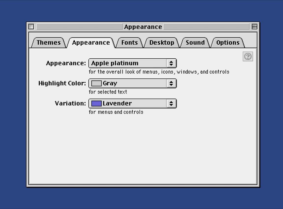
Prior to its arrival as a web feature, a dark appearance had become a common interface request on both the Mac and iOS. While Apple’s “pro” apps, such as Final Cut Pro and Logic, have used a non-standard dark interface since 1999, the idea goes back further, to Apple’s canceled Copland project. Shortly after Apple killed the project, they announced the purchase of NeXT, which brought Steve Jobs back as interim CEO. Parts of Copland, including the Appearance Manager did make it into Mac OS 8, but when theme functionality shipped with Mac OS 8.5, the only theme in the list was Apple Platinum.
The themes that Apple had previously promised did make their way into the world through developer releases, and users got their first taste of a dark Mac appearance by way of the Hi-Tech theme.
Following the non-arrival of official support for Appearance Manager themes, Apple began taunting its users with the infamous brushed metal interface. This unwelcome guest first appeared in Quicktime 4.1, in 1999, and gave plenty of false hope that themes were still a possibility. Instead of themes for the entire OS, brushed metal crept into other new applications, including iCal, iSync, and the infamous Sherlock.
When themes never arrived in subsequent updates, it soon became clear that Apple was never going to natively support interface themes. Users turned turned to the Kaleidoscope control panel, but even that died with the release of Mac OS X in 2001 and its lickable Aqua appearance. Aqua did offer an alternative “graphite” appearance, but it did little but turn Aqua’s colorful controls to a dully gray. Brushed metal, however, continued to infect Mac OS X until being unceremoniously shown the door a few years later.
Beyond Aqua
Interface customization was always a power user feature in the late-Classic and early-OS X days, although simply owning a Mac at all in those days probably qualified most people for power user status. This is somewhat speculative, but if I had to guess, I’d say the calls to add a system-wide dark appearance for the Mac and iOS probably started to increase among the broader user population sometime around 2013. This is when Apple ditched its skeuomorphic designs in favor of the flatter look of iOS 7 and beyond. The operating system was getting whiter, both mobile and desktop screens were getting bigger and brighter, and the idea of a less retina-searing glowing rectange in your face may have started to grow in appeal.
Then, in 2018, it finally happened. With the introduction of macOS Mojave’s dark appearance, Apple finally gave the people what they wanted for over 20 years. It wasn’t perfect, but it wasn’t bad either. A year later, the first CSS prefers-color-scheme media query appeared in Safari Technology Preview, and within another year, every browser was supporting it. Apple extended the dark appearance to iOS 13, and Android rolled out theirs as well. Major sites started rolling out their own dark modes, often with pretty awful results.
Of course, we were all so busy implementing this exciting new web feature that it took us a while to realize that, while light-on-dark might be easier on the eyes for some people, we totally forgot to ask anybody with astigmatism how it was for them). Uh, sorry about that. We’ll do better.
Listen to the people
OK, so dark mode isn’t perfect, but at least those of us who make websites can finally give people what they want, right?
OK, hold on a second.
Everybody asking for dark mode was asking for dark operating systems. Was anybody actually asking for a system-level setting to make every website dark?
I’m pretty sure they weren’t. I mean, it’s a system setting, not a browser setting. Where did we all get the idea that people wanted dark websites? Somebody’s got to know, right? Let’s check with the people who decide how the web works, to see if they can offer some clarity.
Here’s how the W3C describes dark mode:
The
prefers-color-schememedia feature reflects the user’s desire that the page use a light or dark color theme.
But does it? Does it?
I don’t remember expressing the desire that the pages I visit use any particular color theme. I changed a system setting. I just wanted dark windows, and if you check the macOS Appearance settings, it doesn’t say a damn thing about websites.
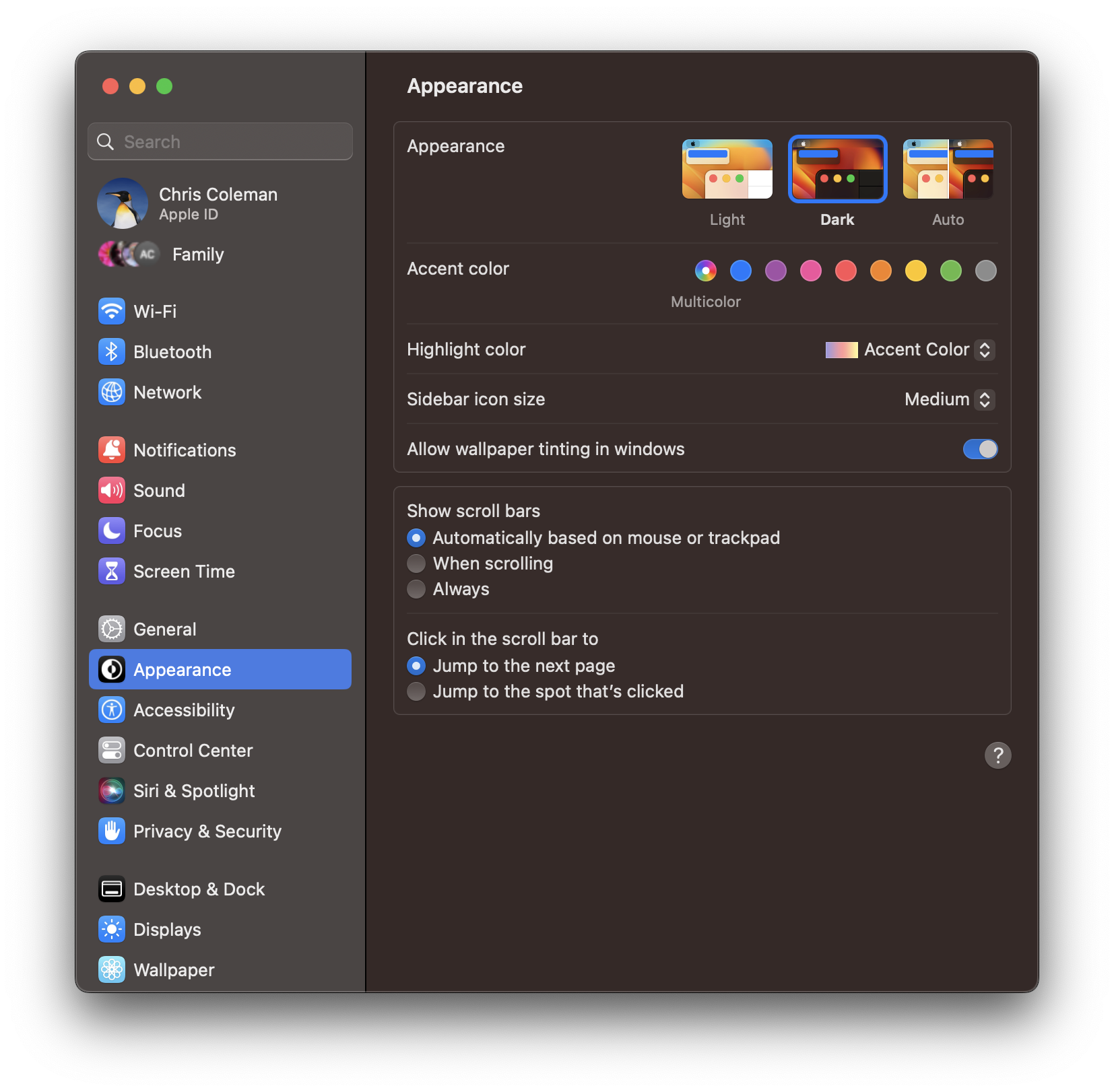
Let’s see… nope, nothing about changing how every website looks in there.
I ask this seriously: Does anybody even want what this provides?
Almost certainly yes, some people probably love this. But that’s incidental. This setting is simply overstepping its authority. Most people didn’t ask for this. This type of overstep is also present in the prefers-contrast media query and, to a lesser extent, prefers-reduced-motion and prefers-transparency. I qualify this only because the W3C says these features “detect if the user has requested the system” make these adjustments.
I happen to think that system animations on iOS are way too slow. To compensate for this, I might turn on the setting to reduce motion, but that still doesn’t mean I want web pages to reduce their motion. Reduce Motion and Reduce Transparency also happen to be buried in the Accessibility settings, so they’re a lot less likely to be active by chance than the dark appearance setting, which users encounter during setup, and is the default pane when you open the System Settings on a Mac. It still seems like web browsers are outside their lanes on these settings, but at least the W3C description is accurate.
So how do we solve this?
The real solution is up to the OS and browser vendors. The OS should offer to make its interface dark, but your browser should offer to make websites dark. It could be that simple.
Until browsers get their acts together, it’s up to the people making websites to deal with it. Nobody says you have to offer a dark mode, but plenty of people do prefer and find them useful. So it’s certainly worth considering.
If you’re designing a site for a brand where a dark design is appropriate, and you’re not offering lengthy reading experiences, it’s probably even fine to default to it. But if that doesn’t describe what you’re doing, either don’t offer it, or provide a manual toggle. If you’re into measuring such things, you might even consider keeping tabs on how many people turn your dark mode on or off, and adjust your default accordingly.
OK, so I’ve said what I have to say and I feel better. I’ll be following this up shortly with another piece (already mostly written, I swear!) about how you can handle this sort of toggle and manage the styles that make it happen.