Case Study
Building an integrated, sustainable design system
During my first stint at the American Association for the Advancement of Science, much of my focus was on Science Careers, then separate from the main Science site, which focused on career resources for scientists.
In 2011, I spent a few weeks creating new reference styles and markup, using current HTML5 and CSS3 capabilities, that I could hand off to external deverlopers for a replatforming project that wasn’t going to to involve major design changes. The goal was to fix a few issues and provide a longer life for the existing design as we waited for an eventual proper redesign.
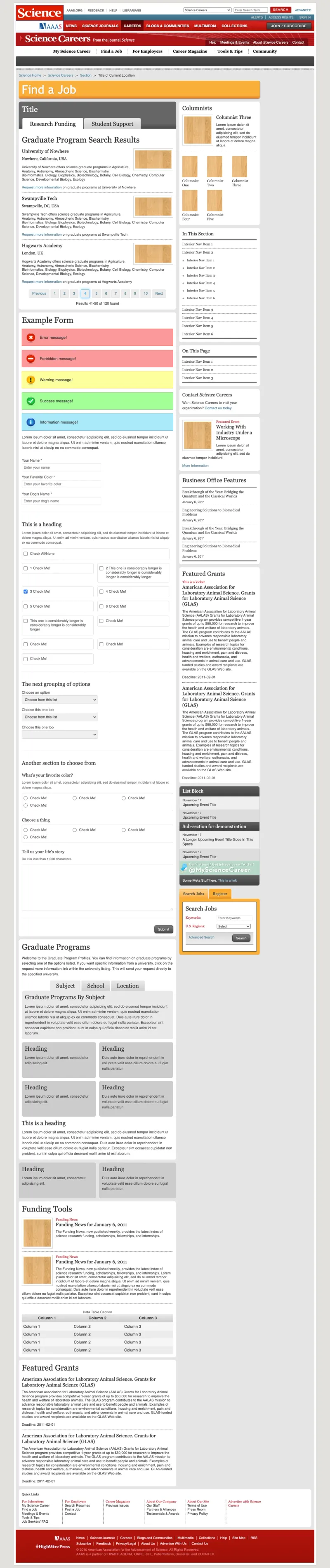
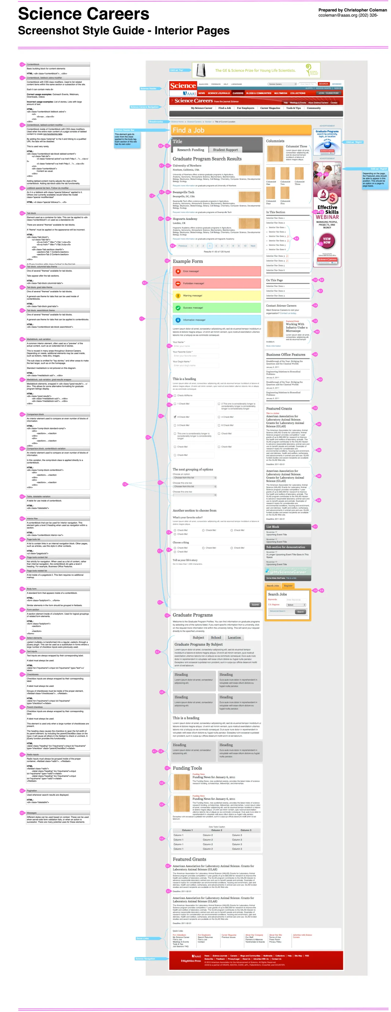
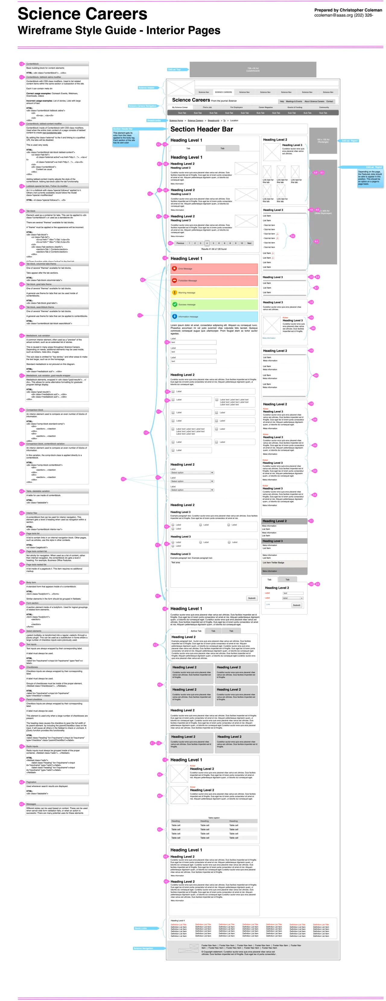
Above: A reference template, along with two versions of a usage guide for Science Careers. Styles and markup weren’t sufficient to explain what elements were and how they should be used, so I designed a detailed guide to explain them.
Shortly after wrapping this up, I left for a new opportunity, secure in the knowledge that I’d left my colleagues with the tools they’d need to handle the replatforming project without me.
Managing design at scale
In 2013, I returned to Science/AAAS, where a digital transformation was taking shape.
The replatforming project had failed, the technology approach was abandoned, but a different project to move Science’s Careers and News sites onto Drupal was nearing completion (unfortunately using none of what I had prepared). We soon re-launched the Science brand with a renewed effort to maintain design consistency and protect brand integrity. Technology-wise, we wanted to get in sync with our journal vendor, which had developed a Drupal-based platform for research content, and we soon began a project to redesign and merge News, Careers, and others into an all-new site.
Design work had started before our new web team formed, without accounting for development and hosting. With the design intended to be shared across at least five sites, maintaining standards would be a challenge, especially on the vendor-hosted journals. We brought design efforts in-house, receiving full-page Photoshop comps, but lacking definition of the elements in them — essentially pictures of a website.
The first step toward maintaining consistency would be to adopt a methodology and appropriate tools to manage it. Front-end tooling at the time was quite primitive compared to today, but there were a clear winners: Atomic Design and Pattern Lab.
I began by taking an inventory of everything in these designs that might constitute an element, and defining usage guidelines.
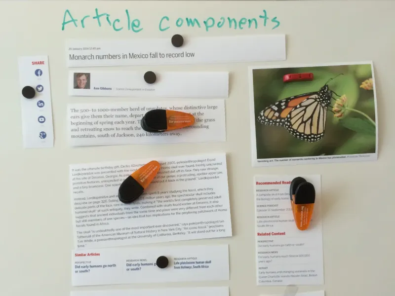
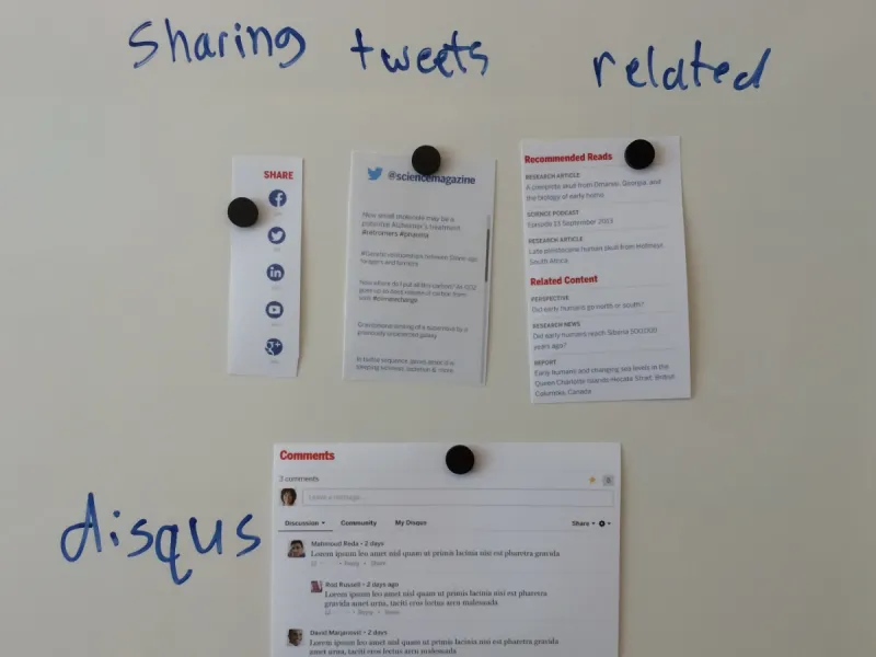
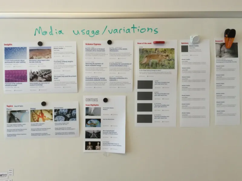
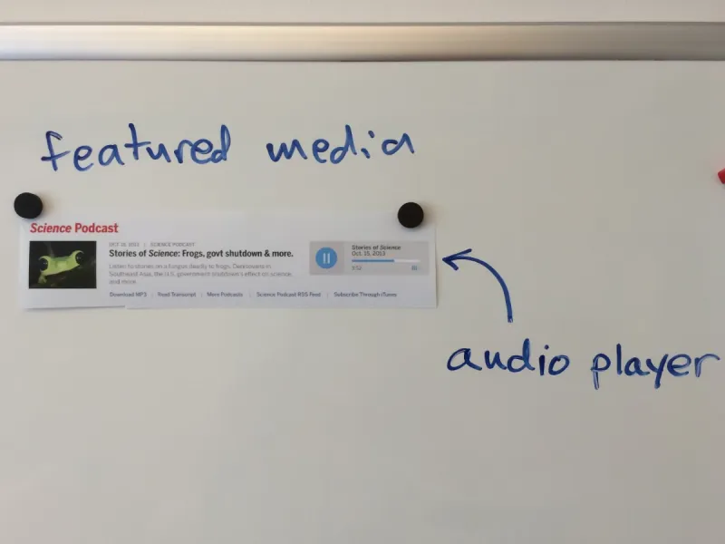
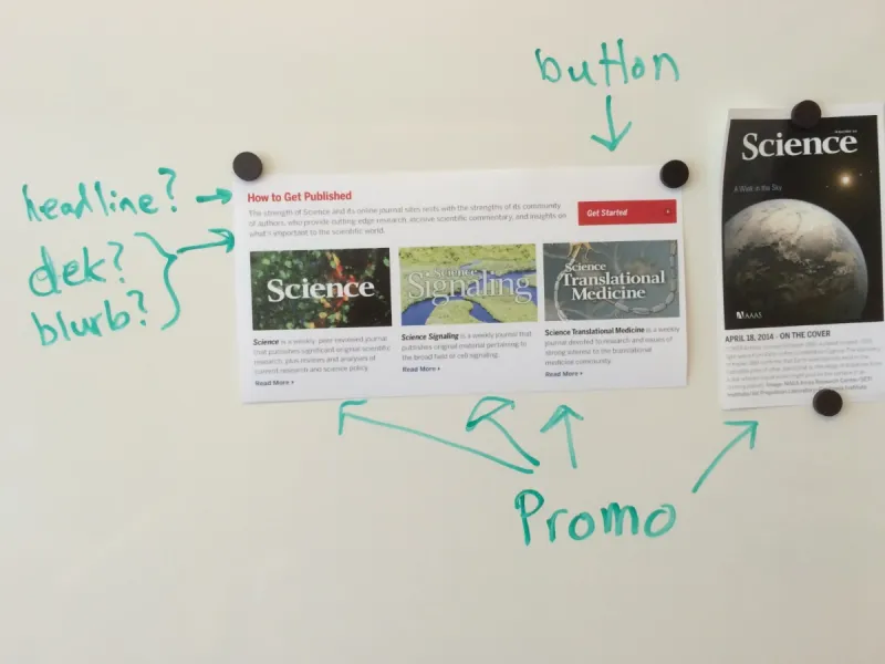
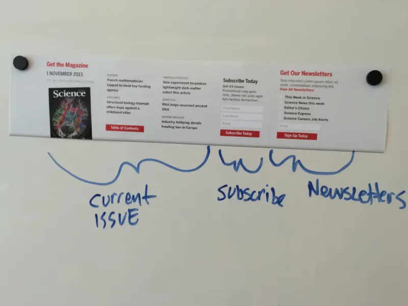
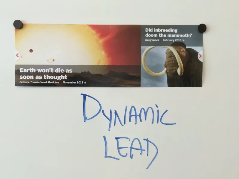
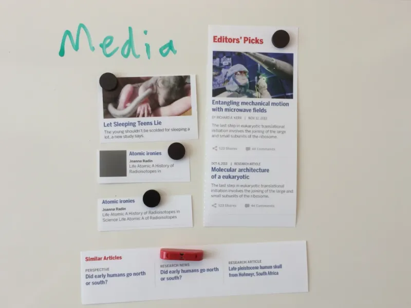
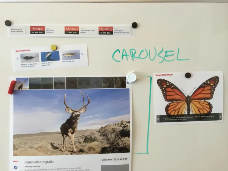
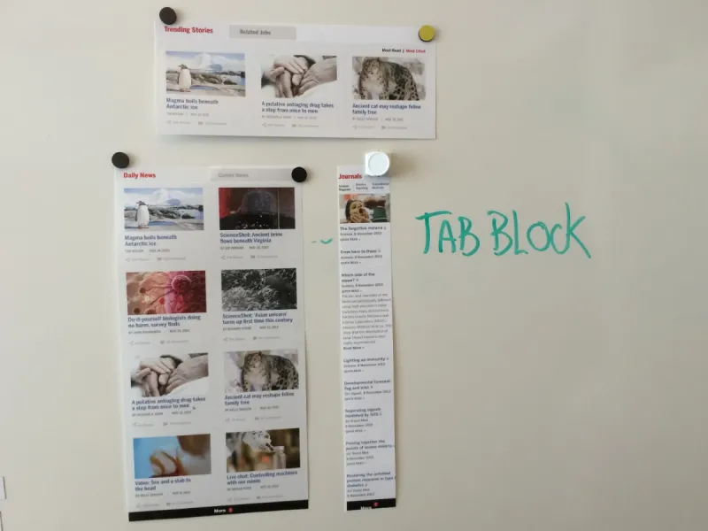
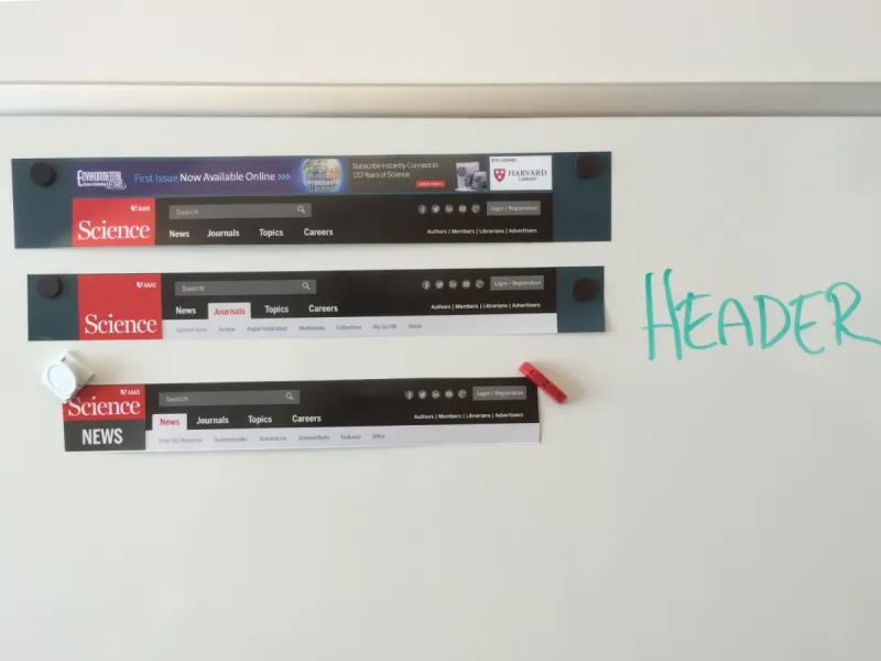
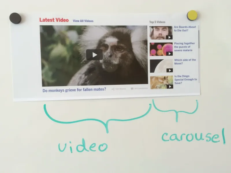
Above: Identifying components involved cutting up huge printouts and discussing as we shuffled them around a whiteboard. We identified dozens going down to the atomic level, but the process helped us eliminate many unnecessary items and identify others that could be variants of a single component.
Defining our components and establishing a system was a snap with Pattern Lab. We had a flexible system, but we didn’t yet have web sites. All that CSS still had to make its way into themes for a Drupal site, a Wordpress blog, and the research journals on our vendor’s platform. Brand integrity and mitigating design drift were important, but so were were performance, accessibility, and workflow management. No out-of-the-box solution handled all of these, but using Gulp.js, I made a custom build process that would produce bespoke stylesheets for each site, that integrated with each site’s theme, and included only the elements needed for that site.
So how well did it work?
In short: Even better than we could have hoped. We achieved:
- ✅ — Brand integrity was intact across the entire network
- ✅ — Design was in sync at launch — and stayed that way
- ✅ — Duplication of efforts was minimized
The system handled all of these incredibly well.
This approach couldn’t solve every challenge we would face, but it provided a canonical source of truth for the implementation of design outside of individual themes — a daily benefit to sitebuilders, producers, and the back-end developers at our journal hosting partner and in-house. I made a few trips to California to help our vendor integrate the system into their build process and help their front-end team to contribute styles and markup specific to their platform.
We followed our the successful relaunch of Science with two new journals, a new global search site, new content types, several microsites, and new storytelling tools — all streamlined by integration into this system.
In addition to generating styles for themes, the system powered workflows for:
- Visual regression testing, to generate snapshots of anything in Pattern lab, prevent unintended changes, and compare to production sites
- Browser testing with Browsersync to sync browsing activity across any number of browsers using our device test lab
- Critical style generation, to generate subsets of our styles and help ensure fast page load times
- Documentation generation for Sass and Javascript, using Sassdoc and JSDoc
- Performance monitoring, to test changes using various tools
- Asset optimization, to automatically compress theme parts including images, styles, and scripts, reducing browser requests
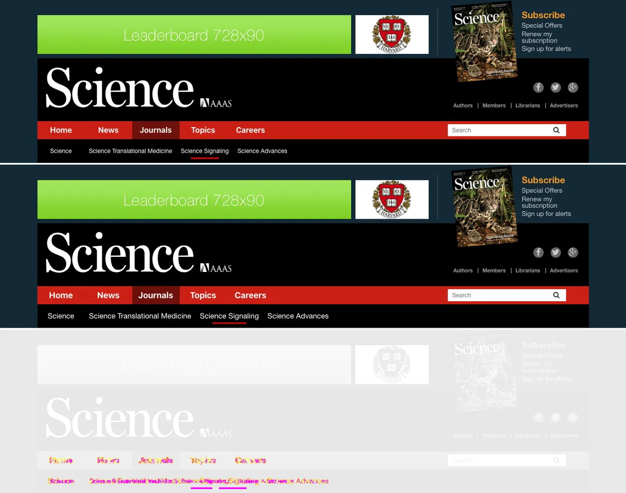
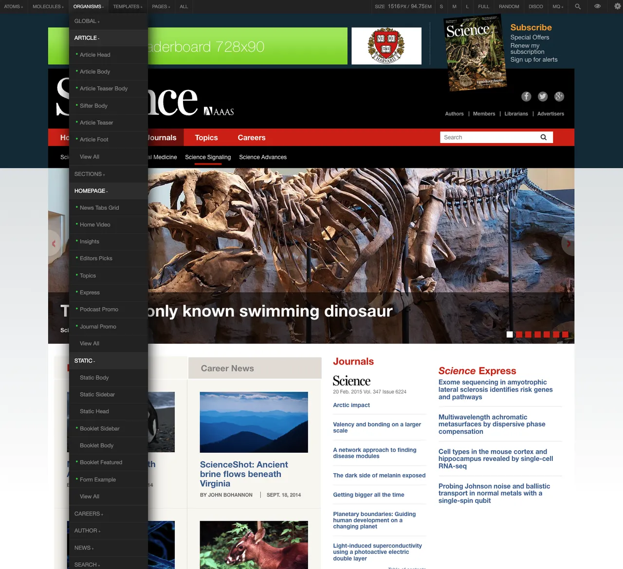
Above: Visual regression testing on a header component; Pattern Lab ‘page’ showing Science homepage with organisms menu.
Going further
Back-end performance issues delayed our launch, so we were aware of the productivity impact of this model several months before launch. We were seeing so much daily success, both within my team, and in collaboration with our journal vendor, that I was confident others could benefit from this approach. I presented a talk, “Styleguide-Driven Development” at the 2015 CSS Summit and Drupal Govcon, both in July, 2015. The general approach proved to be exactly right for its time, with projects to integrate Pattern Lab and Drupal themeing beginning to sprout up around that time.
Heavily component-driven approaches, mostly with React and Storybook are virtually the default these days, but it was an innovative approach at the time, and one that paid dividends in a number of areas.