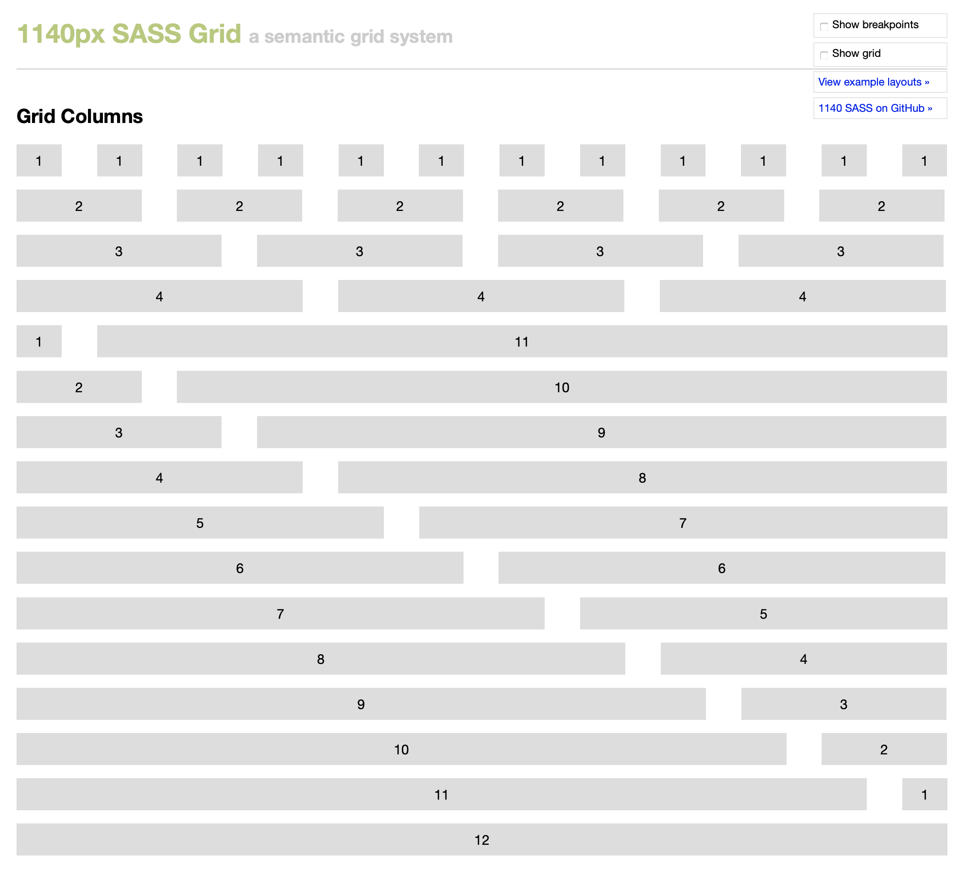
Introducing the 1140px Responsive Sass Grid! Take a look at the grid columns and a few example layouts. Both pages include a column and breakpoint overlay that will help you get an idea of how it functions.
I know what you’re thinking … “great, yet another grid system.”
Yeah, well you’re probably right. Here’s the thing: I don’t think there’s any one perfect CSS grid system, so it’s important to choose the one that works best for your project. There are many out there that I like, particularly the 1140px CSS Grid System.
The problem with this and most other grid systems is that it’s hard to get less semantic than classnames like “onecol”, “twocol”, “threecol”, etc. Enter Sass.
Sass makes it easy to avoid the ugly classnames usually associated with CSS grid systems. With Sass’s powerful variables and mixins, we can get the goodness of the grid without without all the mess.
Background
This project arose from a need I had while redesigning The Yule Blog. I used the 2011 edition of that site as a learning experience to teach myself more about Sass. While the site was always responsive, my approach needed some work, especially considering that there were 25 or so feature articles, each with a customized layout.
To prepare for the 2011 edition of The Yule Blog, I need to do some housekeeping. This grid system is already helping me to update the numerous templates and future-proof them by using semantic classes instead of classes tied to a grid system.
Benefits
It’s easy to use. I want something powerful but not confusing. I don’t want to have to think about it too much when I actually use it. It requires Sass 3.2, so that it can take advantage of the new mixin features.
Basic markup
Keep in mind that your class names will vary because you will create them using @include in the Sass. These examples use nonsemantic class names.
<div class="container">
  <div class="row">
    <div class="col-4">
      <p>Column 1</p>
    </div>
    <div class="col-8 last">
      <p>Column 2</p>
    </div>
  </div>
</div>
Push classes
You can offset columns to the right. Look at examples.html to see this in action.
<div class="container">
  <div class="row">
    <div class="col-4 push-4">
      <p>Column 1</p>
    </div>
    <div class="col-4 last">
      <p>Column 2</p>
    </div>
  </div>
</div>
Creating semantic classes
This example uses includes the container, row, column and push mixins…
.mcs {
  @include container;
  .mcs-content {
    @include row;
    article {
      @include column(4);
      @include push(4);
    }
  }
}
Markup for this example…
<div class="mcs">
  <div class="mcs-content">
    <article>

    </article>
  </div>
</div>
Include breakpoints
Include breakpoint mixins to add a responsive element as the page width shrinks. This example uses the same markup as above.
.mcs {
  @include container;
  .mcs-content {
    @include row;
    article {
      @include column(4);
      @include push(4);
      @include breakpoint(desktop-small) {
        @include column(6);
        @include push(3);
      }
      @include breakpoint(phone-landscape) {
        @include column(6);
        @include push(3);
      }
      @include breakpoint(phone-portrait) {
        @include column(8);
        @include push(2);
      }
    }
  }
}
Acknowledgements
This grid is based in large part on the original 1140px CSS Grid System by Andy Taylor. I’ve extended a series of mixins created by Ryan Schmukler and added push classes by Liam Cooke. I hope that my work can tie all these great things together.
Contributing
Please feel free to fork the project on GitHub and submit a pull request with any improvements. There’s definitely still work to be done.