I wanted to check one little thing in the AP Stylebook, and now I’m writing a blog post. I’ll try to make this quick.
The hardest part about using the printed AP Stylebook is that you have to remember what they call things. For example, if you’re looking up how to format a range of dates, well good luck. The information you need might be under dates, numbers, punctuation, or some completely other topic. You’ll be tempted to google it, which will lead you to a page or PDF posted by any number of universities’ journalism departments (but usually Purdue). That may or may not answer your question. In some cases, you’ll find post from the AP Stylebook account on Facebook or Twitter. Will these answer your question? Usually not.
You’d think a website would solve all of that. And you’d be wrong. The AP Stylebook website is a mess. As a search tool, it fails spectacularly. It’s full of things that look like links, but aren’t, and links send you in useless circles between entries that fail to answer your question. Its search isn’t smart enough to figure out what you’re looking for if you come close. A good answer usually requires an exact match to your query—and if you already know exactly what you’re looking for, you probably already have a sense of the answer.
Anyway, as I write this, I’m not currently logged in because my password expired, and I need to reset it. Let’s walk through what I’m seeing. I’m not going to redesign this for them, but I’ll highlight the low-hanging fruit that could have made this process less painful. I can’t speak to the exact level of effort that making any change would be in a system I have no specific knowledge of, but these are some relatively straightforward design and UX writing issues.
Step 1: Go to the website and log in
Of course, I’m going to start by going to apstylebook.com. First things first, why is everything so small? There’s tons of 12px and 15px text. Serif fonts might be appropriate, but they don’t work at tiny sizes. It’s 2023. Everybody, please just stop with the tiny fonts.
How to improve it
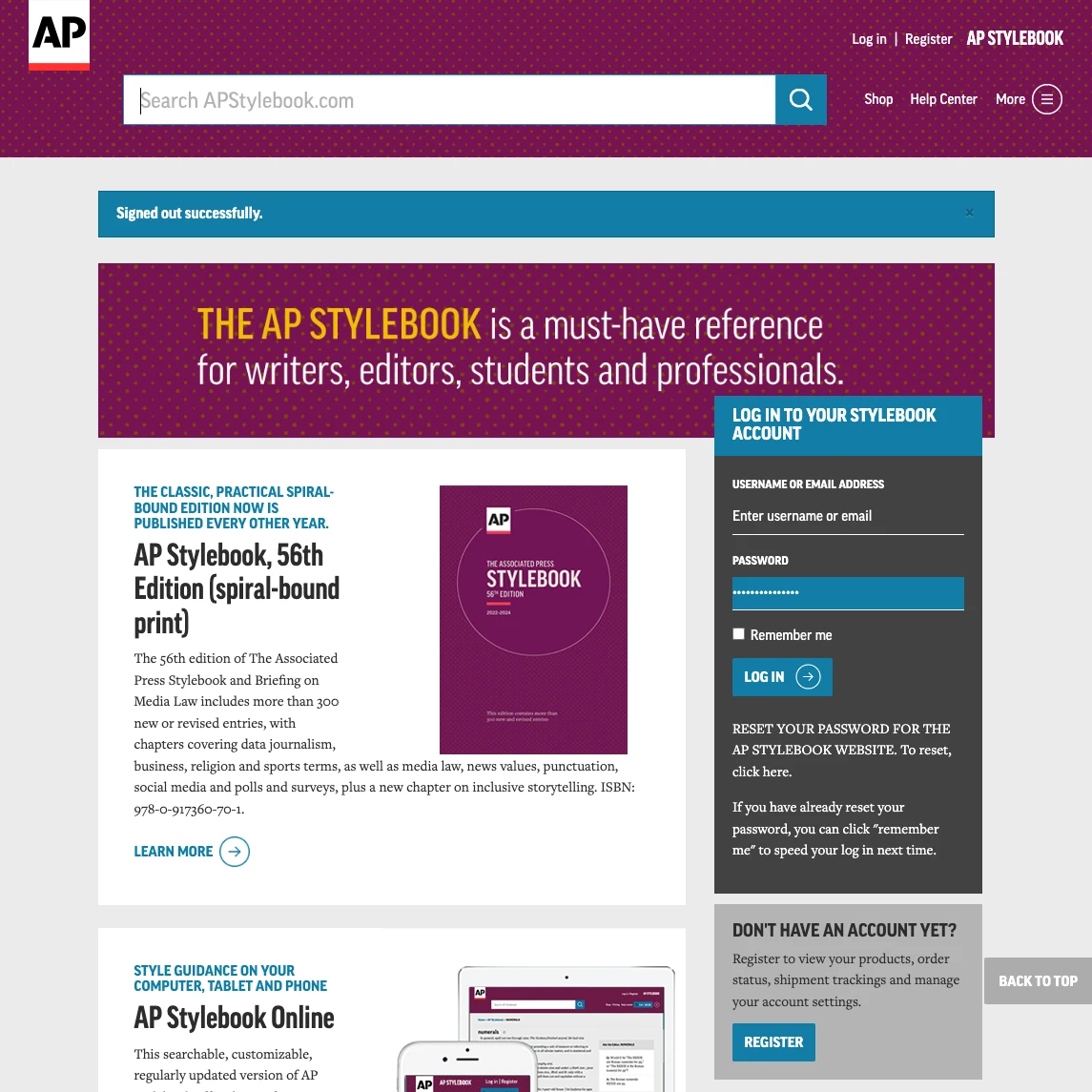
There’s nothing you can actually do here without logging in. Literally everything that’s not the login form is a promotion of some kind, not the actual AP Stylebook.
- Start by not logging me out in the first place. This site should be quick and easy to use. I’m not concerned about somebody stealing my computer and looking up how to format the abbreviations for academic degrees.
- Failing that, make the form the focus of the page.
- Remove the password reset instructions from the form. This is not the time for that. I’m here to log in.
Step 2: Figure out why I’m not logged in
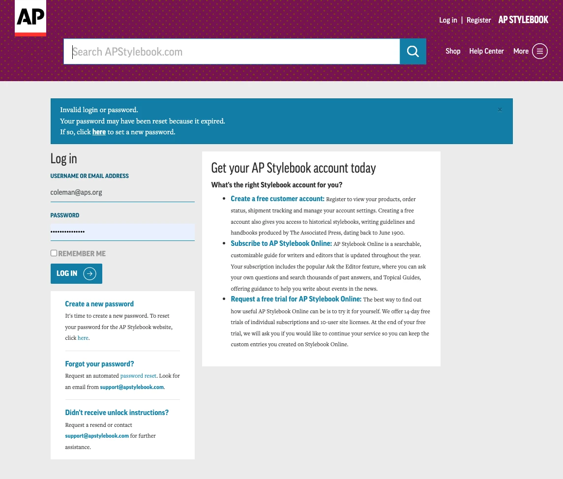
OK, so I’m on a login screen, and there’s a bunch of junk. Now I need to look at all of this stuff to figure out why I’m here, instead of being logged in.
- Do I want to “Get your AP Stylebook account today?” Uh, no. I have an account. And what is with the paragraph of text for each of these items? I just want to log in.
- Do I want to create a new password? No, my password is fine. It’s saved in my browser.
- Did I forget my password? Again, it’s saved in my browswer. I’m not an animal.
- Didn’t receive unlock instructions? What the hell?
After looking at all this junk, I realized the blue bar at the top is an error message. Ah yes, blue, the traditional color of errors, warnings, and caution. Let’s look at this a bit deeper. Also, if you look very closely, there’s a tiny little “x” in the top-right corner, in case you feel like closing this message. If you’re wondering, the contrast ratio is 1.41. That’s cool, in case I feel like closing it.
There’s a phenomenom called “banner blindless”, in which users of websites tend to ignore anything banner-like. We’ve known about this for 25 years. Even though, or perhaps because, it has the most visual weight of anything on the page, it’s the last thing people are going to look at.
How to improve it
- First of all: Do I really need to reset my password? Could this all have been avoided?
- Assuming the answer to the previous item is “yes,” send me directly to the password reset page! I shouldn’t be taken to the general login page and shown an error message.
- The email field doesn’t read as a field at all. Make it look like a form field.
I could go into more detail here, but I’d be getting ahead of myself, so let’s move on.
Step 3: Now reset my password
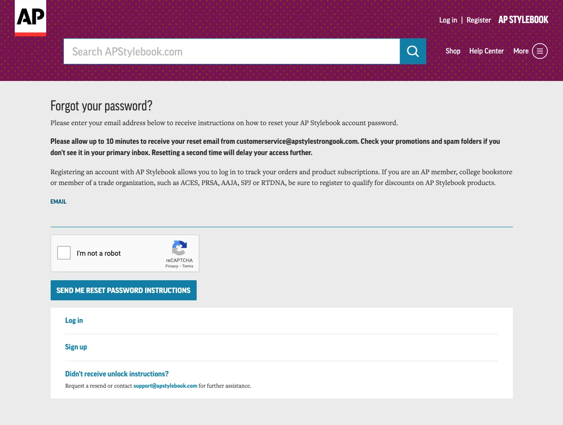
Once I’ve found the “click here” link to reset my password, I’m not even taken to a page to reset my password. I’m taken to a page with the title “Forgot your password?” The answer is still “no,” but I’m here, so I guess this is the closest thing they’ve got. On the surface, this page seems simple, but it’s a whole new mess.
They actually expect users to read all of this. In reality, nobody will. Everybody is going straight for that reCAPTCHA, clicking “I’m not a robot” and hitting “Send me reset password instructions.”
Guess what happens if you do that. You get another blue error bar. Never mind that the error itself “1 error prohibited this user from being saved:” doesn’t make sense (and isn’t even using AP Style). When I first did this, I hopped straight to my email client and waited for an email that never came because I didn’t fill in my email address. I didn’t fill it in because I didn’t even see that there was a text field on this page.
I just tried logging in. Are you telling me that you know that I need to reset my password, but you can’t even send my email address to the next page? I don’t even want to be doing this.
The sloppiness of this whole thing really comes out on this page. Take a look at the bold paragraph in the middle of the page. Do you see the email address “customerservice@apstylestrongook.com”? If you check the source, there’s a <strong> tag wrapping the contents of the paragraph. At some point, a developer, intent on eradicating <b> tags, ran a bad regular expression like <.*[bB].*[>/] that found any instance of “b” or “B” inside of an angle bracket, including between them. The result took <b>customerservice@apstylebook.com</b> and turned it into <strong>customerservice@apstylestrongook.com</strong>. Amazing work from the authority on formatting and editing.
How to improve it
- This is where I should have been taken to initially.
- Don’t make the user supply information you should already know.
- Put the main thing in the H1, and make it accurate
- Focus! Remove all of the information about registering, and logging in.
Step 4: Actually change my password
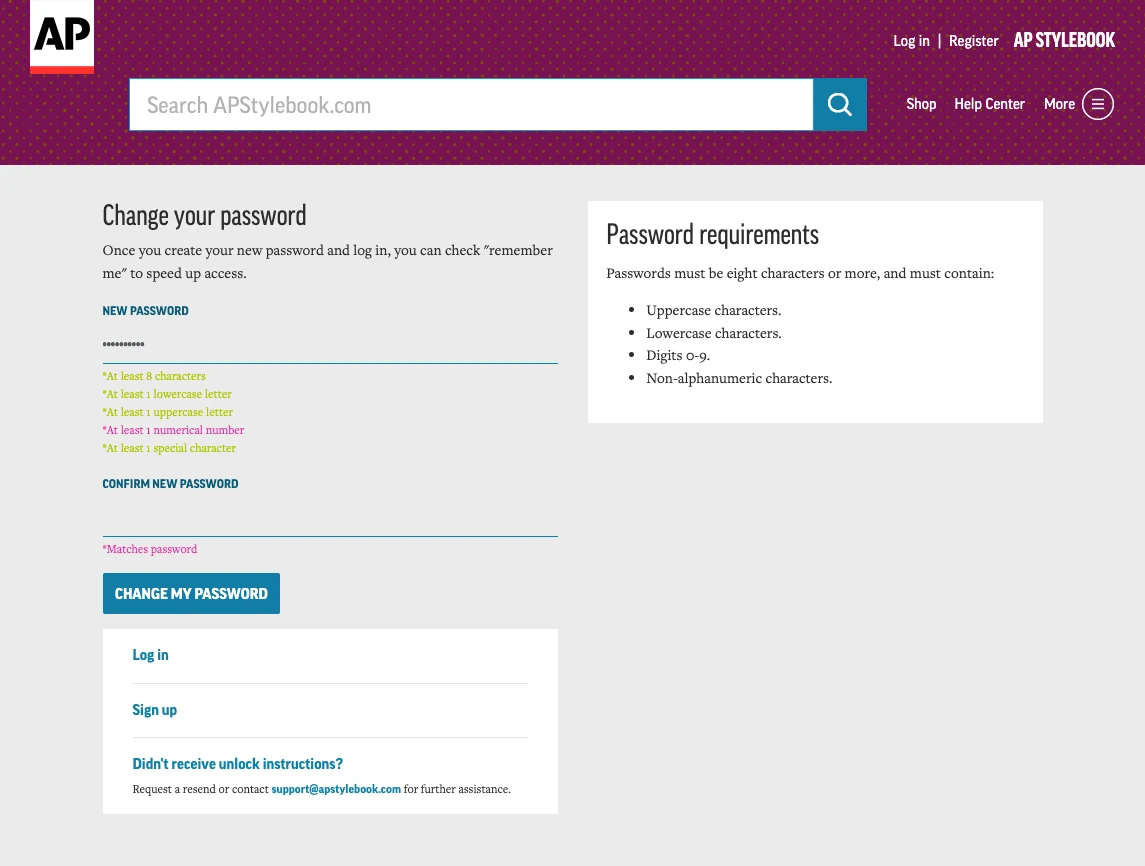
This page could be worse, but there’s a lot of room for improvement.
- The heading is fine (However, if you view source, it’ actually an
h2) - Why does the text under the heading tell me about checking a box on a form that isn’t even on this page? That has absolutely nothing to do with changing my password.
- There’s a serious problem with the color contrast ratio on the rules under the new password field.
- Why do the password requirements appear in two places, formatted differently? That’s just noise.
- Highlighting whether or not you’ve met the requirements as you enter your password is actually a really good pattern! There’s nothing worse than submitting the new password having your browser ask if you want to save it, and then finding out that it wasn’t valid. But those colors…
How to improve it
- Use H1 for headings. Come on, guys.
- Remove extraneous information like the log in/sign up box below the reset fields.
- Don’t repeat the password requirements in a separate box
- Use better colors for the password requirements. Stick with red and green, not pink and whatever this is.
- Don’t only rely on color to convey information. Use an icon in conjunction with the color.
In summary
These aren’t crazy changes. I suspect that a lot of the extra junk on these pages comes from using a standard template to display everything. A simple template, without all the noise, would go a long way here. Beyond that, it’s clearer words, more accessible colors, and a few odds and ends. It’s probably not a ton of work. For a site that insists on making users periodically change their passwords for no good reason, it’s probably worth the effort to get it right.